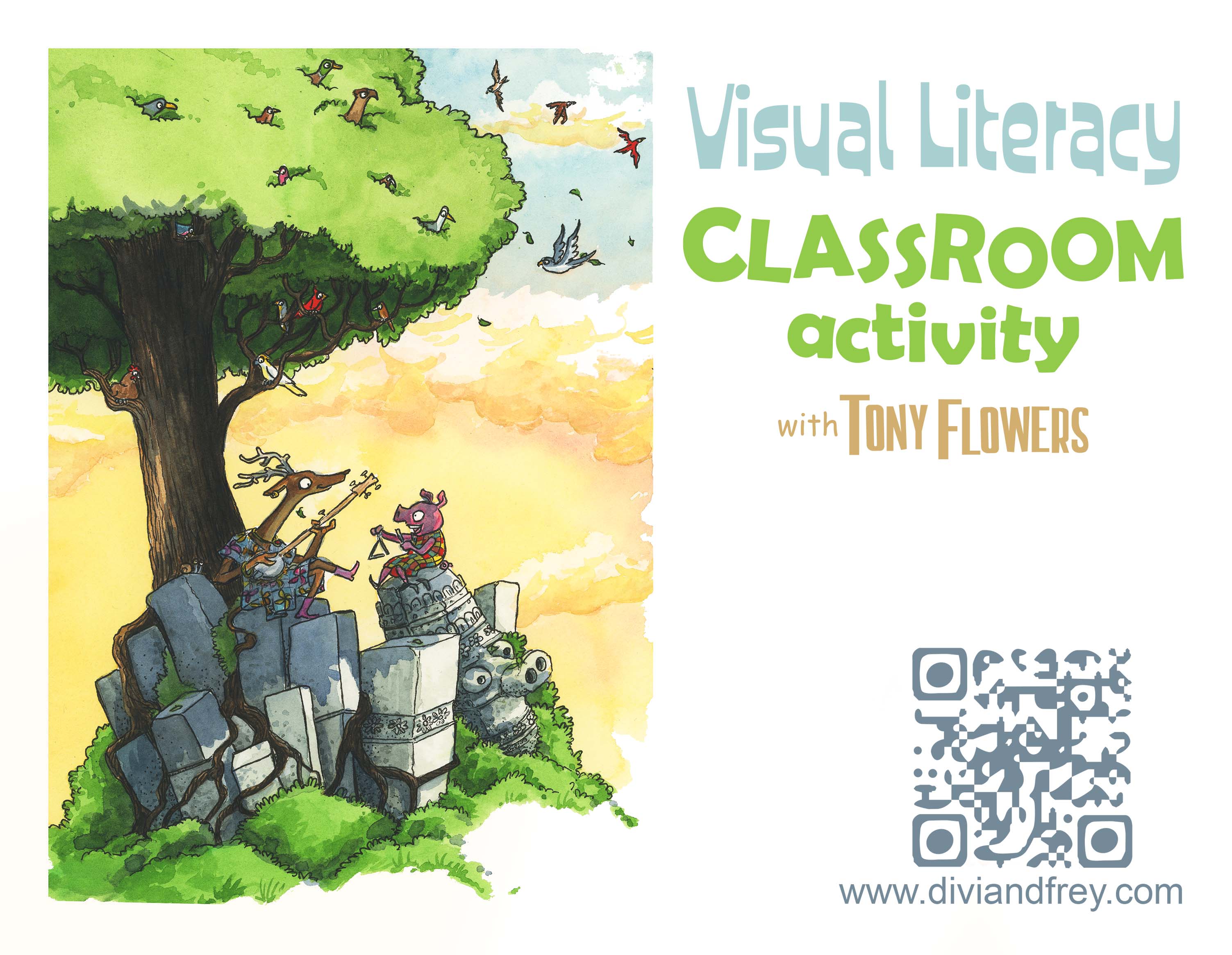
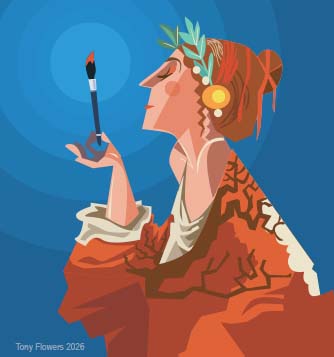
Tony Flowers is an award‑winning illustrator, author, and educator known for his detailed, humorous artwork and storytelling across picture books, chapter books, and graphic novels. Drawing inspiration from real life, travel, and everyday moments, Tony creates warm, adventurous worlds for young readers. He also teaches widely, supporting students and teachers in building creative confidence and visual‑literacy skills.
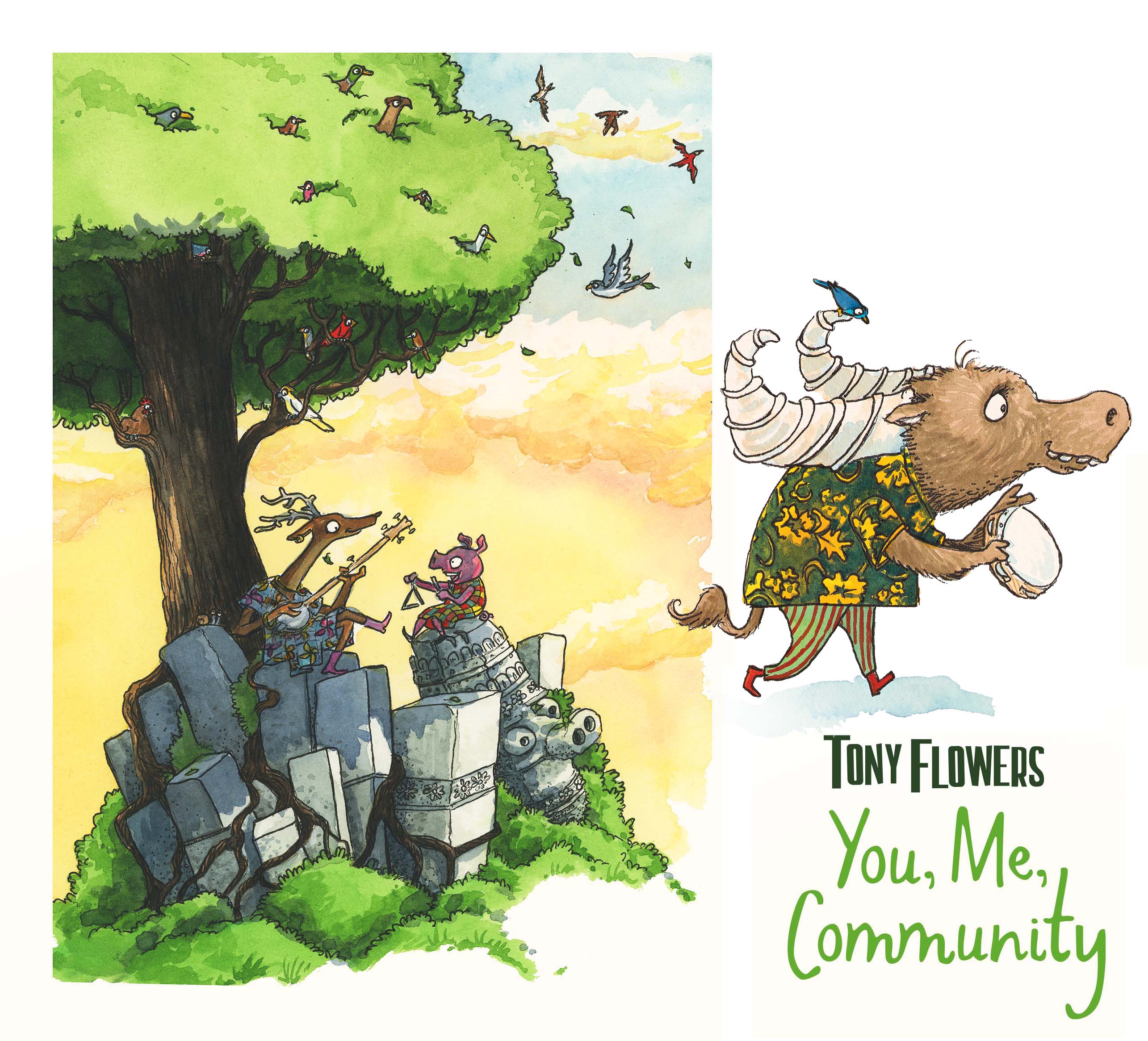
You, Me, Community: Using Time as a Storytelling Device
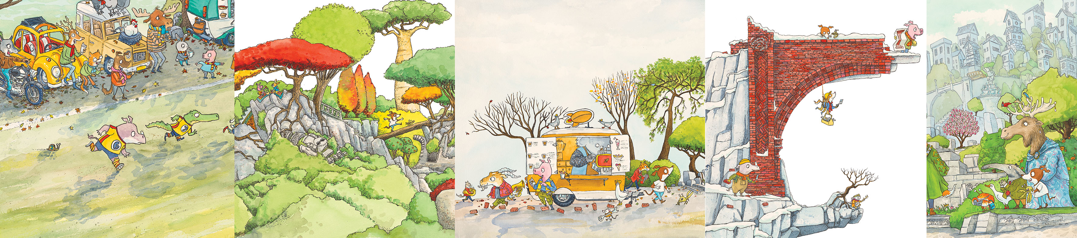
One of the quiet joys of illustrating You, Me, Community was finding ways to show the passing of time without ever needing the text to say it. Picture books rarely mention seasons, weather, or time of day directly, yet these elements can become some of the most powerful storytelling tools an illustrator has. In this book, the passing of seasons is not just illustrative folly, it is device that always me to show that building a community takes sustained effort without being didactic. The readers feel the rhythm of the community and the slow, steady progress of a goal to build a bridge to unit them.
The Bridge as a Symbol of Time and Togetherness
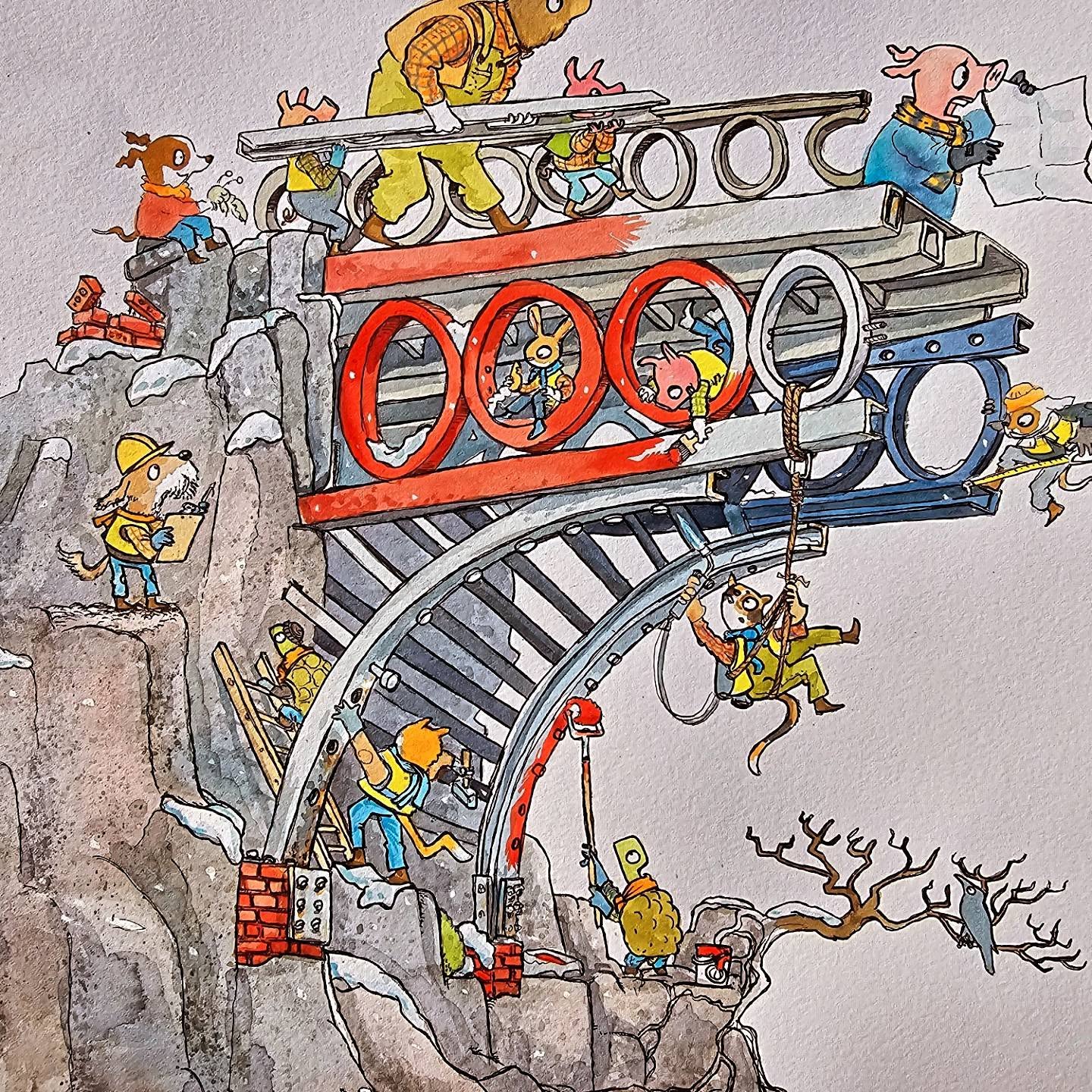
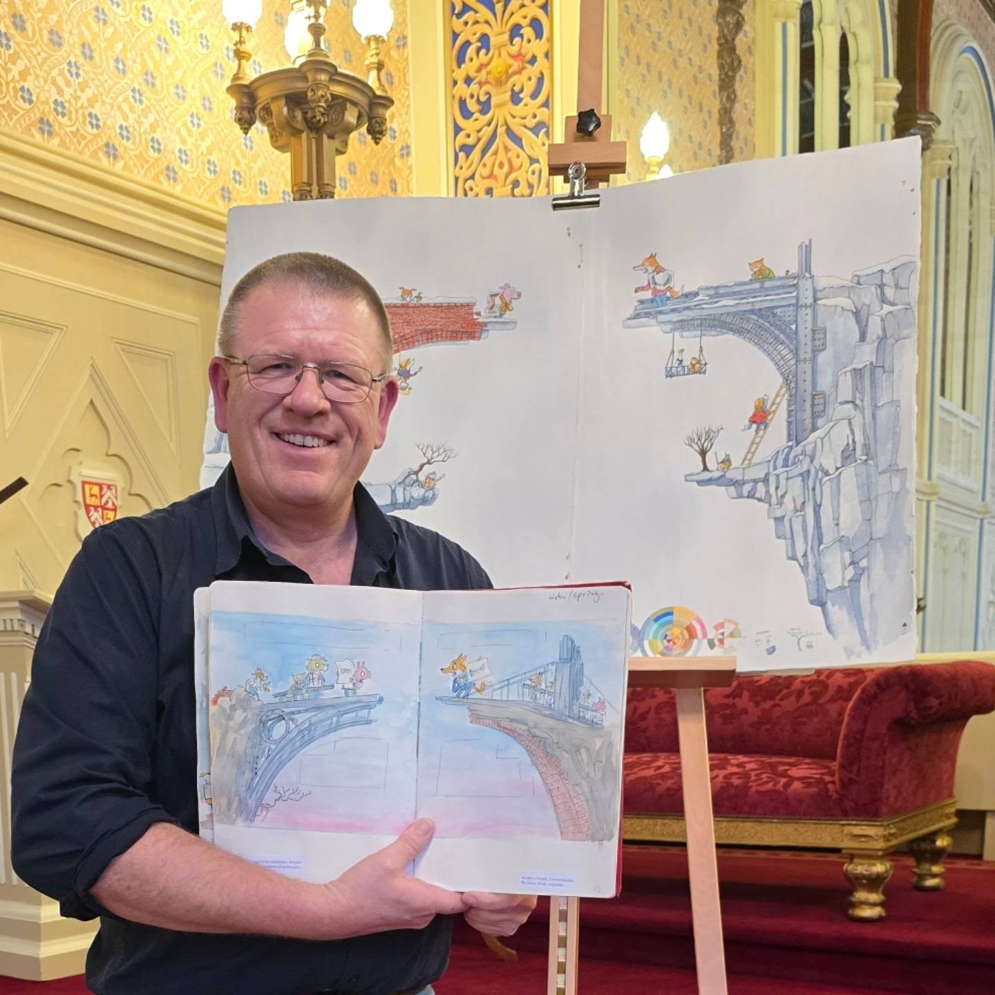
Throughout the story, the bridge becomes a visual symbol of community. We see it in different stages, the second spread feature the gap between the cliff faces, characters in hall discuss and planned the bridge, progress of constructure weaves throughout the pages, and finally a unique version of the bridge is completed. It’s a structure that doesn’t appear overnight. It takes time, effort, and collaboration. By showing the bridge across different seasons, readers can feel the long arc of the community’s journey.
We start with summer and optimistic look at the world, anything is possible, Autumn not only adds warmth to the images, change from planning to construction. We see the leave thin and fall as Winter brings problems to over come,
“… And if we sometimes disagree with members of community, we take a breath. Communicate. We listen, think, negotiate” – Zanni Louise, You Me Community (2026)
And as problems are overcome, the blossoms Spring bring new optimism and completion of the bridge and the community is united. A visual crescendo.
The text doesn’t spell any of this out, but the illustrations do. Time becomes a character in the story, shaping mood, pacing, and emotional resonance.
Why Illustrators Need to Think About Time
When you’re illustrating a story, one of the first questions to ask is: How long does this story take? Is it a moment? A day? A year? Several decades?
Once you understand the timeframe, you can start to use time as a narrative device. Morning light feels hopeful. Night can feel mysterious or lonely. A long shadow can add drama or tension. Weather can become a challenge for characters to overcome. Seasonal change can show growth, transformation, or the passing of important milestones.
Personally, I’m a big fan of long shadows, pink‑and‑orange skies, and characters lit by a single strong light source. These choices aren’t just aesthetic for aesthetics’ sake, they’re intentional ways to build story and emotion. They help guide the reader’s feelings without ever needing a line of text.
Time Creates Emotion
Think about how different times of day or year can shift the tone of a scene:
Morning: fresh, gentle, full of possibility
Midday: energetic, busy, bright
Sunset: warm, reflective, emotional
Night: dramatic, quiet, or even a little spooky
Summer: vibrant, active, joyful
Winter: still, determined, introspective
In You, Me, Community, these shifts help readers feel the community’s journey. Time becomes a visual heartbeat.
EXERCISES:
These activities help you start thinking about time as a storytelling tool.
1. Draw the Same Scene at Three Different Times of Day
Choose a simple location, a park bench, a backyard, a street corner. Draw it three times:
Morning
Afternoon
Night
Ask yourself: How does the light change to reflect the change in the time of the day? How does the mood change? What colours shift? Where do shadows fall? What story does each version tell?
2. Create a “Season Wheel” for a Character
Draw your main character four times, once in each season. You can include a mood board to capture the colours of the season or specific equipment or clothing might be noted next to the drawing
Think about:
Clothing
Weather
Background details
How the character feels in each season
This helps them understand how time can show growth, change, and emotional tone. It might also give you inspiration for writing the story, what challenges and opportunities for a story do the winder clothes offer over summer clothes?
3. Show a Character Persevering Through Weather
Pick a simple action, walking to school, carrying groceries, riding a bike. Draw the character doing that action in:
Sunshine
Rain
Wind
Snow
How does the character’s body language change? How does the weather affect the story?
NOTES OF TEACHERS:
These exercises can be used by teachers to help students think about how the environment and time can add drama, tension, or humour to a story.
Here are five focal points that you can use to guide students through the time‑based illustration activities. They’re practical, easy to apply in a Grade 4–6 classroom and help young artists think more deeply about visual storytelling.
1. Mood and Emotion
Help students notice how time changes the feeling of a scene. Ask them to describe the mood before they draw:
Morning = calm or hopeful
Afternoon = energetic
Night = dramatic or mysterious
This builds emotional literacy and helps them understand that pictures can “feel” different even when the subject stays the same.
2. Light and Shadow
Encourage students to observe where light comes from and how shadows behave. Focus on:
Long shadows vs short shadows
Warm light vs cool light
Single light sources (streetlamp, torch, window)
This helps them see how light can guide the viewer’s eye and add drama.
3. Environmental Clues
Teach students to use background details to show time or season. Examples:
Leaves changing colour
Snow or rain
Flowers blooming
Length of shadows
Clothing changes
This helps them understand that small visual cues can communicate big ideas.
4. Character Behaviour and Body Language
Ask students to think about how characters respond to time or weather. For example:
Leaning forward in the wind
Huddling under a coat in winter
Relaxed posture in summer sun
This builds storytelling skills by connecting environment to character emotion and action.
5. Consistency Across Panels or Versions
Guide students to keep certain elements the same while changing others. For example:
Same bench, different time of day
Same character, different season
Same action, different weather
This teaches visual continuity, an essential skill for illustration and comics and helps them see how time transforms a story without changing its core.
BOOK LAUNCH
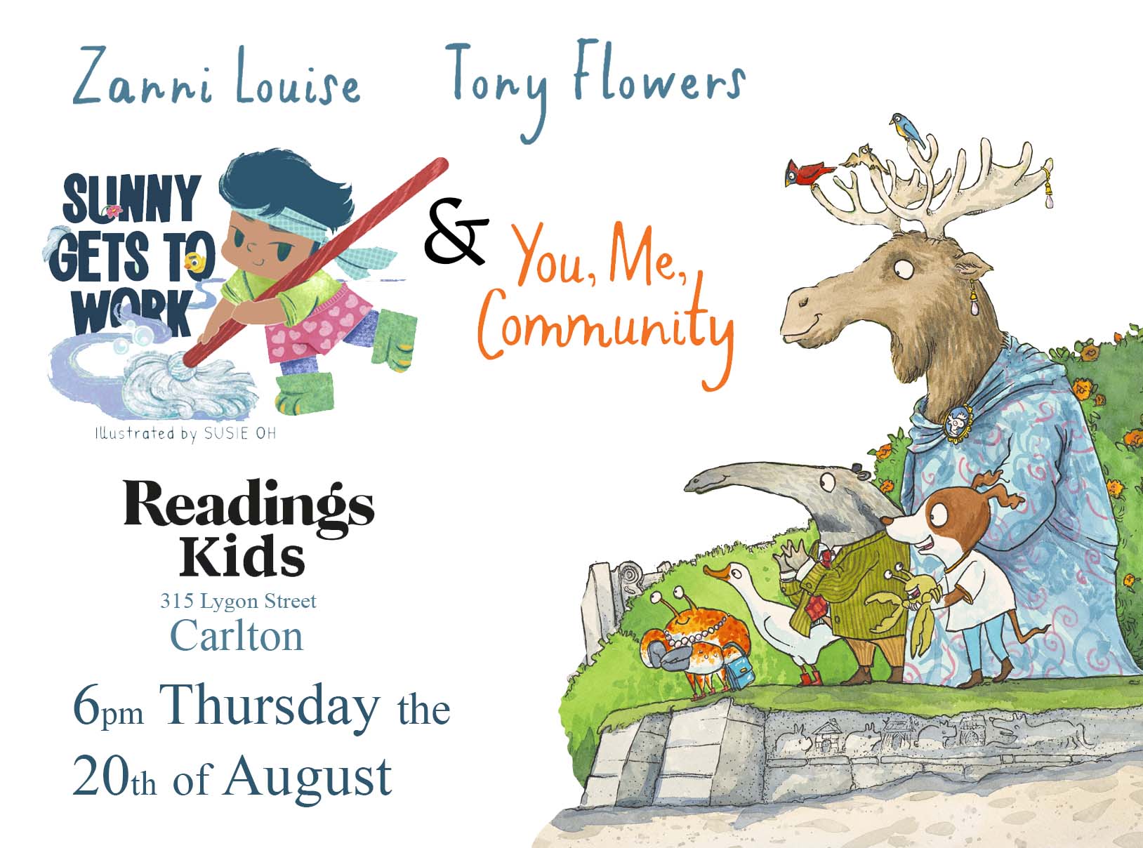
Join us in Melbourne on 20 August for the launch of You, Me, Community at Readings Kids, Carlton, starting at 6pm. Please book with Readings Kids so they can plan for numbers. This will be the only event this year where both Zanni Louise and I will be appearing together, making it the best opportunity to have your book signed by both of us. And, as always, when I sign a copy, I’ll include a simple original drawing inside. We’d love to celebrate the book with you and hope to see you there.
Introduction: A Changing Landscape in Children’s Illustration
The rapid rise of AI image‑generation tools has created a seismic shift in the visual arts, and children’s publishing is no exception. While AI can now produce polished images in seconds, the role of the traditional illustrator remains central to the craft, integrity, and emotional depth of picture books. In this article, I explore what human illustrators uniquely contribute, how AI is currently being used, and why the distinction matters, especially for young readers.
Before diving in, I want to address a common misconception among aspiring authors. If you’re preparing a manuscript for submission to a publishing house and your next step is to start hunting for the perfect illustrator, stop. That isn’t your job. Your role is to write a good story, told well. The publisher will select the illustrator. This is the moment where you must learn to let your project go and trust the publisher, editor, and illustrator to do their jobs. With that clarified, let’s look at illustration vs AI images.
The Narrative Power of Illustration
Illustrations in children’s books do far more than decorate the text. They carry narrative weight, emotional tone, and subtext. Children “read” pictures with as much sophistication as they read words, and illustrators design with this in mind.
So, what do illustrations actually do in a picture book?
1. Alongside the text
These images support the written narrative by clarifying setting, character, and mood. They help young readers decode meaning and build comprehension, especially in early literacy stages. Think of the wonderful work of Lynley Dodd in Hairy Maclary or my personal favourite, Slinky Malinki.
2. Work with the text
Here, meaning emerges from the interplay between words and pictures—neither is complete without the other. This “picture book dance” is a hallmark of the form and requires trust and collaboration between author, illustrator, and editor. The iconic partnership of Sir Quentin Blake and Roald Dahl demonstrates this beautifully. Author‑illustrators such as Bob Graham, Stephen Michael King, Anne James, and Alison Lester also excel in this space.
3. parallel to the text
Some illustrators create parallel visual stories that run beneath or beyond the written text. These hidden narratives invite re‑reading, discovery, and deeper engagement, rewarding visually literate children with layers of meaning. I was fortunate to work this way recently on You, Me, Community (written by Zanni Louise). The text was beautifully lyrical and open, allowing me to weave in an entire visual narrative that complemented, but did not duplicate, the words.
What Traditional Illustrators Bring to Picture Books
Traditional illustrators, whether working in paint, pencil, collage, or digital media, draw from lived experience, emotional intuition, and cultural understanding. Their work is shaped by years of practice, visual literacy, and a deep awareness of how children interpret images.
They bring:
Intentional storytelling: every visual choice supports narrative, theme, and character.
Emotional authenticity: human experience shapes expression, gesture, and atmosphere.
Cultural sensitivity: illustrators understand context, symbolism, and representation.
Consistency and continuity: essential for character‑driven stories and series.
A unique artistic voice: style becomes part of the book’s identity.
These qualities cannot be automated.
AI Images in Publishing: Current Uses and Current Limits
AI is already being used in some self‑publishing projects and by a small number of publishers for covers and simple character images. While this may seem efficient, it removes vital development opportunities for new and emerging illustrators, who traditionally build their careers through small commissions, early‑career picture books, and cover work.
AI’s limitations, as they currently stand in a rapidly developing field, include:
Lack of narrative understanding: AI predicts patterns; it does not understand story, emotion, or subtext.
Inconsistent characters: maintaining continuity across 32 pages remains unreliable.
Ethical concerns: many models are trained on unlicensed artwork, raising copyright and moral rights issues.
No cultural awareness: AI frequently produces insensitive or inaccurate depictions.
No collaboration: AI cannot respond meaningfully to editorial direction or co‑develop a book’s vision.
The Commercial Reality: Why AI Images Cheapen the End Product
Some creators argue that using AI prompts constitutes authorship. While this may feel valid on a personal level, the commercial reality is different.
When a picture book uses AI‑generated illustrations:
The book often looks glossy rather than professional. AI images have a synthetic sheen that experienced readers and publishers recognise instantly.
If the cover looks AI‑generated, readers question the quality of the text. If one part looks rushed or artificial, people wonder whether the writing received the same level of AI care.
It reinforces the harmful idea that children’s books are “simple” or “lesser.” This assumption is deeply offensive to those who understand the craft. Picture books are complex works of literature requiring mastery of pacing, visual narrative, emotional resonance, and child‑centred design.
Children deserve more than “good enough.” They deserve books created with intention, expertise, and respect for their developing minds. Think back to your favourite childhood books, they hold a special place in your heart. The books we fall in love with shape us, and that is not a responsibility to take lightly.
A Reality Check for Aspiring Authors Considering AI
If you are thinking of producing a picture book because AI makes it look easy, please pause.
Research what books are currently being published in your country and internationally.
Look at award‑winning titles—for writing, illustration, and design. In Australia, this includes the CBCA Book of the Year Awards, the YABBA Awards, and various state‑based awards.
Compare your concept to these standards. Does your book meet the level of craft, narrative depth, and visual coherence? Reflect on this honestly.
If not, consider:
Joining local writing groups, especially kid‑lit communities.
Connecting with organisations like SCBWI (Society of Children’s Book Writers and Illustrators).
Learning the craft of picture‑book storytelling before rushing to publish.
The world of children’s literature is welcoming, but it is also a professional field with high expectations and a deep responsibility to its readers.
Traditional Illustration vs AI Images: A Comparison
Traditional Illustration
Emotional authenticity
Narrative intention
Cultural sensitivity
Character continuity
Unique artistic voice
Collaborative development
Ethical transparency
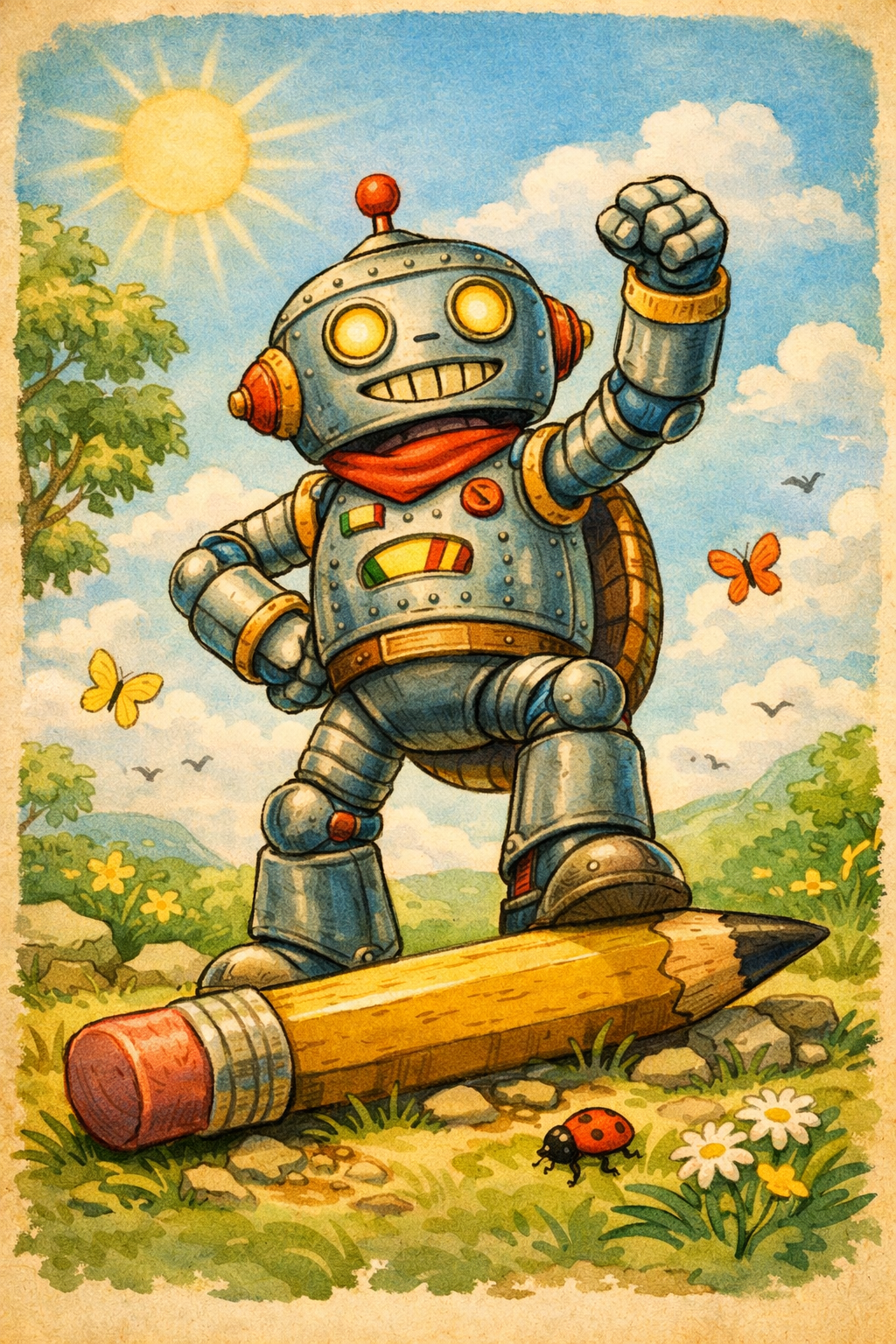
Image above Co-Pilot’s version of a retro robots victory of a pencil for a children’s book illustration
AI Images – Strengths
Speed
Low cost
Style mimicry
AI Images – Challenges
No narrative understanding
Inconsistent characters
Ethical concerns
Cultural inaccuracy
No collaboration
“Glossy” but shallow aesthetic
Commercial stigma
What AI Still Cannot Do (But Illustrators Can)
Create intentional visual storytelling
Build emotional subtext
Collaborate with authors, editors, and art directors
Ensure cultural accuracy
Develop a unique artistic voice
Maintain character continuity
Understand child readers’ developmental needs
Create art grounded in lived experience
Conclusion: The Future Is Hybrid, But Human‑Led
AI will continue to evolve, and its role in publishing will grow. But picture books, true picture books require human insight, emotional intelligence, and narrative intention. The illustrator’s role is not disappearing; it is becoming more important as we navigate questions of authenticity, ethics, and artistic integrity.
Children deserve stories made with care. Illustrators deserve the space to create them. And the industry deserves to uphold the standards that make picture books one of the most sophisticated and beloved forms of literature.
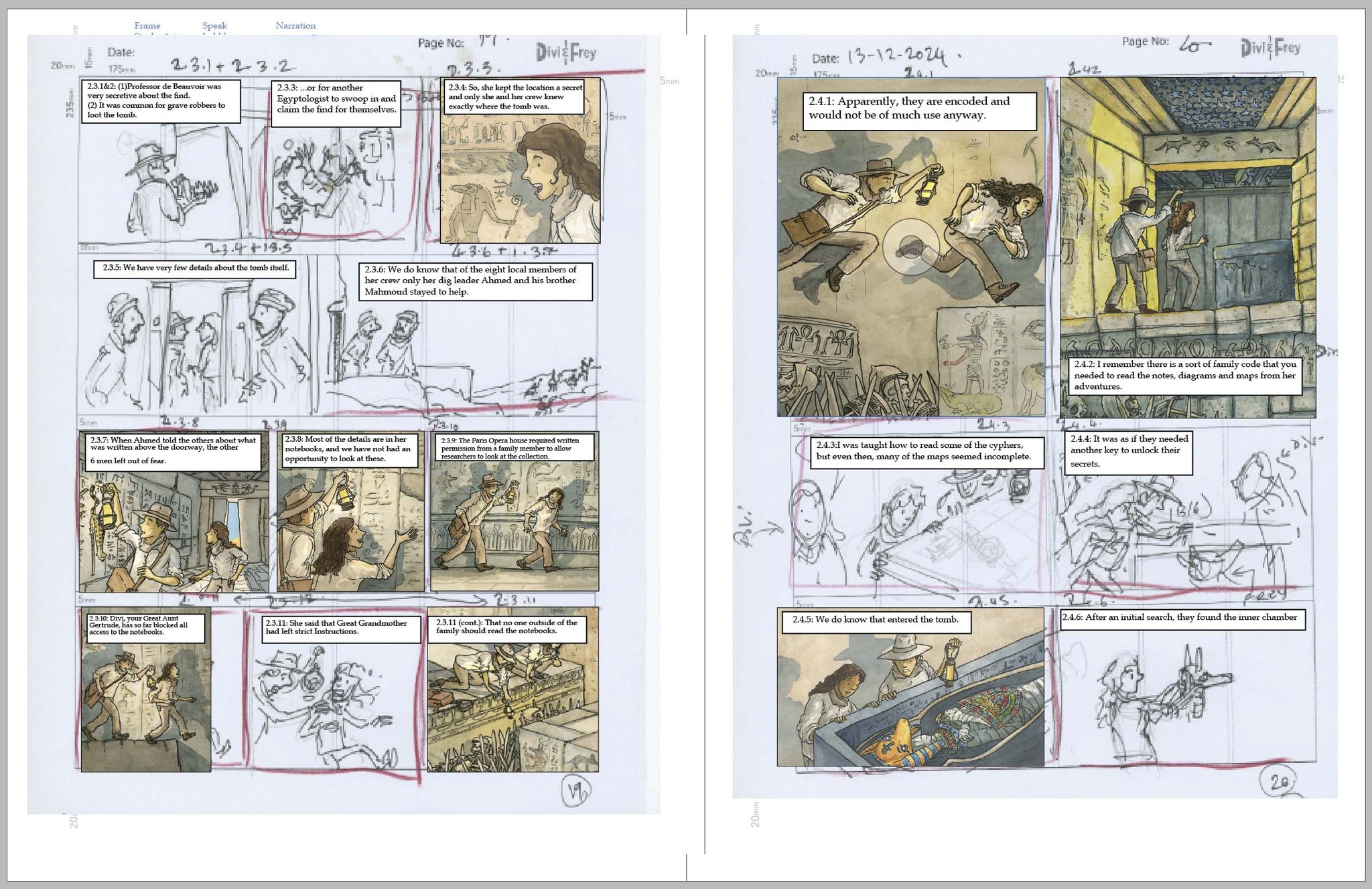
Above: Divi & Frey graphic novel 3D image (Tony Flowers, Walker Studio – publication date TBC)
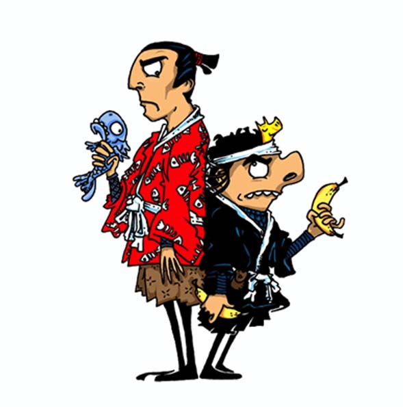
Image process from Samurai vs Ninja series with Penguin Australia (2015)
When I’m not sketching the latest escapades of Divi and Frey or immersed in a new picture book project, I’ve had the privilege of teaching university students, an experience that’s deepened my understanding of visual literacy in unexpected ways. Although I never quite finished my PhD, the journey through academic research and creative practice offered rich insights into how visual literacy is perceived, taught, and applied.
As an illustrator whose work is rooted in visual storytelling, I’ve had the unique opportunity to bridge theory with practice, examining how academic frameworks around visual literacy align with the lived experience of creating images that communicate, engage, and inspire. Through this lens, I’ve developed a series of classroom activities designed to help students decode, interpret, and create visual narratives with confidence and creativity.
These activities are grounded in both research and real-world illustration, and I’m excited to share them with you along with some of the discoveries I stumbled upon along the way.
Identify key elements in a visual story (character, setting, action)
Make predictions based on visual clues
Express ideas through drawing and oral explanation
Resources:
Printed illustration (from a picture book or wordless story)
Drawing paper and pencils/textas
Instructions:
Promotional image from the Samurai vs Ninja series, Penguin Australia (2015)
Show students a single illustration from a story.
Ask: “What do you think might happen next?”
Students draw what they imagine the next scene would look like.
Invite students to share their drawings and explain their ideas to the class.
Discussion Prompts:
What clues helped you decide what happens next?
How did you show movement or emotion in your drawing?
Did your scene change the story in a surprising way?
Extension Ideas:
Pair students to combine their scenes into a mini comic strip.
Add speech bubbles or sound effects to enhance storytelling.
See post on Wally Wood’s 22 panels and related exercises to help students who might struggle with creating a comic sequence or for students who need extension exercises to build on their skills
Year 4 Teaching Notes
Learning Intentions:
Use visual clues to make narrative predictions
Develop descriptive language to support visual storytelling
Explore character motivation and emotional tone
Resources:
Illustration from a graphic novel or picture book
Drawing paper, pencils, coloured markers
Writing paper
Instructions:
example from Divi & Frey and the Curse of Anubis, in development with Walker Studio Australia. expected releases in 2027
Present an illustration with clear action or tension.
Discuss what’s happening in the scene and brainstorm possible outcomes.
Students draw the next scene and write 2–3 sentences describing what happens.
Share drawings and written descriptions in small groups.
Discussion Prompts:
What emotions are your characters feeling?
How did you decide what the setting looks like?
Did your scene continue the story or take it in a new direction?
Extension Ideas:
Create a two-panel comic showing “before” and “after.”
Compare different students’ interpretations and discuss how visuals shape meaning.
Year 6 Teaching Notes
Learning Intentions:
Analyse visual narratives for mood, pacing, and character development
Create sequential art that builds on existing story elements
Use dialogue and visual composition to enhance storytelling
Resources:
Illustration from a wordless graphic novel or dramatic scene
Storyboard templates or blank comic panels
Drawing and writing tools
Instructions:
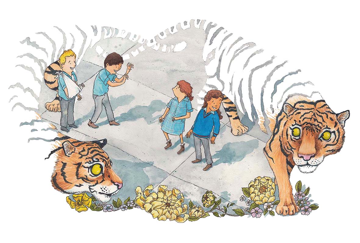
Image from ‘You, Me, Community , text by Zanni Louise, Walker Book Australia (Aug 2027)
Present a complex illustration with layered visual clues.
Facilitate a discussion on possible narrative directions, character motivations, and emotional tone.
Students create a 2–3 panel storyboard showing what happens next, including dialogue and setting details.
Students present their storyboards and explain their creative choices.
Discussion Prompts:
How did you use composition to guide the viewer’s eye?
What choices did you make about pacing and action?
How does your scene reflect or challenge the original illustration?
Extension Ideas:
Rewrite the scene from a different character’s perspective.
Use digital tools to create animated versions of the panels.
If you have enjoyed these tips or have any request for future post please don’t be shy, let me know. If you message me I will see what I can do to create new post in response to your requests.
These post is made up of four lessons that were originally created as the opening module of an online short course on visual literacy for teachers, a project I began developing but ultimately decided to share here instead. Rather than keeping them tucked away, I wanted to make the material freely available so that any teacher, anywhere, can benefit from the ideas, strategies, and classroom applications they contain. If you’re a teacher and you find these lessons useful, I’d genuinely love to hear from you.
I’m also very happy to talk with teachers or teacher networks in person (face to face or via zoom). I you are interested in a presentation, a practical workshop, or a deeper dive into visual literacy and multimodal teaching, feel free to reach out and we can explore what that might make this happen.
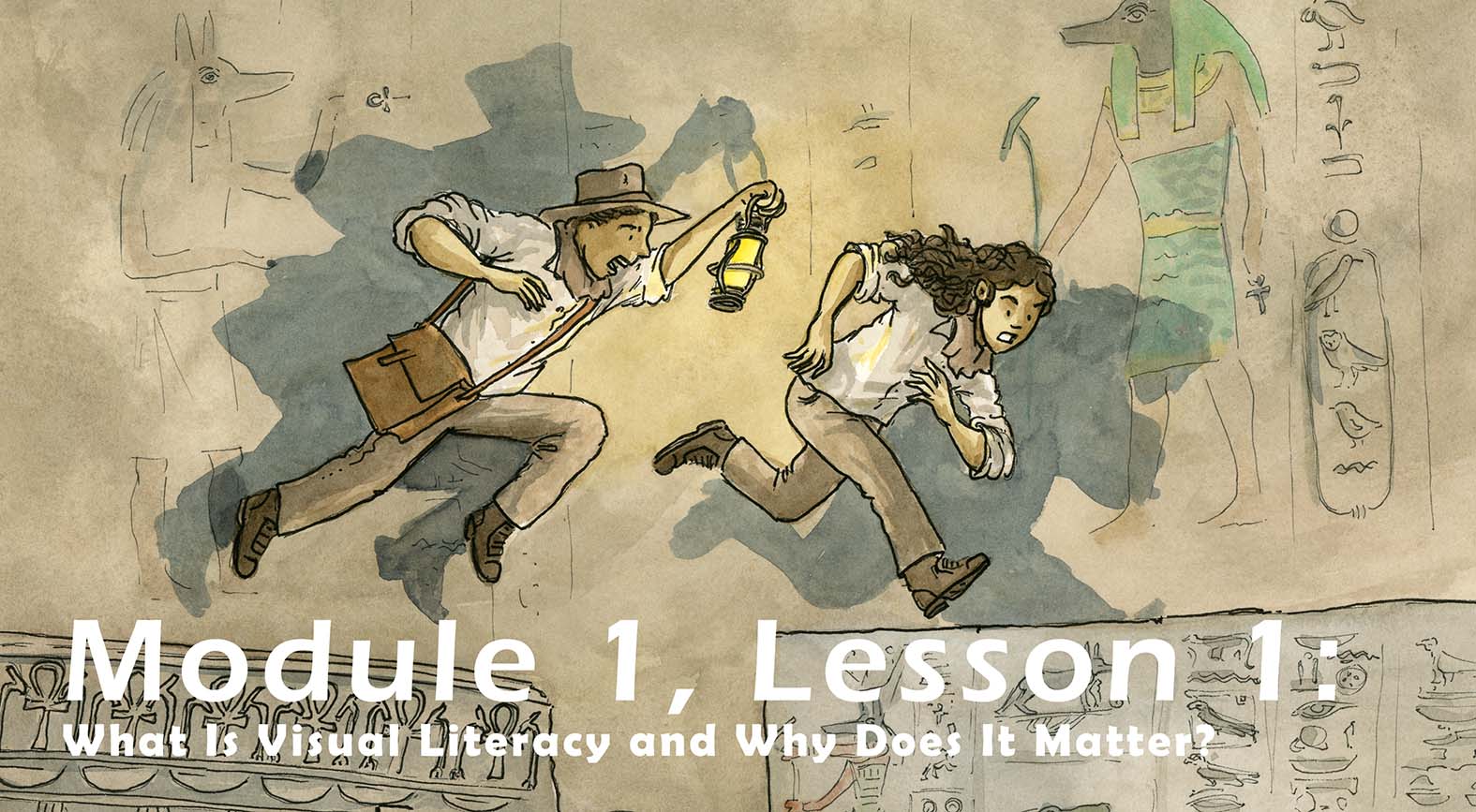
Welcome to Lesson 1 of Module 1! Today we lay the foundation for your journey into visual literacy, an essential skill for 21st-century learners and a powerful tool for every teacher.
Why This Matters
Visual literacy is more than just “looking at pictures.” It gives us the ability to understand, interpret, and create meaning using images. In today’s media-rich world, students are constantly engaging with visual texts, from picture books and graphic novels to infographics, diagrams, advertising, and social media. Yet many students lack the explicit skills to decode these visuals critically, creatively, and confidently.
When teachers understand visual literacy, they can help students become thoughtful interpreters, empathetic readers, and articulate communicators. Embedding visual literacy into everyday teaching supports comprehension, fosters deeper engagement, and empowers students to express themselves in multimodal ways.
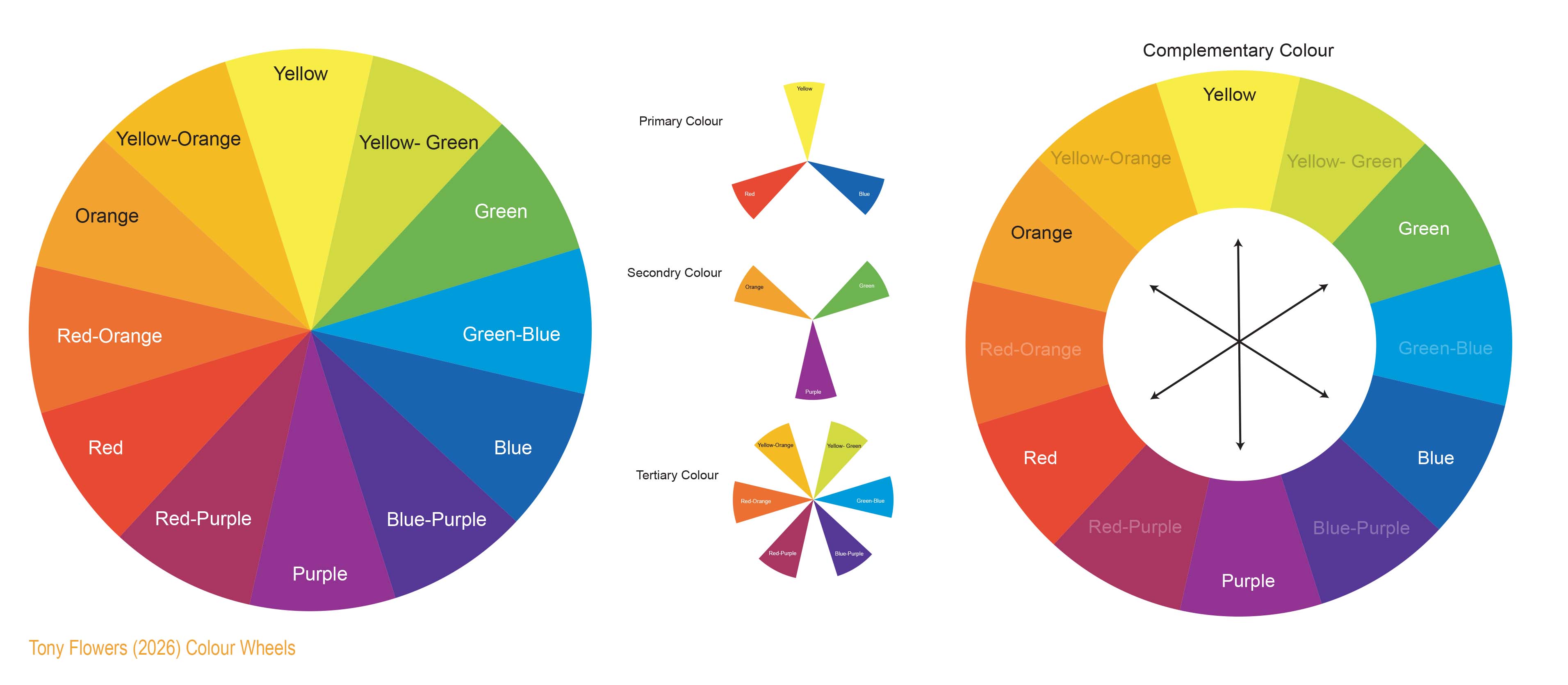
What Is Visual Literacy?
The simplest definition of visual literacy is ‘the skill of reading and interpreting images. This allows us read images in narrative and interpret messages in combination with words. It includes understanding:
Composition and layout
Colour and symbolism
Facial expressions and body language
Sequencing and narrative flow
Curriculum Alignment (Australian Curriculum)
Visual literacy is a key component of the Australian Curriculum, supporting students to interpret, create, and communicate meaning through visual texts across all learning areas. It fosters critical thinking, multimodal comprehension, and creative expression from early years through secondary education.
Example of how Visual literacy is supported across multiple learning areas:
English (Year 3 – ACELA1483): Students learn to understand how visual elements create meaning in texts.
English (Year 6 – ACELY1690): Students analyse and explain how visual elements contribute to meaning.
English (Year 7 – ACELY1701): Students plan and deliver multimodal presentations using visual aids.
Science (Year 5 – ACSIS086): Students communicate ideas using representations, including visual formats.
HASS (Year 6 – ACHHK094): Students interpret historical sources, including photographs and other visual texts.
Media Arts (Years 5–6 – ACAMAM060): Students explore how representations and meaning are constructed in media artworks.
Book study
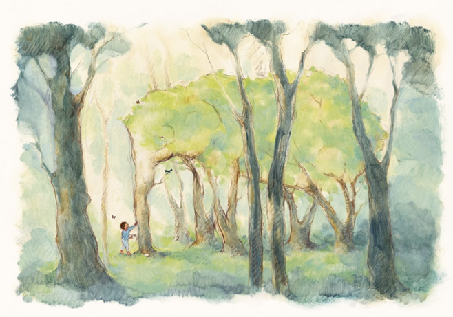
The Boy and the Elephant illustration (2024) Freya Blackwood
The Boy and the Elephant
The Boy and the Elephant by Freya Blackwood (HarperCollins Children’s Books)
This whimsical and emotionally resonant picture book invites children to explore imagination, empathy, and environmental awareness. A young boy discovers that the trees on the vacant block next door, his cherished play space, are about to be cut down. But in his eyes, they’re not just trees.
Visual Literacy Focus: Freya Blackwood’s illustrations cleverly depict the trees with animal-like features—trunks shaped like elephants, branches resembling antlers, encouraging students to interpret symbolism, metaphor, and emotional tone. These visual choices prompt readers to consider how images can communicate deeper meanings beyond the literal.
Discussion Prompts to Build Visual Literacy:
Was the boy’s plan a good idea? Why or why not?
Who benefited from his actions, and how is that shown visually?
What clues in the illustrations suggest how the boy feels about the trees?
What would you do in his place? How could you show that in a drawing?
This story is a rich resource for teaching visual inference, symbolism, and narrative flow, all key components of visual literacy. The above prompts will help create deeper engagement, stronger comprehension, and more thoughtful classroom discussions.
Visual literacy empowers students to make meaning from images, just like they do with text. It’s a vital skill for reading, writing, thinking, and communicating in contemporary classrooms. (Standards: 2.5, 3.2)
Key Takeaways
Visual literacy is about interpreting and creating images.
It supports comprehension, empathy, and critical thinking.
It belongs in every classroom, not just art.
Standards Touched on in This Lesson
Code
Summary
1.1
Use strategies based on students’ physical, social, and intellectual development
1.2
Structure teaching programs using research into how students learn
2.1
Apply content knowledge and teaching strategies to develop engaging activities
2.5
Apply effective literacy strategies across learning areas
3.1
Set explicit, challenging learning goals for all students
3.2
Plan well-structured learning programs
3.3
Use teaching strategies that foster critical and creative thinking
3.5
Use effective communication strategies to support student engagement
Learning Activity
Prompt: Choose a picture book, comic, or illustrated page you’ve used in class. Write down three things’ students could learn by analysing the visuals:
Up Next: Module 1, Lesson 2
Common Misconceptions and Barriers to Teaching Visual Literacy In the next lesson, we’ll explore the doubts and challenges teachers face and how to overcome them with confidence.
Standards Source
This lesson aligns with the Australian Professional Standards for Teachers, published by the Australian Institute for Teaching and School Leadership (AITSL), 2011 (Revised 2018).
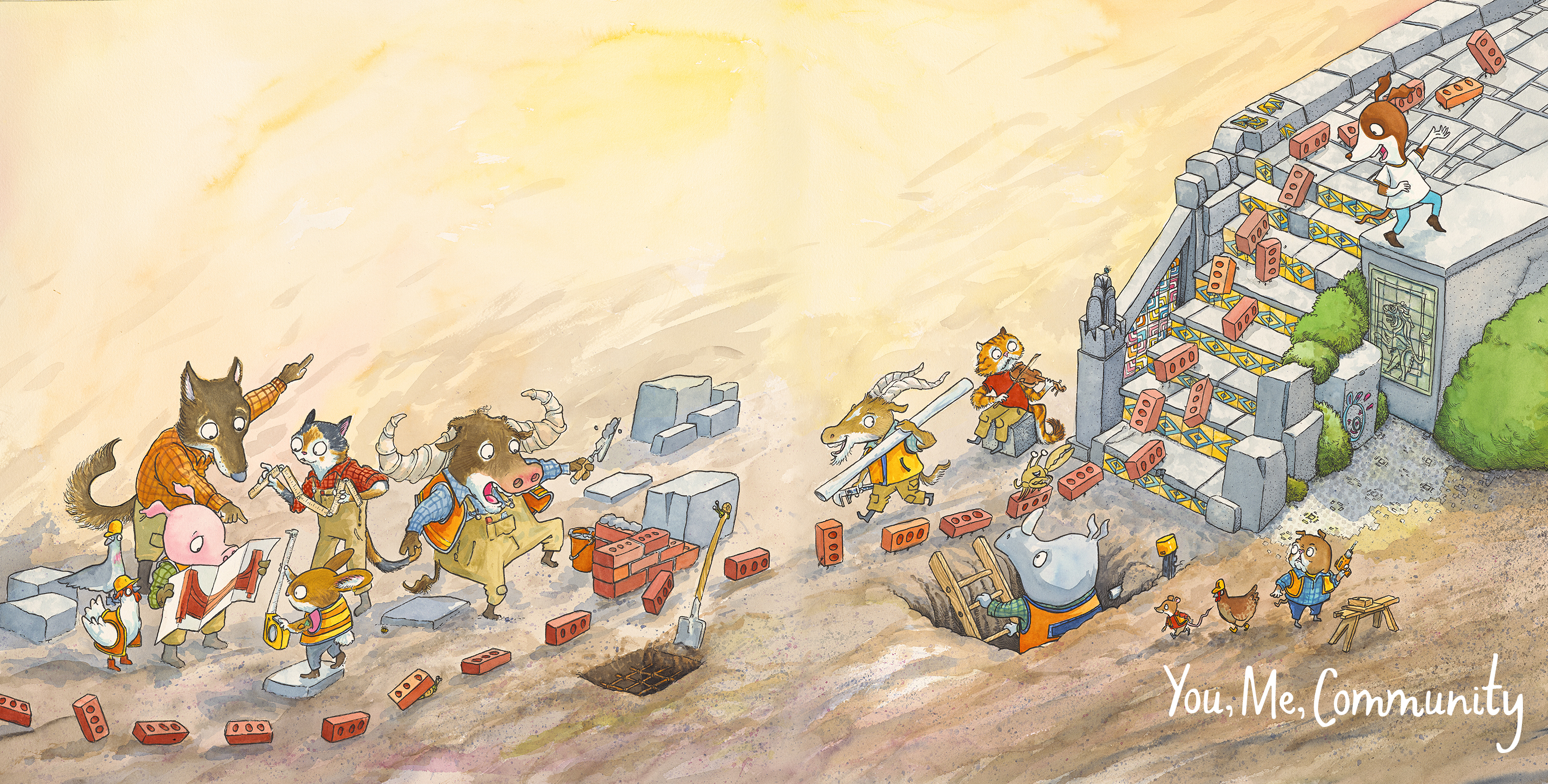
You, Me, Community (2026) Zanni Louise and Tony Flowers – Walker Books Australia
Visual literacy is often misunderstood. Many educators hesitate to teach it, believing they lack the artistic ability or that it doesn’t fit into their subject area. This lesson aims to debunk those myths and show how visual literacy can be seamlessly embedded into everyday teaching.
Misconception 1: “I’m not an artist, so I can’t teach visual literacy.”
Clarification: While visual literacy is about interpreting and creating images. Teachers don’t need to be skilled in drawing, painting, or sculpting. The goal is to guide students in making meaning from visuals, using observation, discussion, and critical thinking. Looking at simple ways to communicate through images.
Classroom Insight: Even simple visuals like stick figures or basic diagrams can be powerful tools for analysis. The focus is on interpretation, not aesthetics.
Drawing Tip: Level Up Your Stick Figures for Storytelling
The humble stick figure is more than just a quick doodle—it’s a powerful tool for visual storytelling. With just a few tweaks, you can instantly boost its expressiveness and character appeal.
Here’s how to upgrade your stick figures in seconds:
Start with shape: Swap the simple line torso for a rectangle or oval. This gives your character a sense of volume and movement.
2. Taper the limbs: Instead of straight lines, draw arms and legs as tapered shapes—thinner at the ends, thicker near the body. This adds flow and dynamism.
3. Now, play! Experiment with posture, gesture, and facial expression. These slightly advanced stick figures are the foundation for countless beloved characters.
Inspiration corner:
Think of Terry Denton’s wildly expressive figures in The Treehouse series or Jeff Kinney’s iconic style in Diary of a Wimpy Kid. Both use simple shapes to create memorable, relatable characters that leap off the page.
Curriculum Links:
(Year 1): Understand how visual elements create meaning
(Year 6): Analyse how visual elements contribute to meaning in texts
Misconception 2: “Visual literacy is only for art class.”
Clarification: Visual literacy is relevant across all subjects. Students encounter visuals in science (diagrams), history (photographs), maths (graphs), and English (illustrated texts). Teaching students to decode these visuals enhances comprehension and critical thinking.
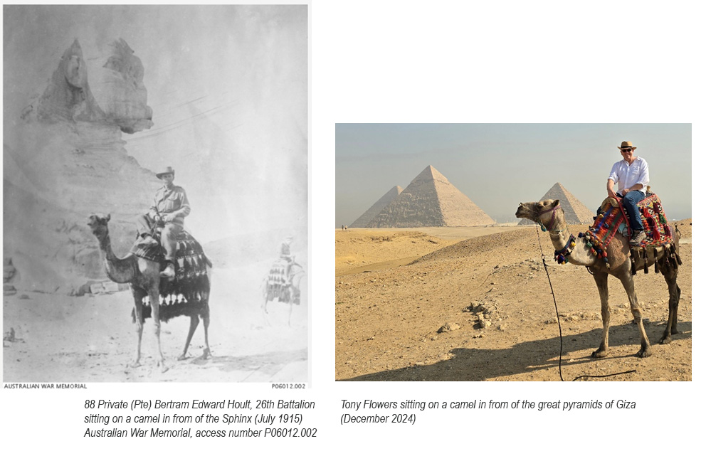
Example: History Then and Now.
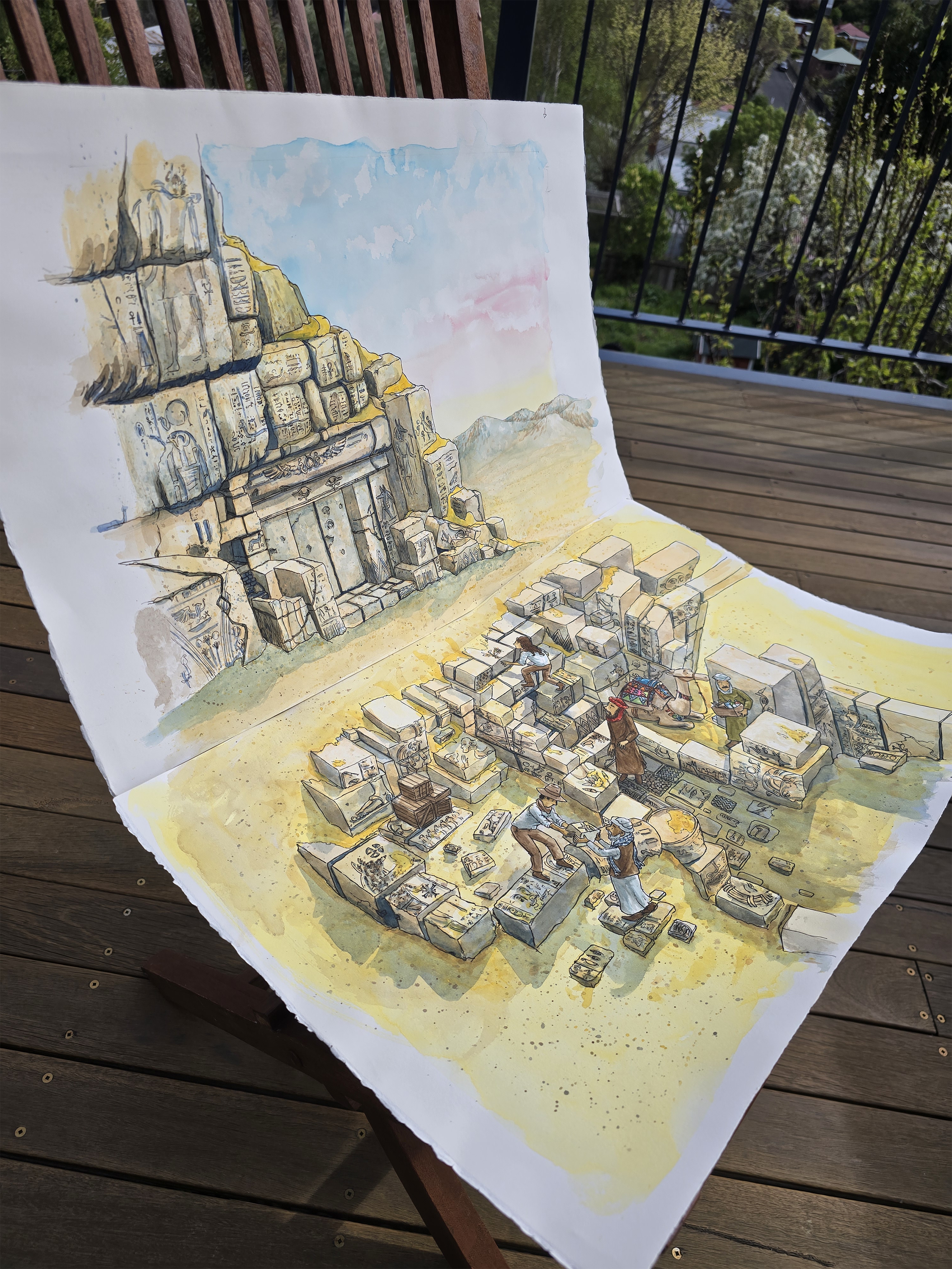
Find a historic photograph of a place (for example, the Pyramids of Giza) and then locate a modern photograph taken from the same or similar viewpoint. Compare the two images to identify what has changed and what has stayed the same. Write or sketch your observations to show how people, buildings, or the environment have transformed over time.
Classroom Insight: Visual literacy supports cross-curricular learning. It helps students interpret data, understand context, and engage with multimodal texts.
Curriculum Links:
(Year 5 Science): Communicate ideas using representations
(Year 6 History): Interpret historical sources
Misconception 3: “I don’t have time to add something new.”
Clarification: Visual literacy doesn’t require additional lessons, it can be integrated into existing ones. For example, analysing an image in a literacy lesson or interpreting a diagram in science enhances the original activity.
Classroom Insight: Think of visual literacy as an enhancement, not an add-on. It deepens engagement and understanding without increasing workload.
Can AI help?:
A suggested Copilot(or another AI tool) Prompt for use with current lesson plans:
“Can you suggest ways to integrate visual literacy into my [subject/topic] lesson for [year level]? I’m teaching [brief description of the lesson or activity], and I’d like ideas for visual texts, analysis strategies, or simple drawing tasks that support comprehension and engagement.”
Example: “Can you suggest ways to integrate visual literacy into my Year 5 science lesson on ecosystems? I’m teaching food chains and energy flow, and I’d like ideas for visual texts, analysis strategies, or simple drawing tasks that support comprehension and engagement.”
Align ideas with curriculum goals and student needs
Curriculum Links:
(Year 6): Analyse and explain how visual elements contribute to meaning
(Year 7): Plan, rehearse and deliver presentations using visual aids
Misconception 4: “My students won’t get it.”
Clarification: Students already engage with visuals daily, on social media, in games, and in books. They often understand visual storytelling intuitively. What they need is the language and confidence to articulate what they see.
Classroom Insight: With the right scaffolding, students can analyse and discuss visuals with enthusiasm and insight. Wordless picture books, comics, and infographics are great starting points.
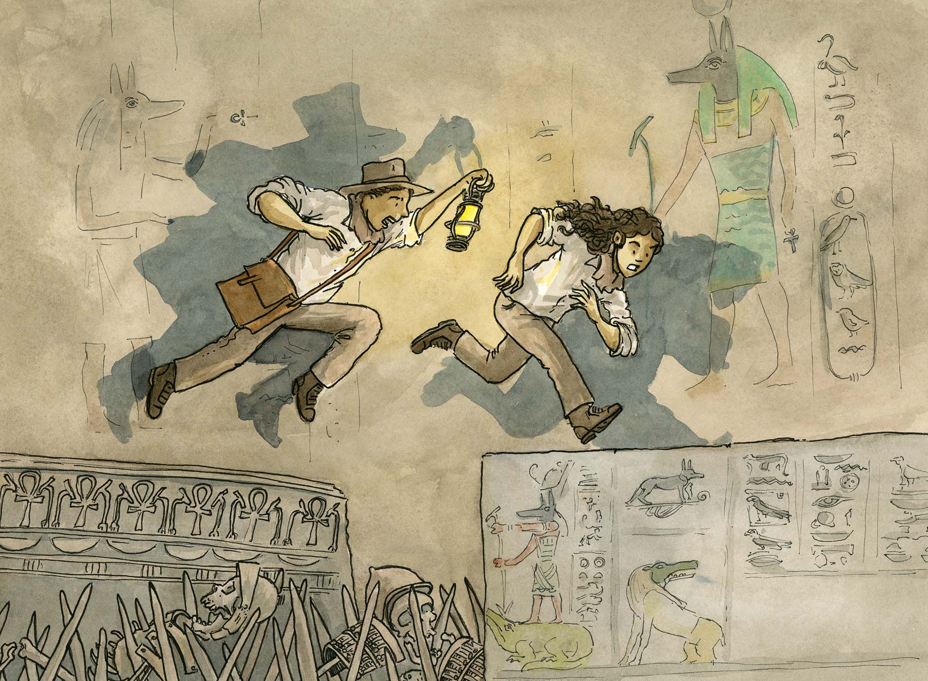
Divi and Frey, the Curse of Anubis (2027) by Tony Flowers, Walker Books Australia
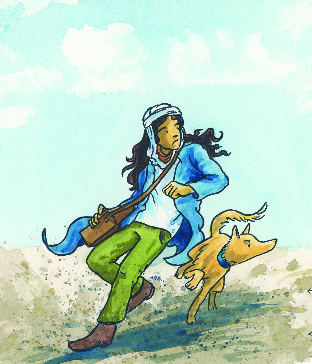
Using the image panel above or find one with similar movement.
Teacher Prompt
“Let’s look at the lines in this image. What do you notice?”
Student Responses
“The character clothes or bag differ look use different lines.”
“The dog is pointing forward and the girl is looking backwards.”
“The character’s hair and clothes have wavy lines.”
Follow-Up Questions
“How do those lines make you feel?” → “It feels like she is rushed and wild, like something bad is behind them.”
“What do you think the illustrator is trying to show?” → “Maybe the character is scared or trying to escape.”
Quick Drawing Task
“Now draw a calm version of this scene using different lines. Try curved or soft lines instead of straight ones.”, Stick figures are perfectly acceptable
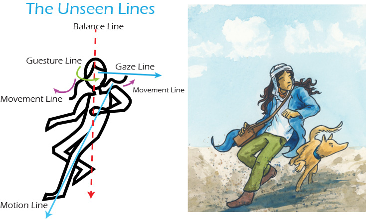
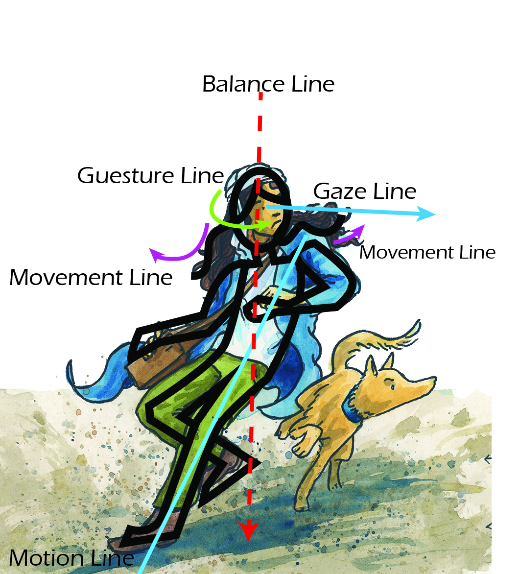
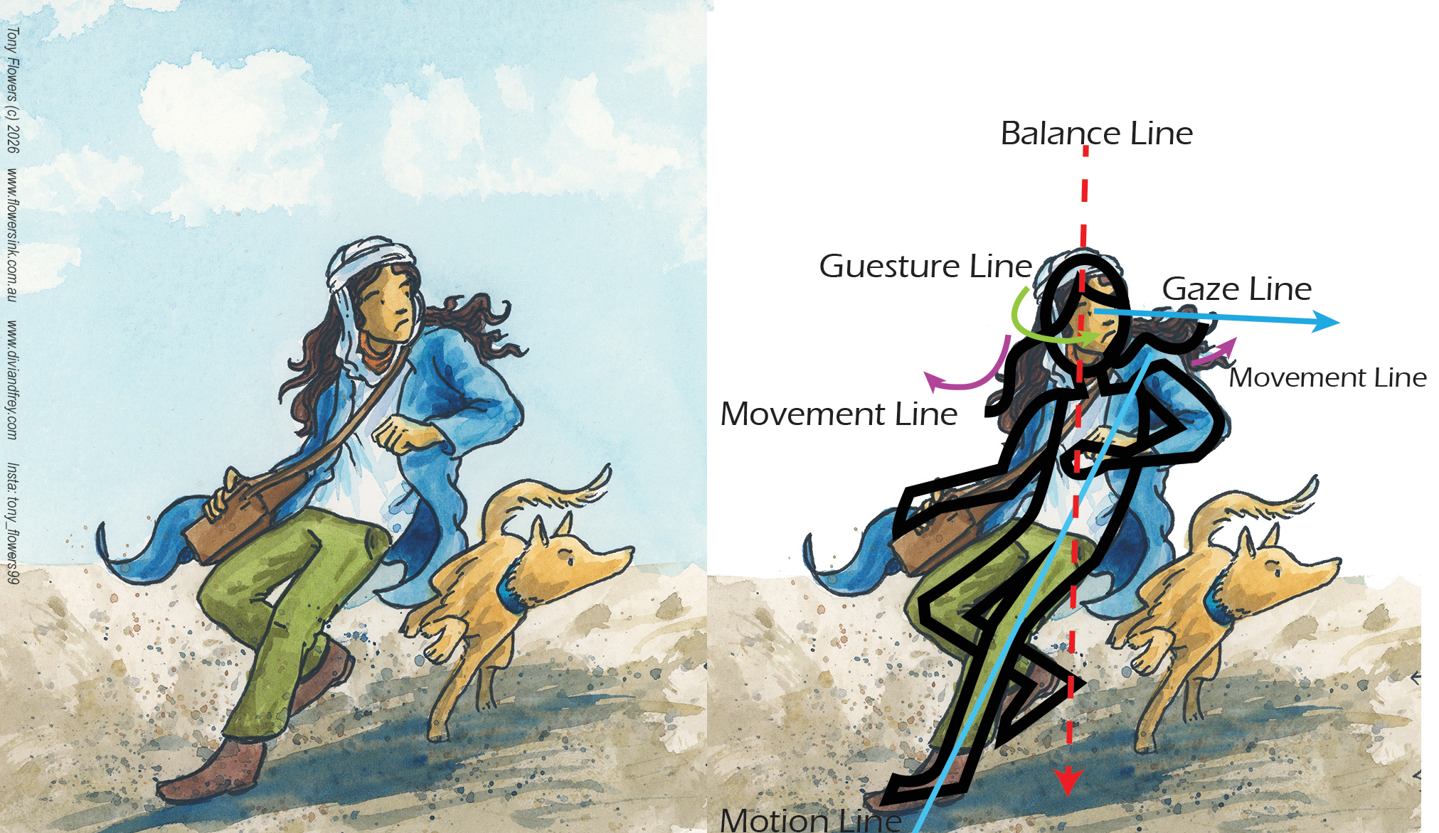
Extension: The Unseen Lines In visual storytelling, unseen lines are the invisible forces that guide the viewer’s eye and shape the narrative flow of an image. These lines, such as motion lines, balance lines, and gaze lines, aren’t physically drawn but are suggested through character positioning, clothing, and surrounding objects to convey movement, focus, and emotional tension.
Try the following prompts with you class;
Prompt 1: Motion Line
“Where do you think the character is moving next? Trace the invisible path their body or clothing suggests, what clues tell you the direction of motion?”
Prompt 2: Balance Line
“If this character were a sculpture, where would their centre of gravity be? Imagine a line running through their body, does the pose feel stable or off-balance, and why?”
Prompt 3: Gaze Line
“Follow the character’s eyes, what are they looking at, and how does that affect the story? Can you find other objects or characters that guide your eye in the same direction?”
******Extension activity read posts on Elements and Principles of Design www.diviandfrey.com ******
Curriculum Links:
(Year 1): Explore the effect of visual elements
(Year 7): Analyse and evaluate how visual elements contribute to meaning
The use of ‘Line’ in illustration will be the focus of Lesson 3.
Practical Exercise: Stick Figure Storytelling
Purpose: To demonstrate that artistic skill is not required to teach visual literacy.
Instructions:
Choose a short scene from a familiar story (e.g. Little Red Riding Hood or a recent classroom read-aloud).
Draw the scene using only stick figures, basic shapes, and speech bubbles.
Label key visual elements such as emotion, action, and setting.
Share with a colleague or small group and discuss:
What visual clues helped tell the story?
What could students learn from analysing this?
Extension Idea: Use student-created stick figure scenes as a springboard for class discussions on visual storytelling, inference, and multimodal comprehension.
Curriculum Links:
(Year 6): Analyse visual elements in texts
(Year 7): Create visual representations to express ideas
Visual literacy is not about artistic ability; it’s about guiding students to interpret and make meaning from visual texts. With the right approach, all teachers can confidently embed visual literacy into their practice.
Key Takeaways
No artistic skill required: Teaching visual literacy focuses on interpretation, not illustration. Teachers act as facilitators, helping students decode and discuss visual elements.
Cross-curricular relevance: Visual literacy applies across all learning areas, including English, Science, HASS, and Mathematics. It supports comprehension and critical thinking in multimodal contexts.
Enhances existing lessons: Visual literacy strategies can be integrated into current units without adding extra workload. They enrich learning by deepening engagement and understanding.
Students are already visual thinkers: Learners engage with visuals daily—through books, games, and digital media. With scaffolding, they can develop the language and confidence to articulate what they see.
Curriculum Links
(Year 3): Understand how visual elements create meaning
(Year 6): Analyse and explain how visual elements contribute to meaning
(Year 7): Plan and deliver presentations using visual aids
Teaching Standards Touched On in This Lesson: | 1.1 | Use teaching strategies responsive to students’ development and backgrounds | 1.2 | Structure teaching programs using research into how students learn | 2.1 | Apply content knowledge and teaching strategies to develop engaging learning activities | 2.5 | Apply effective literacy strategies across learning areas | 3.1 | Set explicit, challenging learning goals for all students | 3.2 | Plan well-structured learning programs | 3.3 | Use teaching strategies that foster critical and creative thinking | 3.4 | Select and use resources effectively and safely | 3.5 | Use effective communication strategies to support student engagement | 3.6 | Evaluate and improve teaching programs | 4.1 | Support student participation | 6.2 | Engage in professional learning to improve practice | 6.3 | Engage with colleagues to improve teaching practice
Learning ActivityPrompt: Reflect on one lesson you’ve taught recently. How could you include a visual literacy element?
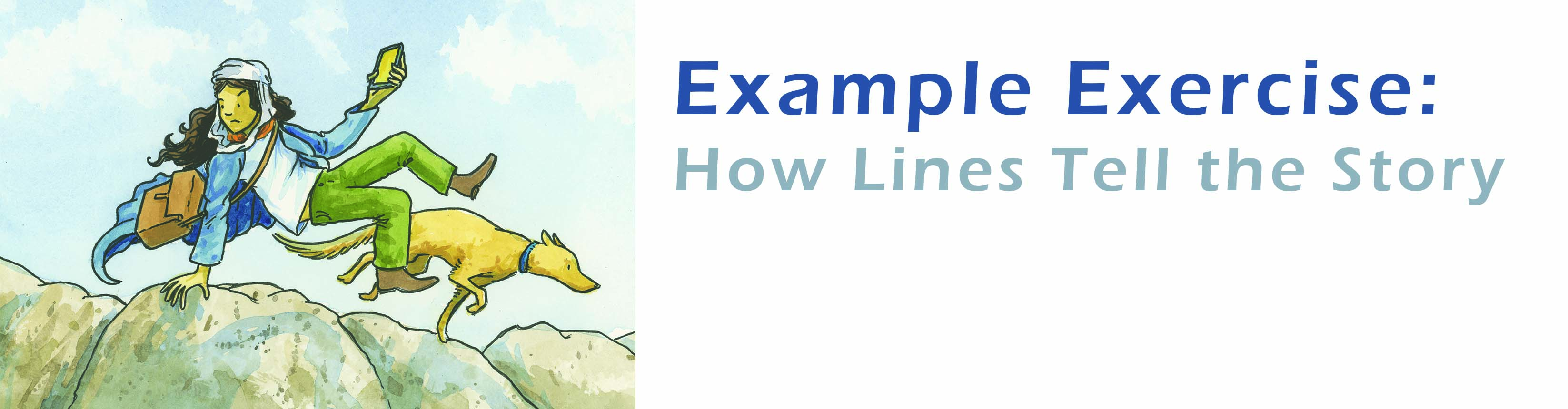
Self-Paced Module Approx. 60 minutes Audience: Classroom teachers (Years 1–7) and aspiring illustrators Focus: How lines in illustrations create emotion, movement, and narrative
Introduction: Why Start with Line?
Every image begins with a line. Whether it’s bold and straight or soft and curvy, lines are the first step in building visual meaning. In design and illustration, line is one of the core elements of design, alongside shape, colour, texture, and space. These elements, combined with principles like balance, contrast, and rhythm, help us tell stories through pictures.
While many visual literacy lessons lean heavily on communication theory (how images send messages), these lessons build on design and illustration theory. This is because understanding how images are built gives students and illustrators a stronger foundation for creating their own visual messages. We’ll still reference key thinkers like Molly Bang, Kress & Van Leeuwen, and Bull & Underwood, but our focus is practical: helping you teach or create with confidence.
If you’re an illustrator, this lesson will also help you build technical language to explain your work to publishers or clients. Extension tasks are included to deepen your craft.
Learning Goals
Learning Intentions
Identify and interpret different types of lines in illustrations
Explore how line contributes to mood, movement, and storytelling
Apply design principles to create a visual narrative
Success Criteria
I can describe how lines are used in an illustration
I can explain how lines affect the mood and movement of a story
I can create a drawing that uses lines to express emotion and narrative
Part 1: the not so humble line
When most people think of a ‘line’, they imagine a simple mark, pen to paper, point A to point B. But in illustration, the concept of line is far more layered and expressive. A line can be bold or delicate, straight or chaotic, visible or entirely invisible. It can define a shape, suggest movement, guide the viewer’s eye, or evoke emotion without ever being drawn.
Lines are not just random marks. Each line in an image is a decision made to tell a story. They shape how a character feels, how a scene flows, and how the narrative unfolds visually. In illustration, line takes many forms: the literal stroke of a pencil, the compositional path that leads the eye, or the implied direction of a character’s gaze or motion. Each type plays a unique role in storytelling and design.
Understanding these different kinds of lines, drawn, compositional, and implied is essential for anyone teaching visual literacy or working to master their craft as an illustrator. They’re the foundation of visual language and the key to building images that communicate with clarity, emotion, and intent.
Part 2: Visual Analysis & Discussion
Step 1: Observe
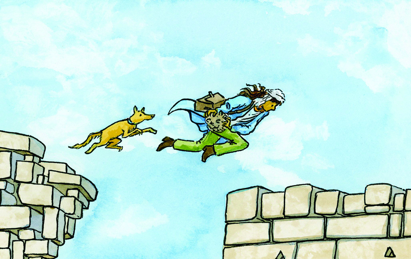
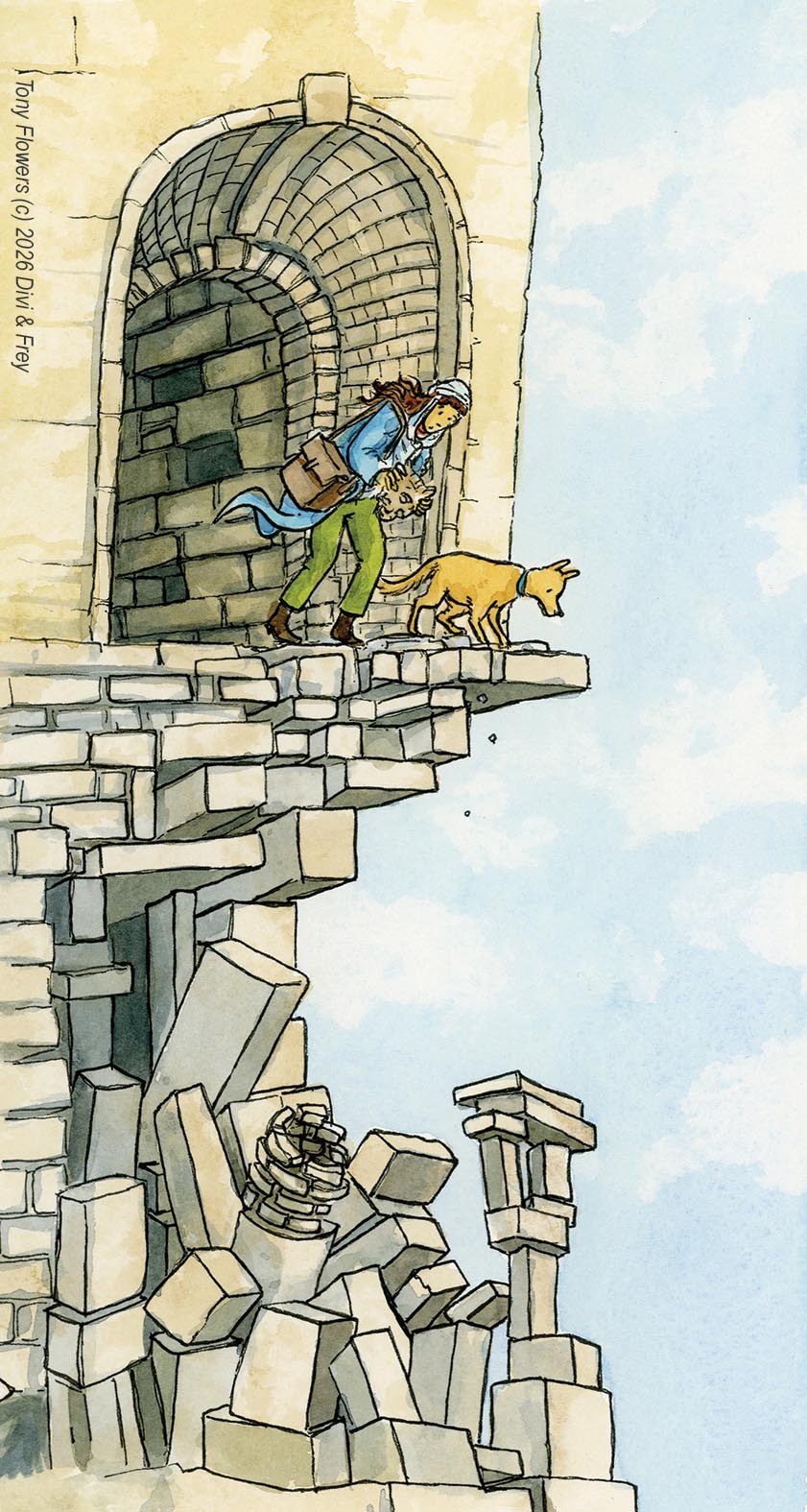
Prompt: “Let’s look at the hidden (or implied) lines in this image. What do you notice?” Use an image with dynamic movement (e.g. character (Divi) running, hair flying, dog (Frey) turning mid-stride). This exercise can be done with any well illustrated picture books illustration. I would suggest repeating this exercise with a panel from Bob Graham’s How to Heal a Broken Wing (or a similar book).
Possible ways to discuss with your students:
“The Gesture Line curves through the person’s body, it makes her look like she’s twisting or turning.”
“The Gaze Line shows she’s looking behind her, even though she’s moving forward.”
“The Motion Line near her legs and the dog’s body shows they’re running fast.”
“The Balance Line goes straight through her body, it looks like she’s leaning but still balanced.”
“The Movement Line in her hair makes it look like the wind is blowing or she’s running.”
Follow-Up Questions to prompt discussion.
“How do these lines help show what the character is feeling?” → i.e, “It feels like she is in a, like someone is chasing them.”
“What do you think is the main thing that the illustrator is trying to show?” → i.e, “Maybe the character is scared or trying to escape.”
Design Principles in Focus
Line: Direction, weight, texture
Movement: Implied through line and composition
Emphasis: Where the eye is drawn
Rhythm: Repetition of line types to create flow
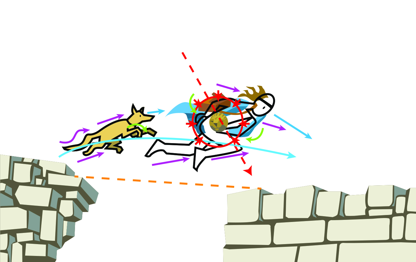
Extension:
Try an apply what we have discussed to the image above.
Now try and name the following implied lines and list what they are adding to the story:
Tip refer to the first image as the arrows are colour coded to the type of line in use.
Part 3: Quick Drawing Task
Prompt: Now draw a character in a scene, play with different unseen lines. An add an intentional gaze for your character and use the balance line to determine where the bulk of the characters body weight will go.
Stick figures are fine
Use soft, looping, or horizontal lines to convey calm, jagged and diagonal lines to add action.
Try and make the character move, run, jump, walk, climb, reach…etc.
Part 3: Exploring Mark Quality Across Materials
Line is one of the most expressive tools in an illustrator’s kit. Its width, profile and texture can communicate emotion, movement, weight and intent. Understanding how different materials behave is key to developing control and fluency in mark-making.
Pens and fine liners: offer consistent, clean lines with minimal variation in width. They are great for precision work, cross-hatching and contour drawing. A perfect tool for the classroom as they so accessible. That said, their uniformity can limit expressive range. To avoid this, look at using different weight pens (i.e. 0.1,0.2,.0.5 or 1mm) in the one drawing or draw on both the tip and the side of the nib.
Dip pens and ink: these are messy but rewarding drawing tools. Sometimes difficult to handle, but if you embraced the potential for chaos you will introduce a dynamic line profile. Pressure and angle affect flow, allowing for dramatic shifts from hairline to bold strokes. The tactile feedback and occasional unpredictability of ink flow creates interesting and lively character and adds spontaneity to the work. Blotting, feathering and pooling can be embraced as part of the aesthetic.
Brush and paint: (especially watercolour or gouache) provide the widest variation in line quality. A single stroke can shift from transparent to opaque, fine to broad, depending on brush type, pigment load and surface texture. These marks often carry a sense of gesture and rhythm, making them ideal for expressive illustration.
Digital tools: simulate all of the above, but with added control. Pressure-sensitive styluses can mimic brush or pen behaviour, and custom brushes allow for endless experimentation. However, digital lines can sometimes feel sterile unless intentionally textured or layered. Studying analogue mark-making helps inform digital technique and keeps the work grounded.
Encourage your students to explore each medium’s limitations and strengths. Ask: How does the material influence the energy of the line? What does the mark say about the illustrator’s intent? By comparing materials side-by-side, students begin to see that line is not just a boundary—it brings its own voice to add to the narrative.
3 Line based classroom activities:
These three activities are designed to help students explore the expressive power of line through age-appropriate, hands-on experiences. Each task encourages students to experiment and reflection on how different materials shape the quality and intent of a mark. These exercises are just examples of how you might teach your students about the use of lines to your class. Feel free to try, adapt and extend of these based on your own students needs, hopefully your students will build a deeper understanding of line as both a technical and emotional tool.
Focus: Comparing mark quality across materials Materials: Fine liners, dip pens, brushes, paint, digital tablet (if available) Activity: Ask your students to create four versions of a simple image(e.g., a tree, bird or face). Each images is created using a different material. Now ask the students to annotate each version with observations: Which tool gave the most control? Which felt expressive? Which was messy or unpredictable? Which image do they like the most and why? Learning Outcome: Encourages analytical thinking and helps students understand how material choice affects visual storytelling.
Grade 8: “Line as Voice” Visual Narrative Panel
Focus: Line variation, intent, and storytelling Materials: Ink, brush, digital tools, mixed media Activity: Ask your students to create a short comic panel (min 3 panels make 12 panels) or visual poem using only black line work, no colour or shading. They must use line width, rhythm, and texture to convey mood, movement, and emotion. Learning Outcome: Deepens understanding of line as a narrative device and challenges students to make intentional, expressive choices.
Visual Timeline: Sequence key scenes from a picture book, noting how line changes across time
Mood Mapping: Match line types to emotions (e.g. jagged = fear, curved = calm)
Compare & Contrast: Use two illustrations with different line styles to explore tone and narrative shift
Illustrator’s Journal: Reflect on how line choices shape your own work—include sketches and notes for future portfolios
Resources & References
Syllabus Bites: Visual Literacy Overview
Bob Graham Visual Literacy Lesson Pack
Molly Bang, Picture This: How Pictures Work
Kress & Van Leeuwen, Reading Images
Bull & Underwood, Picture Books and Beyond
HOW TO BOOK SCHOOL VISITS and TALKS
If you’re a teacher and would like me to visit your school to run workshops on visual storytelling, illustration, or writing process, you’re very welcome to get in touch through my speaking agents. I’d love to work with your students and staff.
After years of visiting more schools and festivals than I can count, I’ve learned what makes an author or illustrator session shine and what can derail it fast. When you’re starting out, it’s easy to think you need to be perfect and endlessly inspiring. In reality, most of us learn by doing and by getting through a few awkward moments along the way.
To help you avoid the mistakes I made early on, here are practical tips to make your school talks smoother, more engaging, and more enjoyable for you and the students. If they save you from even one tech meltdown, one blank-stare moment, or one why did I say that? memory, they’ve done their job.
First step:
Why Are You Doing a Talk or Workshop?
Be clear about why you’re going into a school and what the session is meant to achieve. Was the visit arranged by you, your publisher, or did the school approach you directly? Each path comes with different expectations, and it’s worth checking whether the teacher has anything specific they hope the students will gain from your session. Schools are usually good at communicating their goals (sometimes in very broad terms), but it’s still valuable to spend a moment with the classroom teacher beforehand to get a sense of the context and what they’re hoping to inspire in their students. This helps you frame your presentation in the right direction.
It’s also useful to find out whether the students have been reading any of your books before you arrive. Some teachers prepare beautifully and set everything up so the students already know your work; other times you walk in cold and need to start right from the beginning; who you are, what you do, and what your books are about. Being prepared for both scenarios makes the whole visit run more smoothly.
IMPORTANT TIP: Get Your Background Check Done Early
In Australia, each state runs its own version of a government background check for people working in schools. Here in Tasmania, it’s the Working With Vulnerable People check. It can take a little while for the physical card (which looks similar to a driver’s licence) to arrive, so don’t leave it to the last minute. You’ll need the card, or at least the clearance number, expiry date, and another form of ID, before you can do school talks. Make sure you look up what’s required in your state, territory, or country so you’re fully prepared before your first visit.
THE TEN TIP FOR A SCHOOL VISIT
1. Remember who the most important people in the room are
Its not you or the teachers its the individual students in front of you. Your job is to inspire them and let them see see what they can do, not to prove how impressive you are.
2. Keep your origin story short
Kids don’t want a long backstory about how you began; they want to get to the fun part quickly. Keep it brief so you can spend more time on ideas, creativity, and interaction.
3. Focus on where ideas come from
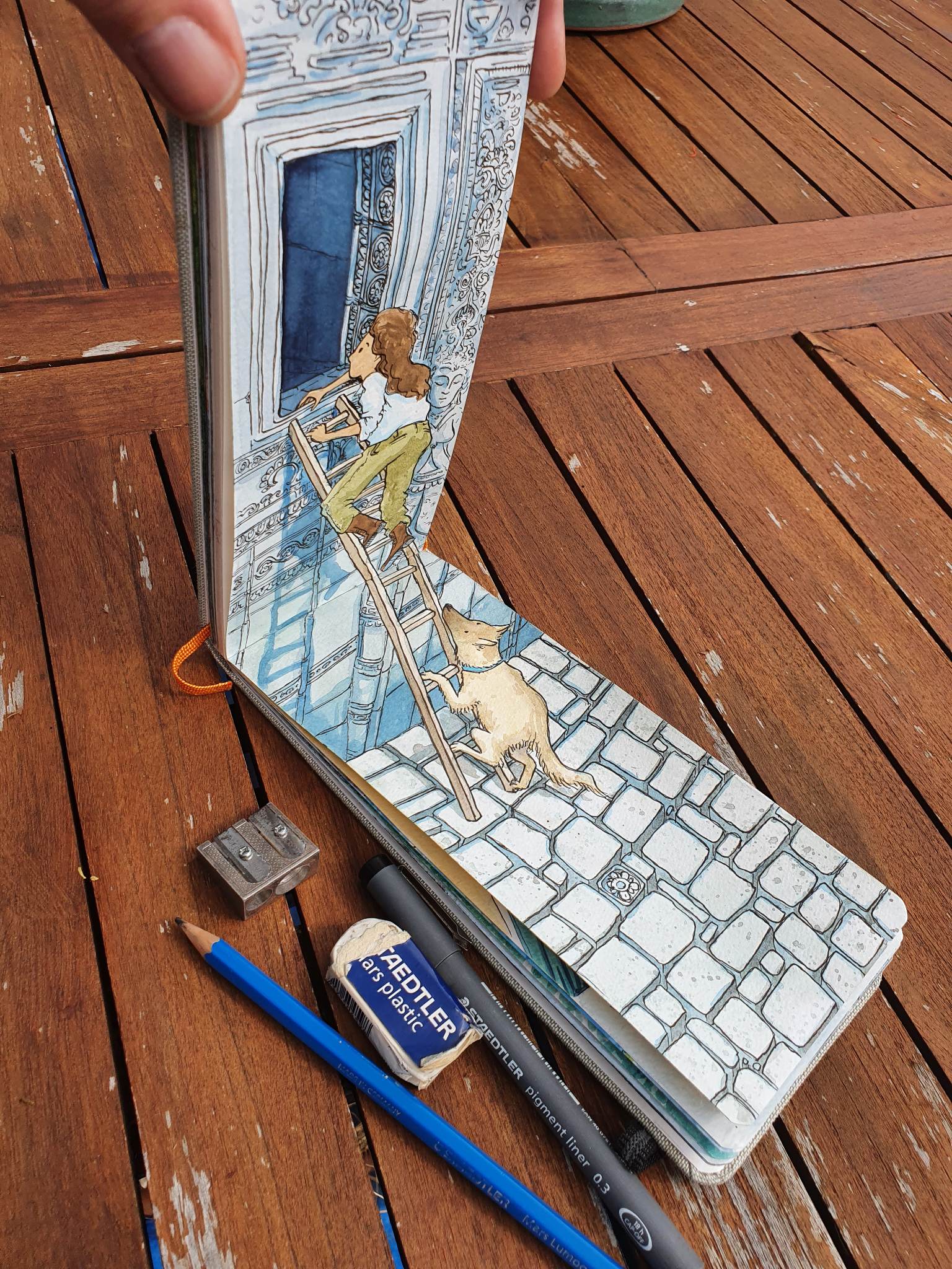
Students are fascinated by where ideas come from the spark, the question, or the unexpected moment that starts it all. I keep my sketchbook handy so I can show ideas arriving in real time and how capturing them helps them grow into a story. For some students, creativity feels like magic; I frame it instead as creative play, where you discover the story as you go.
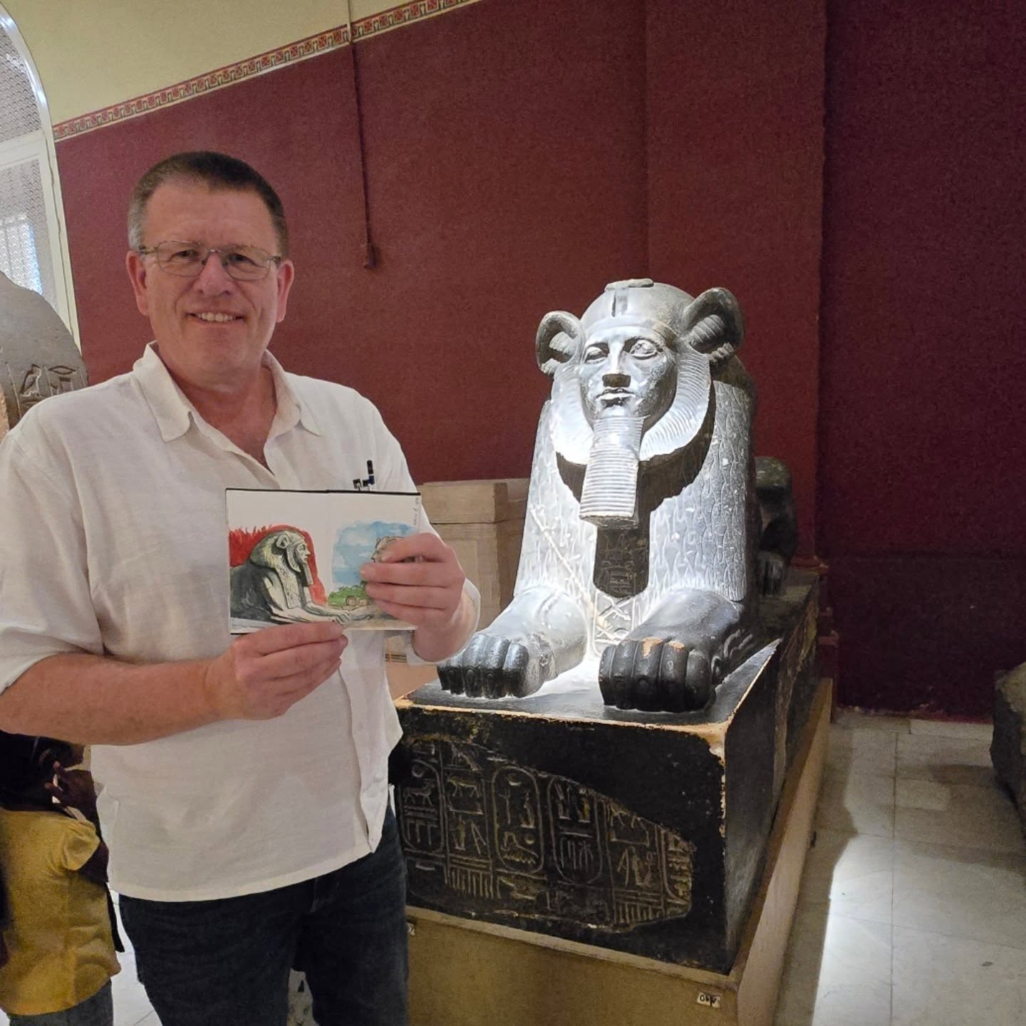
Sketchbook in the Cairo museum 2024
4. Don’t sell your books
A school visit isn’t a sales pitch, and kids spot one instantly. If they enjoy your session, they’ll naturally want to read your work later enthusiasm is the best marketing. You can still show illustrations or read from your book; the key is to share it, not sell it.
Government House, Hobart, Tasmania (2024)
5. Always have a backup plan for when tech fails
If your session depends on a video or slideshow, one frozen screen can throw everything off. Always have a low-tech fallback drawing, storytelling, or a hands-on activity so you can keep momentum. For years I presented without any electronics, relying on a pen and whiteboard (and remembering to pack good markers). I use presentations again now because they’re helpful, but they can also add stress when they stop working.
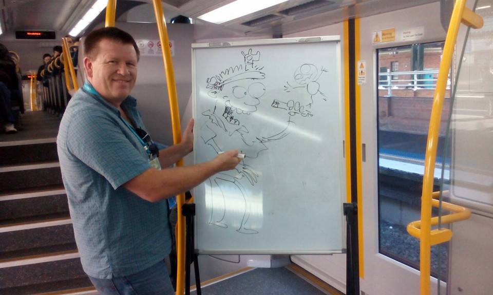
Drawing on a Sydney Train (2017) on my way to presentation (bring your own white board day)
6. Show you can adapt on the fly
When you respond to suggestions and questions in real time and turn them into something new students are captivated. As an illustrator, I weave their ideas into the drawings as I go, showing that this isn’t a rehearsed performance but a creative moment were building together. You can do the same by creating a story on the spot from elements the students suggest.
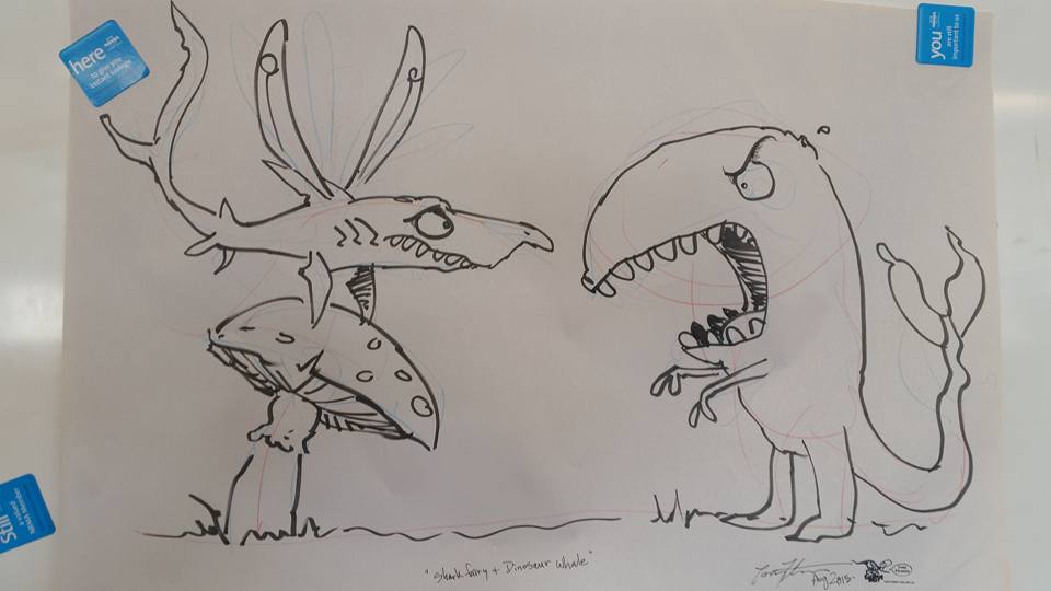
Shark fairy and Dinosaur Whale (2015) school talk image created with suggestion from the class.
7. Show students that mistakes are part of the process
Let students see you make mistakes and that some of your best ideas started as accidents. Share pages from your notebook or sketchbook to show how a wrong line or odd thought made its way into a finished book and ultimately strengthened the work.
Because I include live-drawing demonstrations, I love showing how rough, scribbly sketches gradually become more finished images. I also emphasise that we never start a final illustration without first doing lots of sketches often terrible ones before we get anywhere near the final artwork.
Graphic novel pages in progress (2026) Divi and Frey.
8. Make creativity feel accessible
Break your process into steps so students can see that creativity is something they can practise, like any other skill. I often ask who plays an instrument, how many hours they practise, and whether they improve without practising a great comparison for writing and drawing. I also bring sketches and rejected drawings that eventually led to a finished illustration in a book. Students love seeing the final artwork first, then the journey from rough sketch to polished result.
9. Keep the energy moving
Mix talking with drawing, questions, demonstrations, and quick activities to keep attention fresh. A lively rhythm helps students stay engaged and gives them multiple ways to connect with your message.
Byron Bay Writer’s Festival school events tour, NSW, Australia (2017)
10. Leave them with something they can try today
Leave students with a simple drawing trick, writing prompt, or observation challenge they can try immediately. A practical takeaway makes your visit memorable long after youve left.
What to Leave Behind After a School Visit
1. Bookmarks
Simple, affordable, and always appreciated, bookmarks are great for libraries to hand out and keep your characters visible long after your visit. If your publisher isnt producing them, consider suppliers such as VistaPrint for cost-effective options.
2. A Mini Promo Poster (A3 size)
A bright, eye-catching A3 poster for the library or classroom wall helps keep the excitement alive and reminds teachers to follow up with your book. Leave some clear space so you can sign it neatly with a marker you bring with you.
3. A Copy of Your Book
This isn’t standard, but I try to bring a few spare copies especially backlist titles to leave behind when it feels appropriate. Remember that a paid visit is often funded from a schools limited literacy budget. If a school has booked you, leaving a signed copy for the library is a generous, professional touch. It becomes part of their collection and is often borrowed straight after your talk. Personally, I usually do this for state schools (with apologies to my teacher-librarian friends in the private sector).
4. An Original Drawing
For illustrators, this can be one of the most powerful items to leave behind. A drawing pinned in the library becomes a long-term reminder of your visit. Make sure your name is easy to read I use a stamp with my name and website because my signature is hard to decipher, and kids forget names quickly even when they loved the session.
5. Teacher Notes or Online Resources
If your publisher has created teacher notes for classroom use, mention them at the end of your session. Because I now teach at university and I’m on a mission to create the best teacher notes possible for my books I develop visual-literacy teaching materials and send them to my publisher to support those resources. I also keep www.diviandfrey.com updated as a hub for teachers and anyone interested in illustration and storytelling. Teachers are incredibly busy, so anything that makes lesson planning easier is always appreciated.
Last hit, I always like to do a tour tee shirt for a new release. Both fun and tax deducable.
HOW TO BOOK SCHOOL VISITS and TALKS
If you’re a teacher and would like me to visit your school to run workshops on visual storytelling, illustration, or writing process, you’re very welcome to get in touch through my speaking agents. I’d love to work with your students and staff.
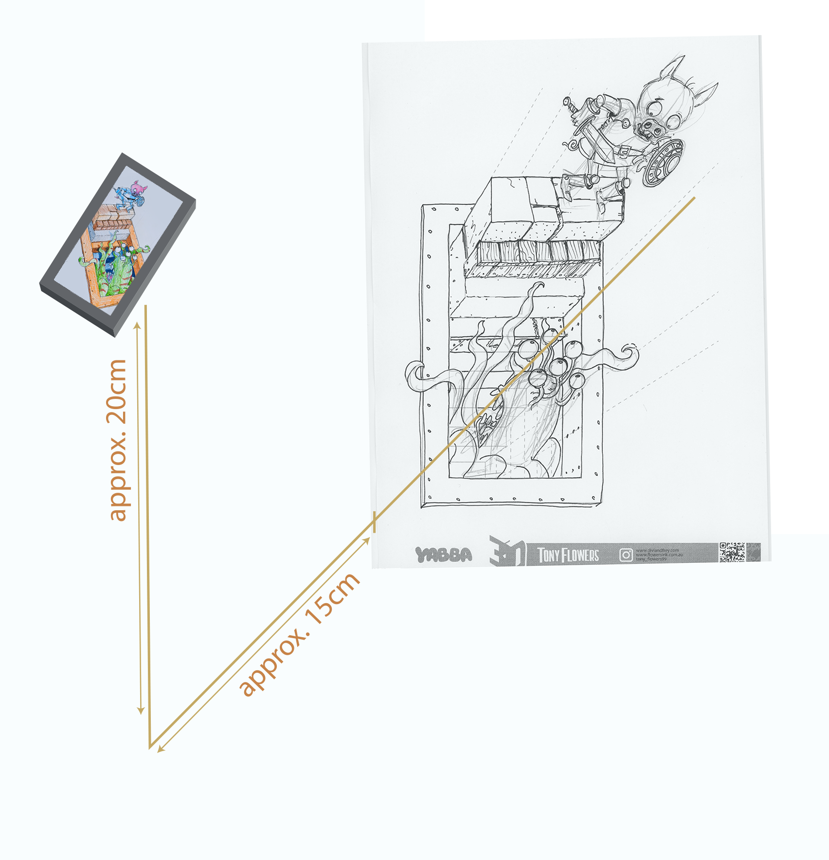
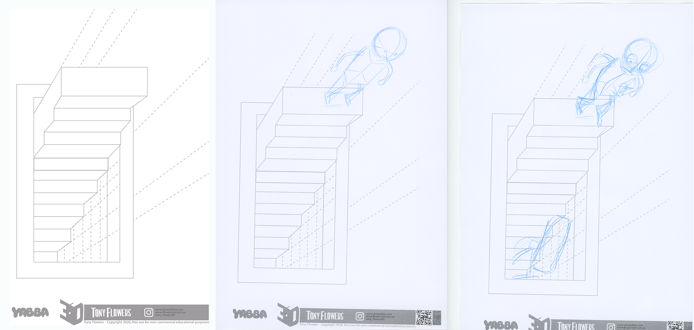
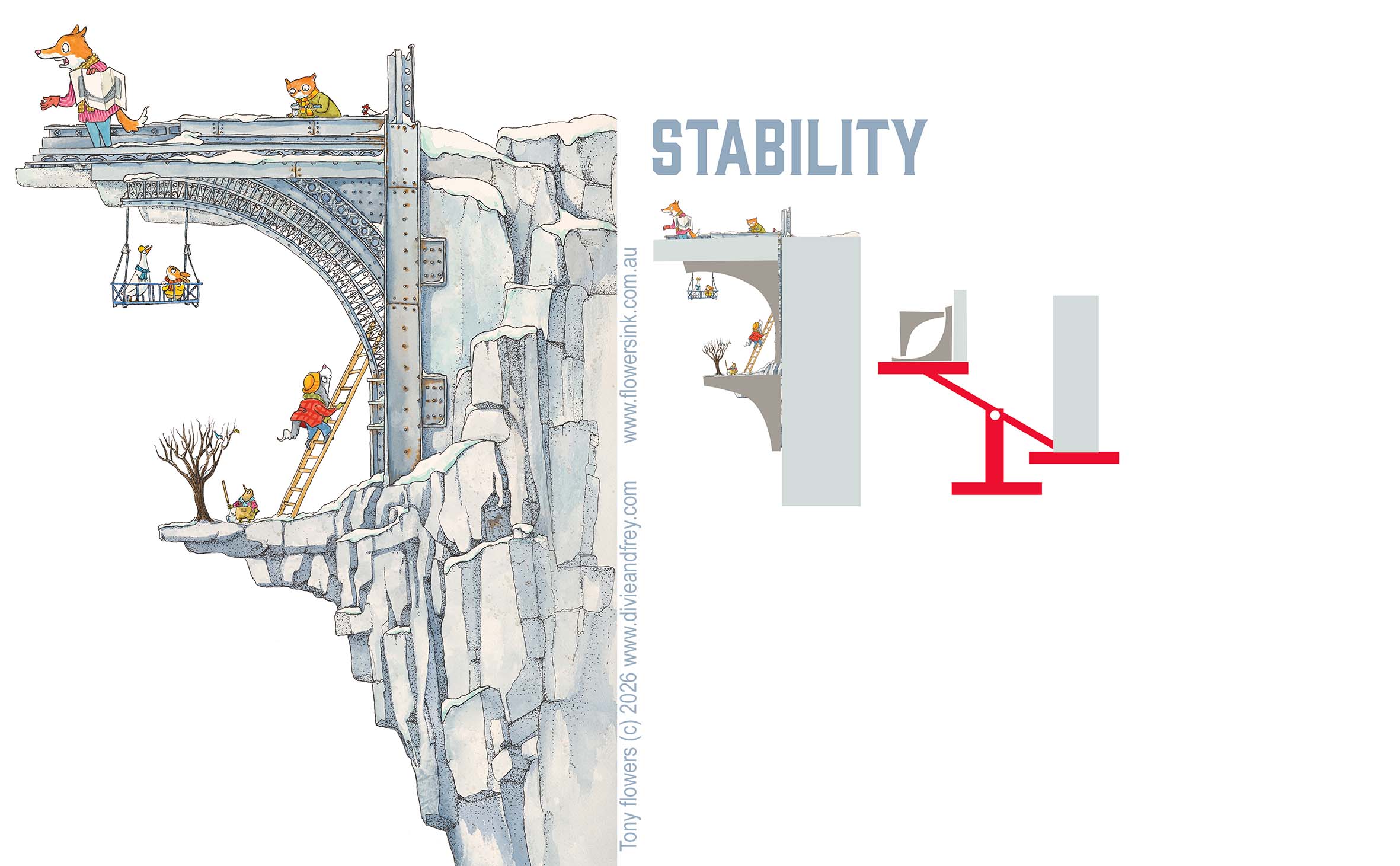
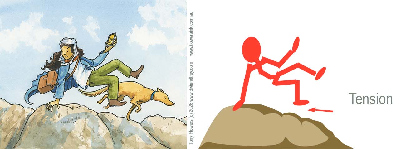
Single‑point perspective illusions use one vanishing point to trick the eye into seeing depth on a flat surface. When all the lines in a drawing angle toward the same point, your brain automatically interprets the image as 3D, even though it’s completely flat. This is the foundation (used below) behind that ladder that seem to rise out of one page on to the next the page; And the doorway that appear to sink inward, and characters that look like they’re floating in front of the paper.
This is one of my sketchbook example that uses two pages form one image.
How to see the illusion
A camera lens makes this illusion even easier to see. Because the lens acts as a fixed focal point, it removes the tiny differences between your two eyes. When you get the camera in the right position when you are looking at the drawing through a phone or tablet camera, the illusion often “locks in” instantly. Everything lines up from a single viewpoint, so the depth becomes stronger and more convincing.
You can achieve the same effect without a camera by closing or covering one eye. With only one eye open, your depth perception flattens, and the perspective lines become more dominant. This helps your brain read the drawing as a single, unified space, perfect for making the illusion pop.
Above is the approx. position for a camera or viewing point for the exercise material below.
*** it should be noted that some people can not see the illusion in these exercises ***
How I Use This Technique in Divi and Frey
In my upcoming graphic novel Divi and Frey, I use single‑point perspective illusions to create scenes that feel dynamic, dramatic, and immersive. Whether it’s a staircase rising toward danger, a cavern dropping away beneath the characters, or an object bursting toward the reader, these illusions help guide the eye and build tension. They allows the reader experiences the story world in a unique way.
The exercises that follow are simplified versions of the same techniques I use when planning pages for the book. They give students a chance to experiment with depth, contrast, texture, and perspective in a hands‑on, playful way.
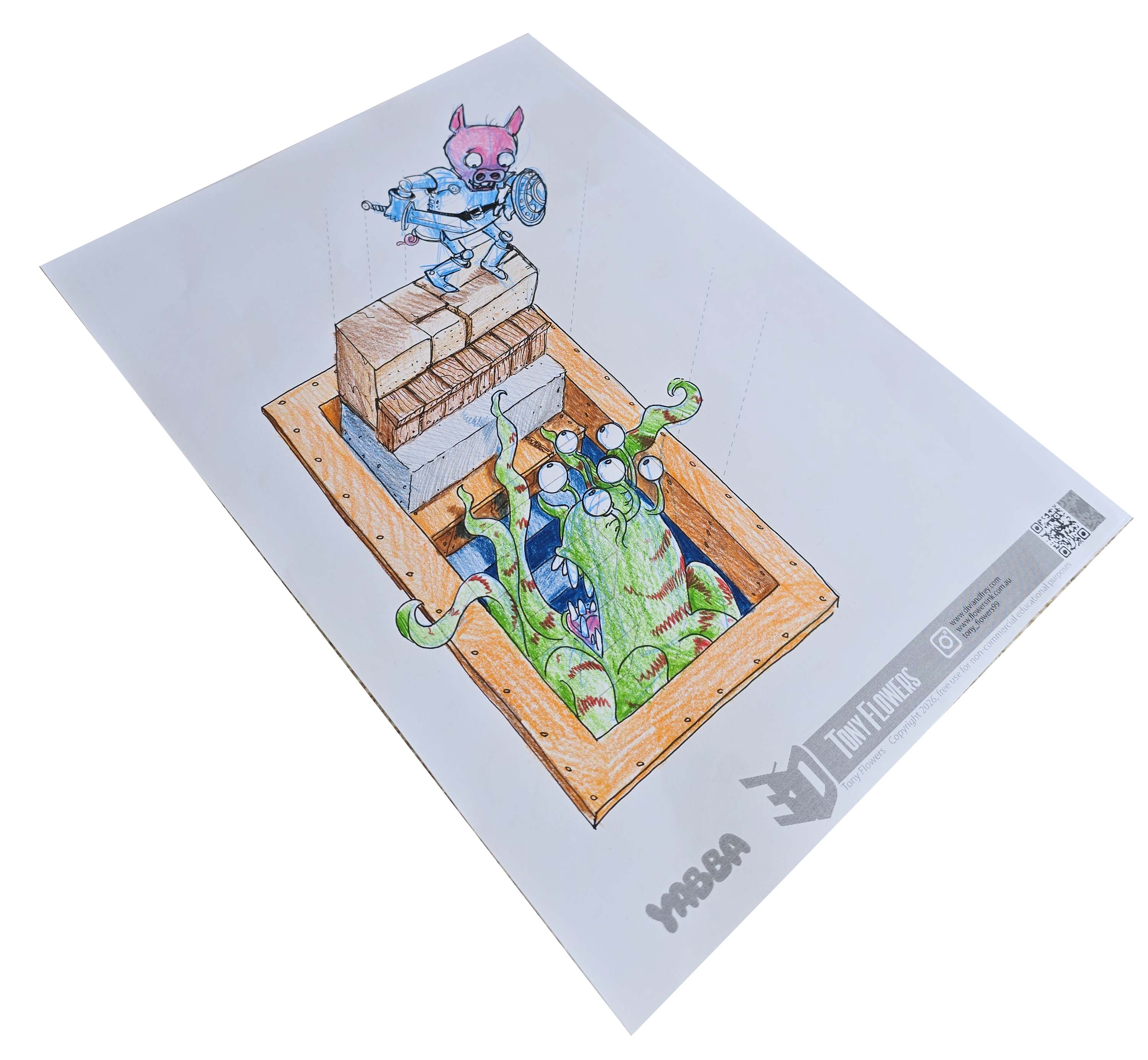
This is a single page activity that was originally developed for a YABBA talk in April 2026 and has been adapted here as a classroom‑ready set of drawing challenges you can use with your students.
This is the starting example used in the Yabber demonstration to show how shadow helps build the illusion.
Learning Outcomes
Students will use single‑point perspective to create a 3D staircase illusion that appears to rise out of a hole in the page, applying visual‑literacy skills, design principles, and creative problem‑solving.
Success Criteria
Students can:
Enhance the illusion using contrast, texture, colour, and light/shade.
Experiment with characters, objects, and materials to personalise the illusion.
Explain how design choices affect depth, realism, and viewer perception.
Before you start shading, take a moment to imagine where the light is coming from and what kind of light it is, direct sunlight, a single light bulb, or an overcast sky. Each type of light creates different shadow strengths. Stronger, more focused light sources produce darker, sharper shadows, and all shadows will fall away from the light in the same direction. Thinking this through first will make your illusion much more convincing.
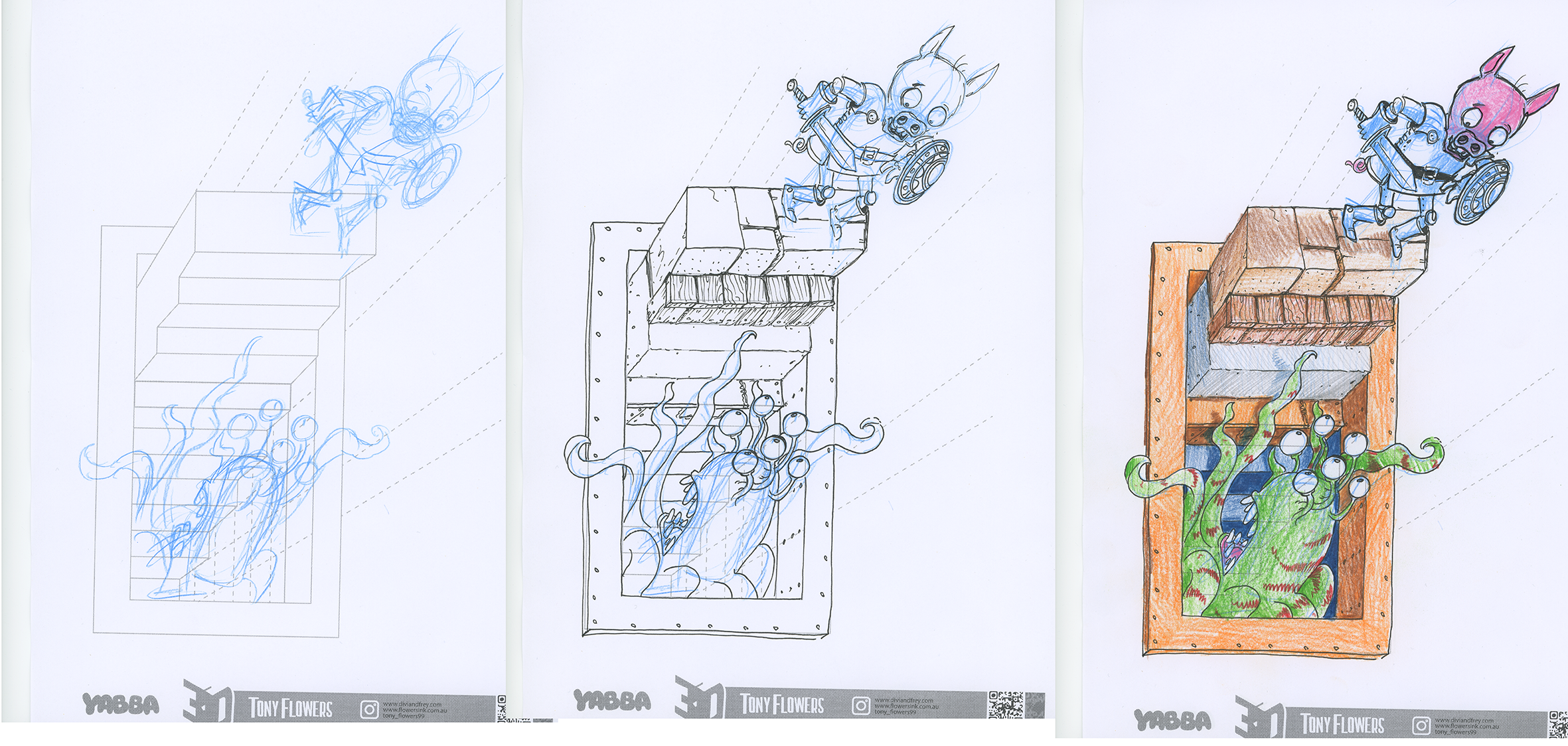
Activity 3 : Characters & Objects Emerging From the Page
Students add characters or objects interacting with the stairs:
A character climbing or sitting on a step
A creature peeking out of the hole
A backpack, lantern, or treasure chest placed on a step
A rope, vine, or ladder extending out of the page
Skill focus: Students use guide lines to determine the correct angle for objects so they appear to sit naturally in the 3D space.
Challenge option: Extend additional objects beyond the staircase, e.g., a hand reaching out, a signpost leaning toward the viewer.
Ways to Enhance the Illusion
Students can strengthen the 3D effect by applying:
Contrast: Darken the interior of the hole; lighten the top surfaces of steps.
Colour: Warm colours for surfaces closest to the viewer; cool colours for deeper areas.
Texture: Use material‑specific marks to add realism.
Light & Shade: Decide on a light source and shade consistently.
Edges: Sharper edges appear closer; softer edges appear further away.
Linking to Previous Posts
This activity naturally extends your earlier posts on:
Elements of Design: line, shape, colour, texture, value
Principles of Design: contrast, emphasis, movement, space, unity & variety
Alignment with the Australian Curriculum
English – Multimodal Literacy (Years 5–8)
Analyse how visual features contribute to meaning in multimodal texts.
Create texts that integrate visual, spatial and linguistic features for effect.
Visual Arts (1–10)
Explore and apply visual conventions (line, shape, space, texture, value) to communicate meaning.
Experiment with materials, techniques and processes to develop skills in 2D and 3D artmaking.
Create artworks that communicate ideas using visual conventions and design principles.
Reflect on how visual conventions and compositional choices influence audience interpretation.
Design & Technologies (Years 5–8)
Investigate how design elements and principles influence the functionality and aesthetics of designed solutions.
Generate and communicate design ideas using technical drawings and visual representations.
SCHOOL VISITS and TALKS
If you’re a teacher and would like me to visit your school to run workshops on visual storytelling, illustration, or writing process, you’re very welcome to get in touch through my speaking agents. I’d love to work with your students and staff.
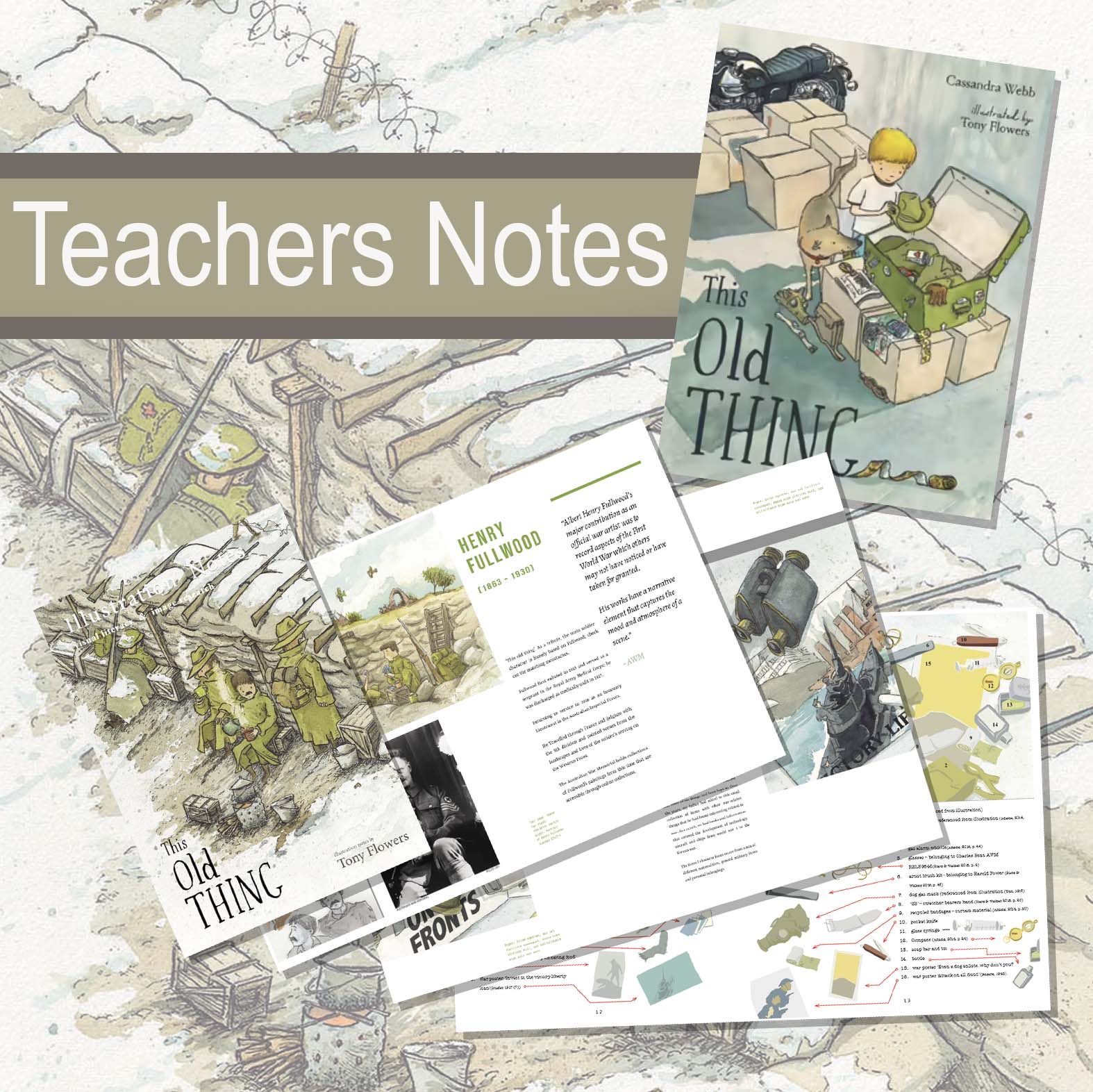
These teacher notes have been created to support classroom exploration of the research, creative process, and visual storytelling behind This Old Thing. Inside, you’ll find a set of practical activities that invite students to investigate objects, history, memory, and the ways we can bring personal stories to life. The resource is designed to give you flexible entry points, whether you’re focusing on ANZAC day (or Remembrance day) activities, inquiry based learning, visual literacy, or creative writing and to offer a behind‑the‑scenes look at how the book was visually developed from early research through to final artwork.
If you’ve already read my first post, Understanding the Elements of Design, you’ll know that those building blocks, line, shape, colour, texture, and so on, give us the raw materials we use to create images. This second instalment looks at what comes next: the principles of design, the ideas that show us how those elements work together to create meaning in our illustrations.
When I first started out as an illustrator, no one ever sat me down and explained the elements and principles of design. I wish they had. These concepts aren’t just academic theory, they’re practical tools that help you see images more clearly, create with intention, and talk about visual work in a way that feels informed and confident.
For new illustrators, the principles become the scaffolding that supports every drawing, layout, and character you create. For teachers, they offer a shared language that makes classroom discussions richer, more accessible, and far less mysterious. Once students understand how ideas like balance, rhythm, contrast, and emphasis shape a composition, they can analyse images with clarity and build their own with purpose.
These principles transformed the way I approached my own books, like Divi & Frey and You, Me, Community and they continue to shape how I teach. My hope is that they’ll do the same for you and your students.
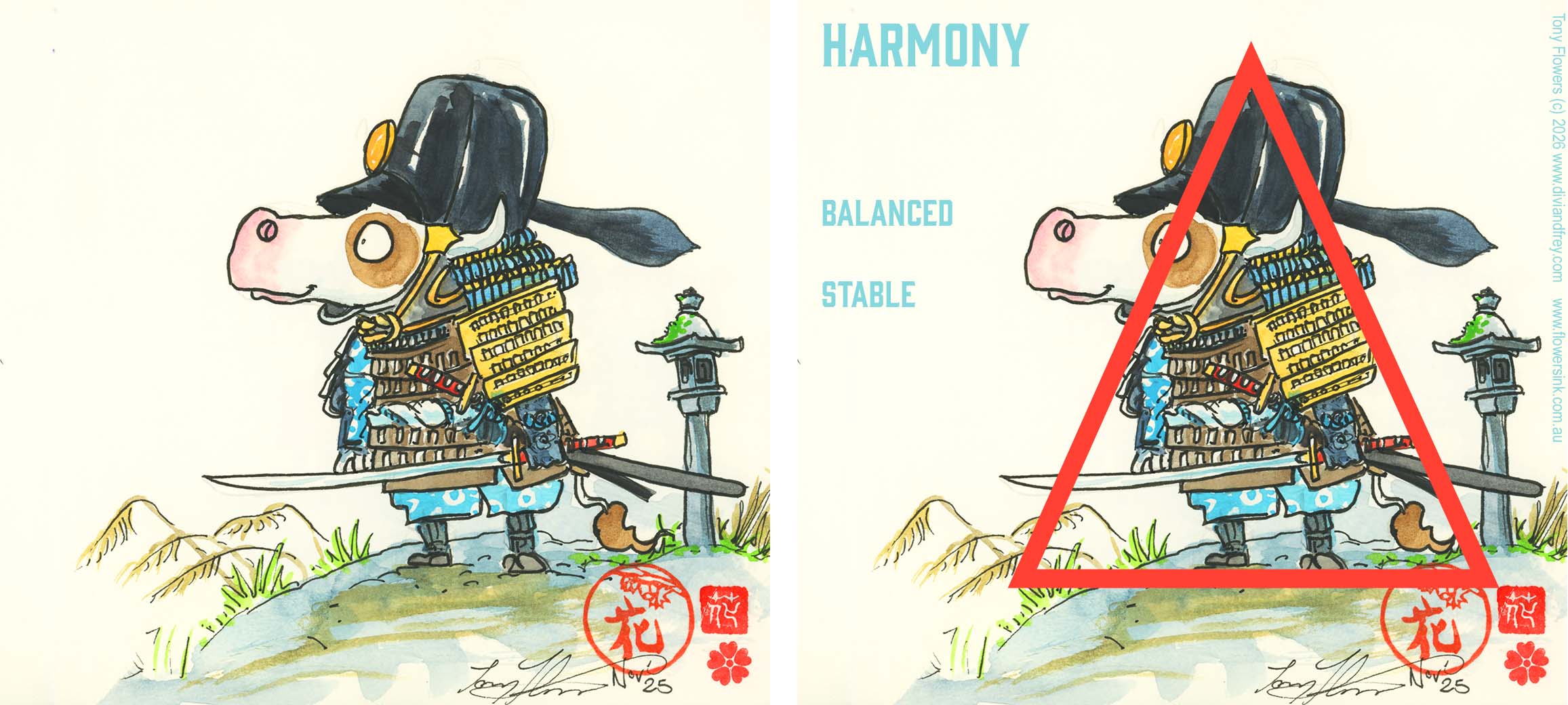
Balance How visual weight is distributed across a composition.
Creates a sense of stability, harmony, or intentional tension.
Contrast The difference between elements (light/dark, big/small, smooth/rough).
Helps important parts stand out and adds visual interest.
Emphasis Directs the viewer’s attention to the most important part of the image. Achieved through contrast, placement, or scale.
Movement Guides the viewer’s eye through the artwork. Uses lines, shapes, and rhythm to create a sense of flow or action.
Rhythm A visual beat created by repeating elements. Can feel calm, chaotic, playful, or structured depending on the pattern.
Pattern A repeated decorative design. Adds texture, structure, or visual energy to an illustration.
Unity How well all parts of a design feel like they belong together. Achieved through consistent style, colour, or repeated elements.
Variety Using differences in shape, colour, texture, or scale to keep a design interesting. Prevents the artwork from feeling flat or repetitive.
Proportion The size relationship between elements. Can create realism, exaggeration, or humour depending on how it’s used.
Scale How large or small something appears in relation to the viewer or other elements. Helps create mood, drama, or focus.
I hope this post has given you a useful introduction to the principles of design and shown how the elements of design can work together to create images that tell meaningful, engaging stories. Thanks for reading along as we explored these ideas.
If you’re a teacher and would like me to visit your school to run workshops on visual storytelling, illustration, or writing process, you’re very welcome to get in touch through my speaking agents. I’d love to work with your students and staff.
When I first started out as an illustrator, no one ever sat me down and explained the elements and principles of design. I wish they had. These concepts aren’t just academic theory, they’re the practical tools that help you see images more clearly, create with more intention, and talk about visual work in a way that’s informed, confident, and meaningful.
For new illustrators, these fundamentals become the scaffolding that supports every drawing, layout, and character you create. For teachers, they offer a shared language that makes classroom discussions richer, more accessible, and far less mysterious. Once students understand how point, line, shape, colour, balance, rhythm and contrast actually work, they can analyse images with clarity and build their own with purpose.
These ideas transformed the way I approached my own books and they continue to shape how I teach. My hope is that they’ll do the same for you and your students. For this post we will look at the Elements of Design and in a future post we will look how the Principles of design bring the elements of design together to make stories.
THE ELEMENTS OF DESIGN
These raw building blocks that we use to build images.
1. Point
The simplest visual mark. A single dot in empty space instantly creates a focal point. Multiple points placed together begin to suggest line, direction, and movement.
In illustration a point might form a detail in an image or a simple eye.
2. Line
A mark between two points. Lines can be thick, thin, smooth, rough, expressive, mechanical, digital, or hand‑drawn. Lines help us:
describe form
create texture
guide the viewer’s eye
build emotion and energy
In the image above you can see some of the lines (on the left) that are used to add movement to this character sketch. As we progress with refining the linework. the medium used and the thickness and profile of these line all add meaning to how the reader views the story within the image.
3. Plane & Shape
A plane is a flat, two‑dimensional surface. When planes combine, they create the illusion of form. A shape is a defined area within boundaries. Shapes can be:
Geometric (circles, squares, triangles)
Organic (natural, flowing forms)
Representational (shapes that resemble real objects)
4. Texture
The visual suggestion of a surface—soft, rough, smooth, spiky, warm, cold. Texture can be:
Representational (fur, brick, fabric)
Abstract (patterns, marks, digital brushes) Texture enriches illustrations and helps communicate mood and material.
One of the reasons I love working in water colour so much, it the ability to build up textures in my images. All of these tiles are from illustration that appear in 4 different books (2 are from the image above). Texture allows you to build in how an environment or object feels.
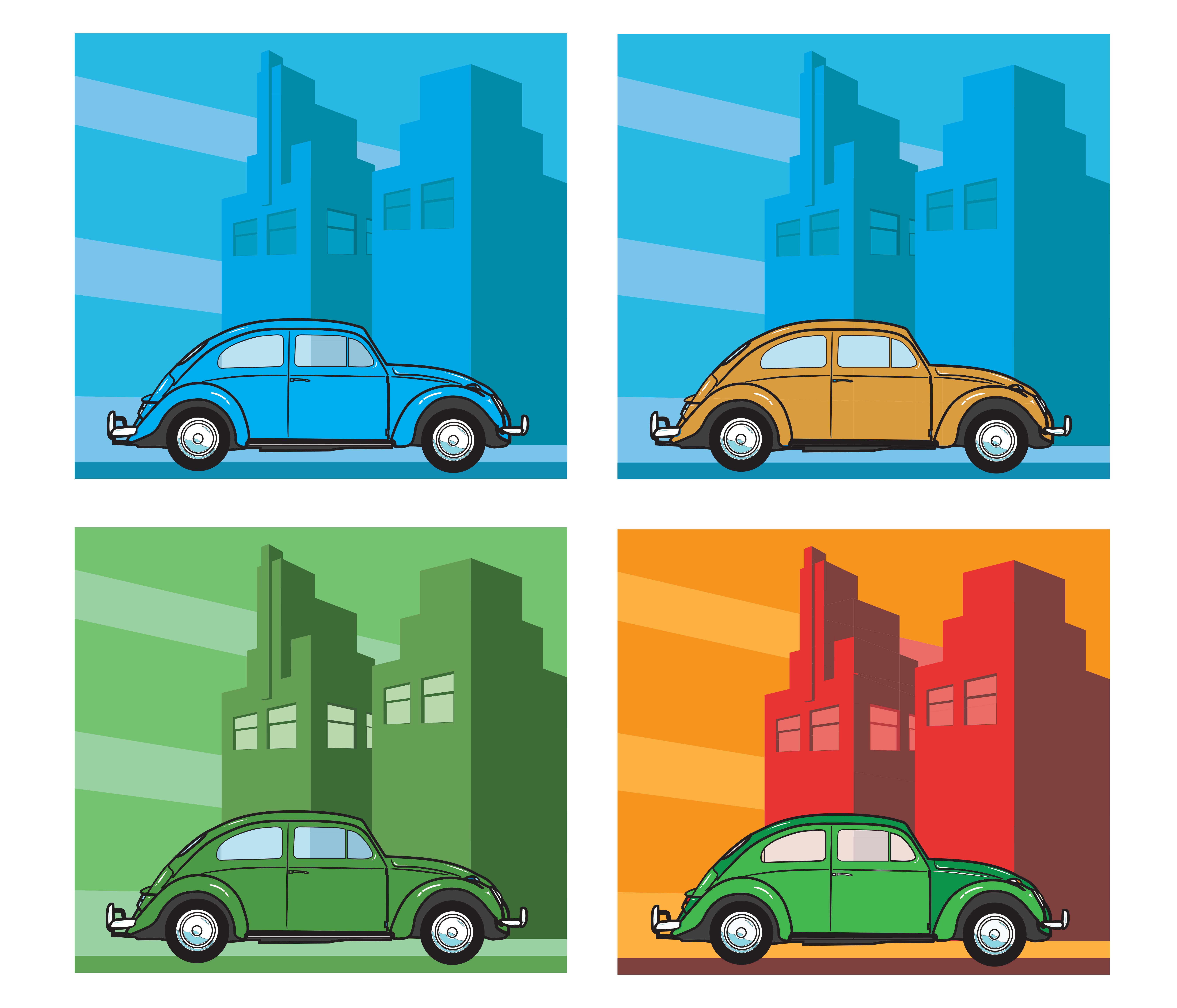
5. Colour
Colour is both science and storytelling. It communicates emotion, symbolism, and atmosphere. Key ideas include:
Cultural meaning and accessibility (e.g., colour blindness)
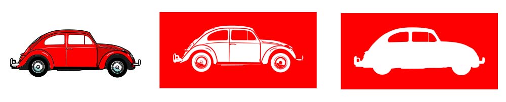
6. Space
The area around and between elements.
Positive space holds content
Negative space (white space) gives breathing room Good use of space improves clarity, readability, and visual impact.
With good use of negative space, what is left out of a picture is just as import as what is included.
In the image above from Grandma’s First Tattoo, you can see of both negative space and positive space are combined to tell a story.
7. Form
The illusion of three‑dimensionality. Form is created through:
planes
shading
light and shadow
value
perspective Understanding form helps illustrators create believable characters, objects, and environments.
8. Value (Tone)
The lightness or darkness of a colour. Value is essential for:
modelling form
creating mood
establishing contrast
guiding the viewer’s eye Techniques like chiaroscuro use dramatic value shifts to create depth and focus.
I hope this post has given you a useful introduction to the elements of design, something that can help you begin your own illustration journey or simply understand images and how to read them with more confidence. Thanks for reading along as we explored these ideas.
If you’re a teacher and would like me to visit your school to run workshops on visual storytelling, illustration, or writing process, you’re very welcome to get in touch through my speaking agents. I’d love to work with your students and staff.
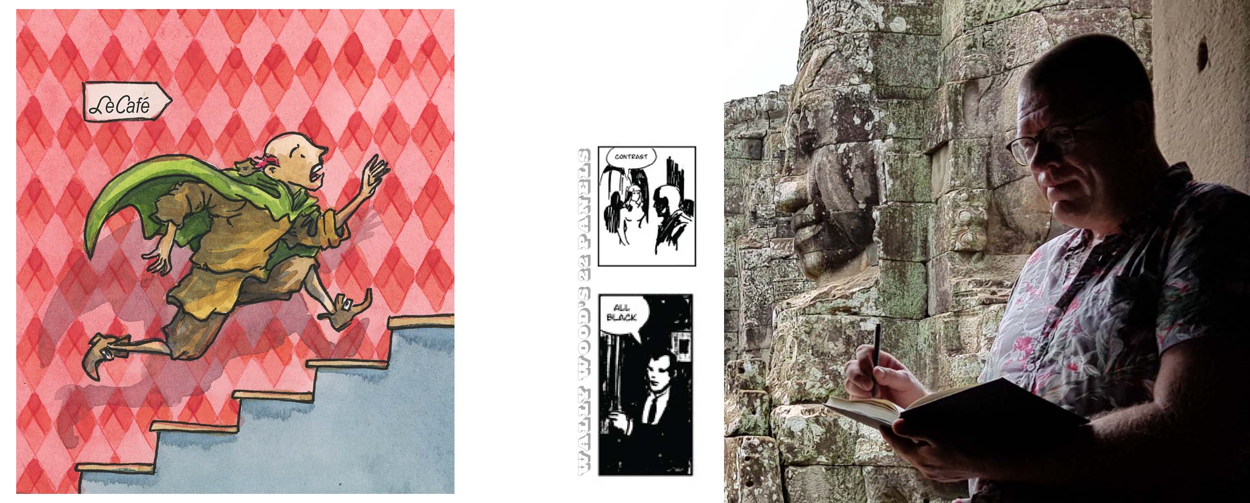
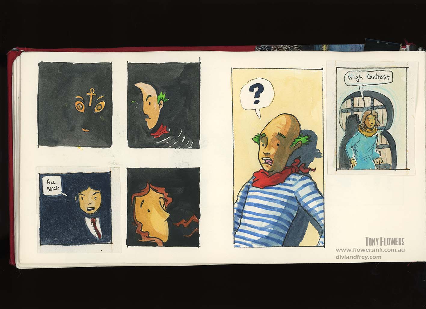
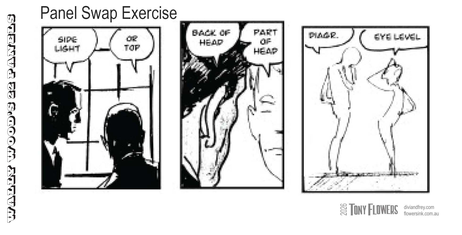
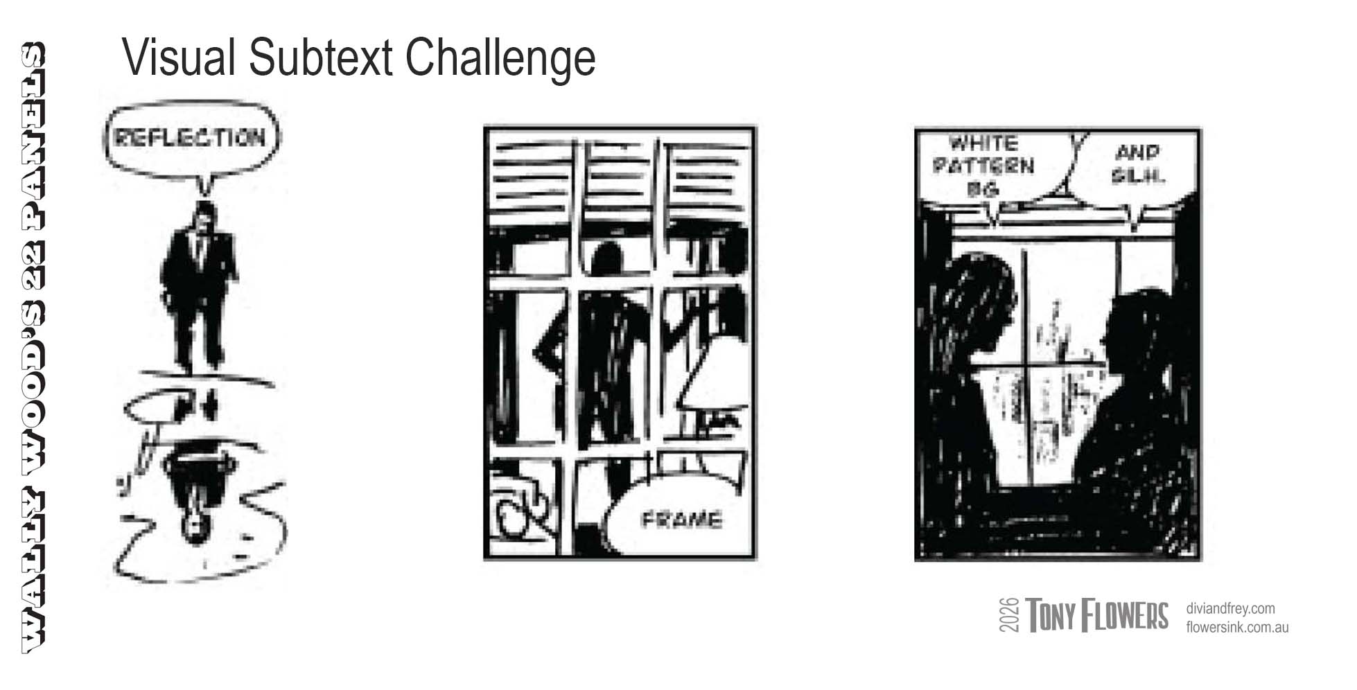
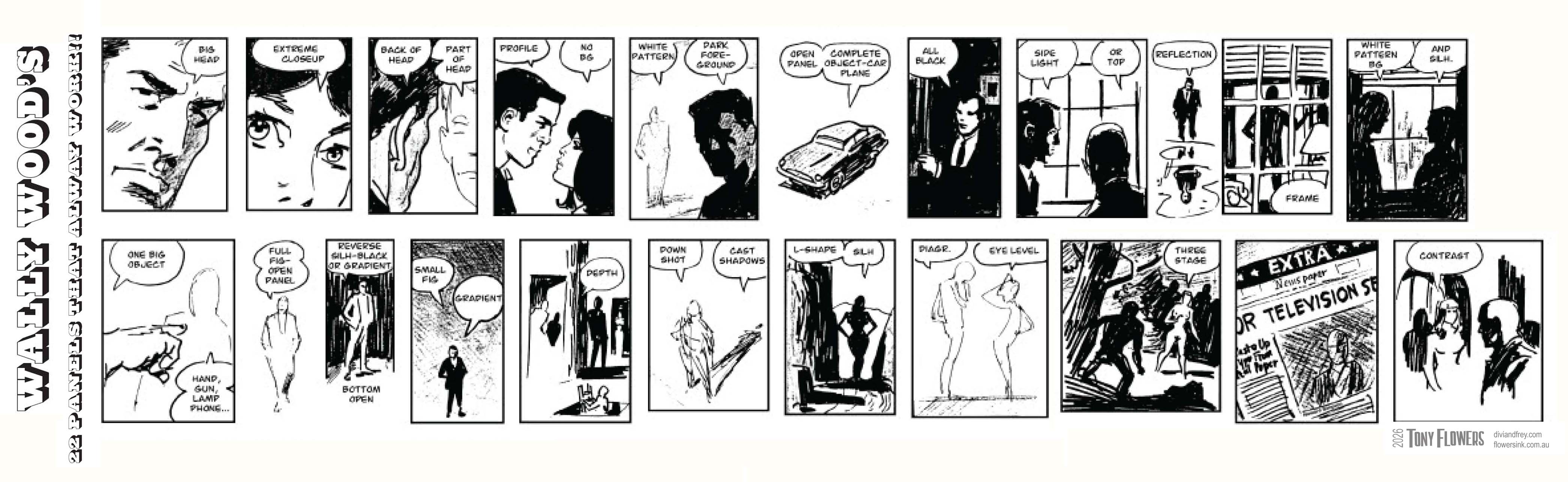
Further to my earlier post on Wally Wood’s 22 Panels That Always Work, I wanted to explore how this system functions as a practical visual shorthand for storytelling. While originally created as a professional tool, the panels translate extremely well into classroom contexts because they help students clearly see how stories are structured, paced, and emotionally shaped through visual choices. [cloudfour.com], [scribblejerk.com]
Below I have put together 2 exercises for Upper Primary school (grades 5 to 6) and 2 for Upper High School (9 to 10). If you do give these activities a go I would love to hear about the results.
Activities for Ages 10–12 (Upper Primary / Years 5–6)
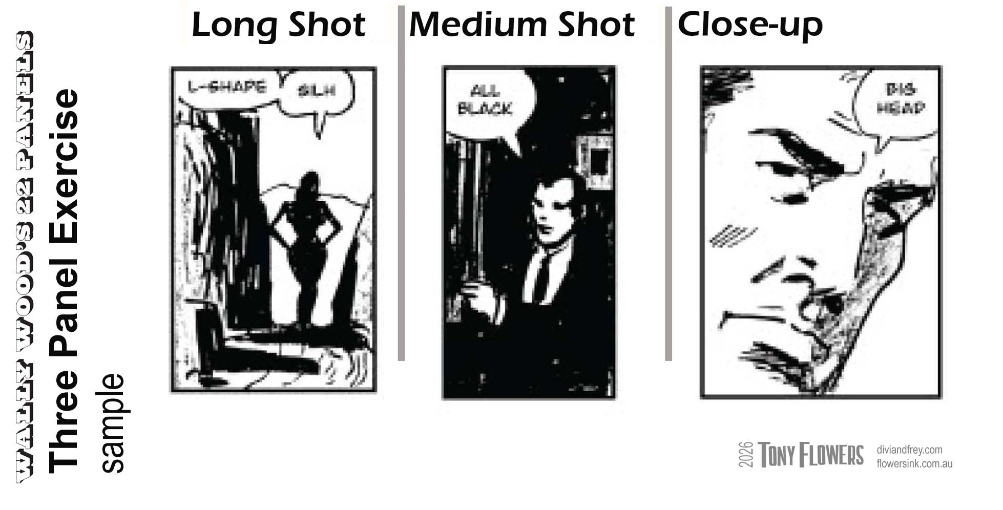
Activity 1: One Moment, Three Panels
Focus: Narrative sequencing and viewpoint Panels used: Long Shot, Medium Shot, Close‑Up
The power of the 22 Panels is that they remove the fear of “what do I draw?” and replace it with purposeful choices. For students, this mirrors the writing process, planning, drafting, revising, and refining meaning.
They are not just drawing pictures. They are learning how stories work.
Tony Flowers (2025) Divi and Frey, book 1
Image uses the principles of Diagram/eye-level (combined with contrast to build data)