Elements and Principles of Design
Introduction
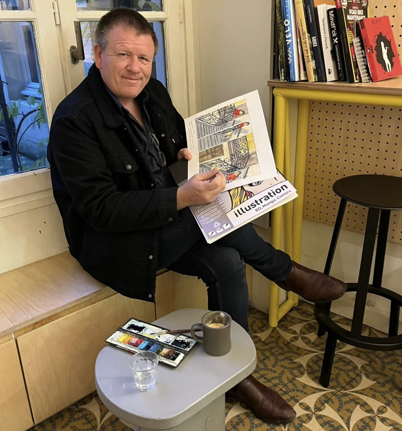
When I first started out as an illustrator, no one ever sat me down and explained the elements and principles of design. I wish they had. These concepts aren’t just academic theory, they’re the practical tools that help you see images more clearly, create with more intention, and talk about visual work in a way that’s informed, confident, and meaningful.
For new illustrators, these fundamentals become the scaffolding that supports every drawing, layout, and character you create. For teachers, they offer a shared language that makes classroom discussions richer, more accessible, and far less mysterious. Once students understand how point, line, shape, colour, balance, rhythm and contrast actually work, they can analyse images with clarity and build their own with purpose.
These ideas transformed the way I approached my own books and they continue to shape how I teach. My hope is that they’ll do the same for you and your students. For this post we will look at the Elements of Design and in a future post we will look how the Principles of design bring the elements of design together to make stories.
THE ELEMENTS OF DESIGN
These raw building blocks that we use to build images.
1. Point
The simplest visual mark. A single dot in empty space instantly creates a focal point. Multiple points placed together begin to suggest line, direction, and movement.
In illustration a point might form a detail in an image or a simple eye.
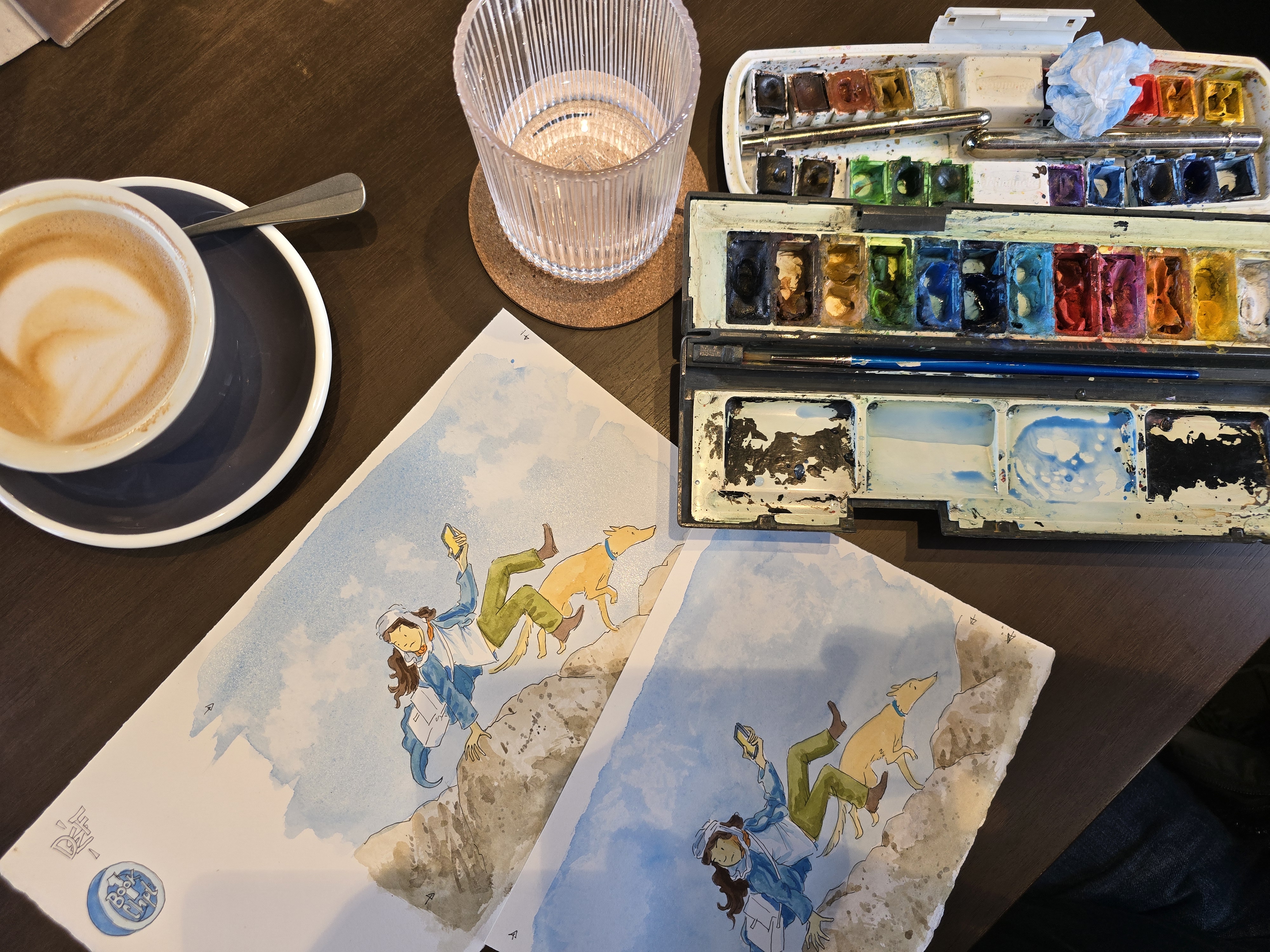
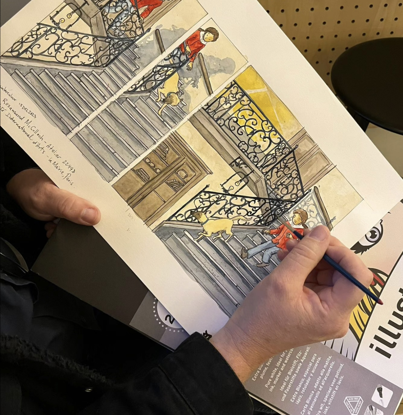
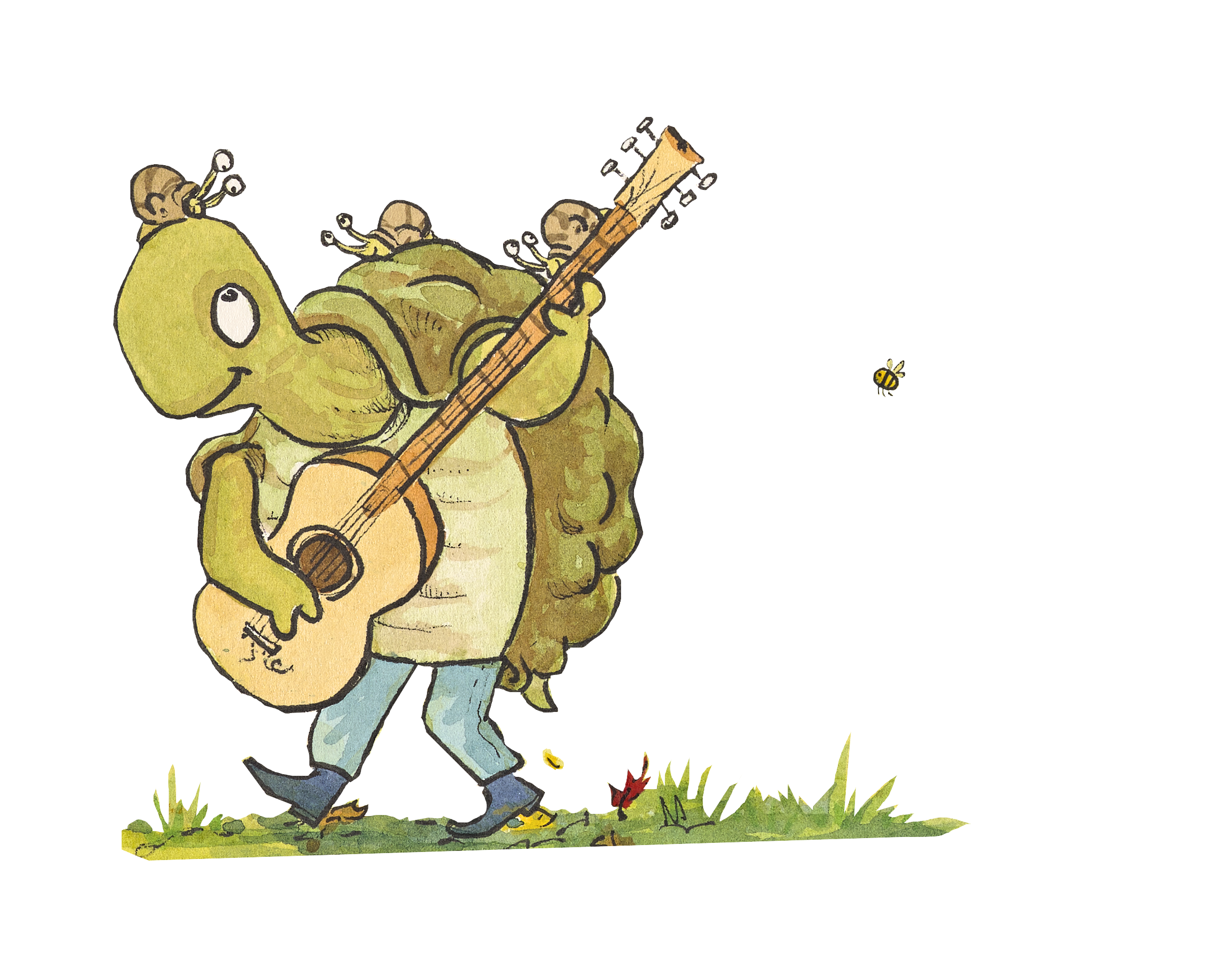
2. Line
A mark between two points. Lines can be thick, thin, smooth, rough, expressive, mechanical, digital, or hand‑drawn. Lines help us:
- describe form
- create texture
- guide the viewer’s eye
- build emotion and energy
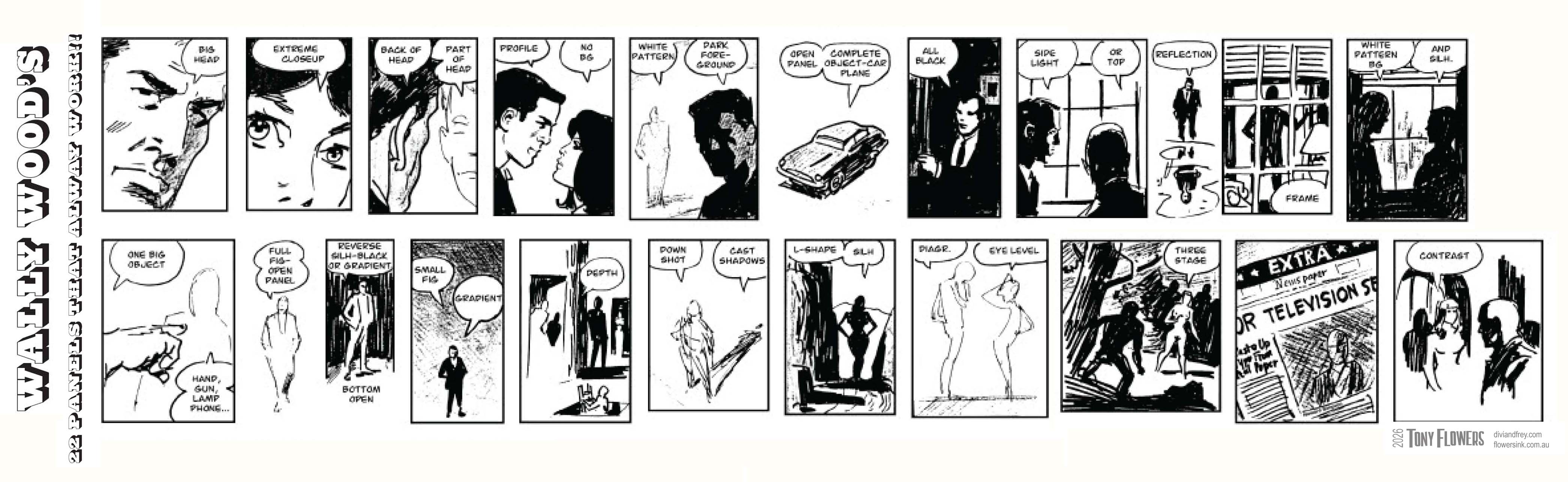
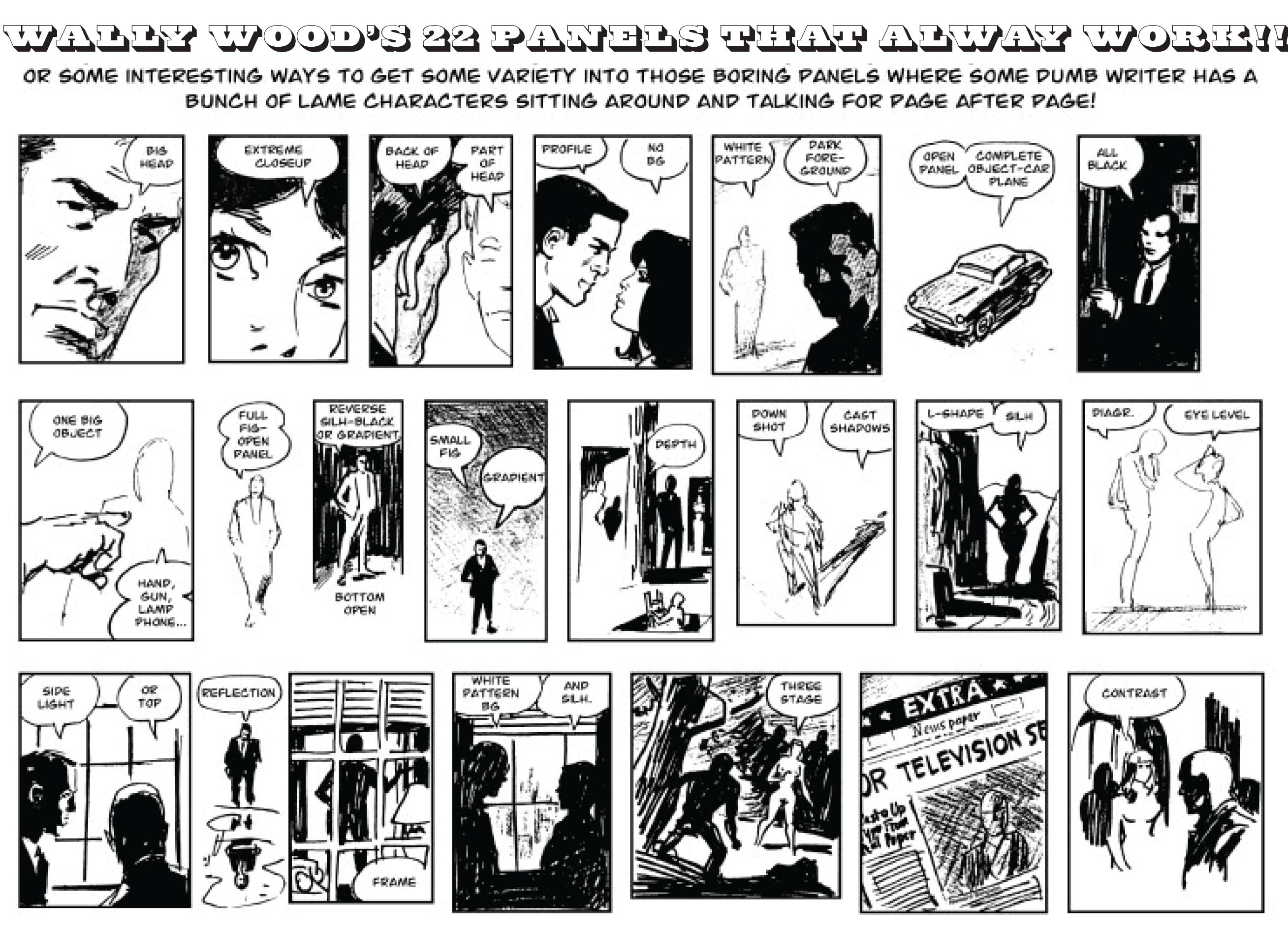
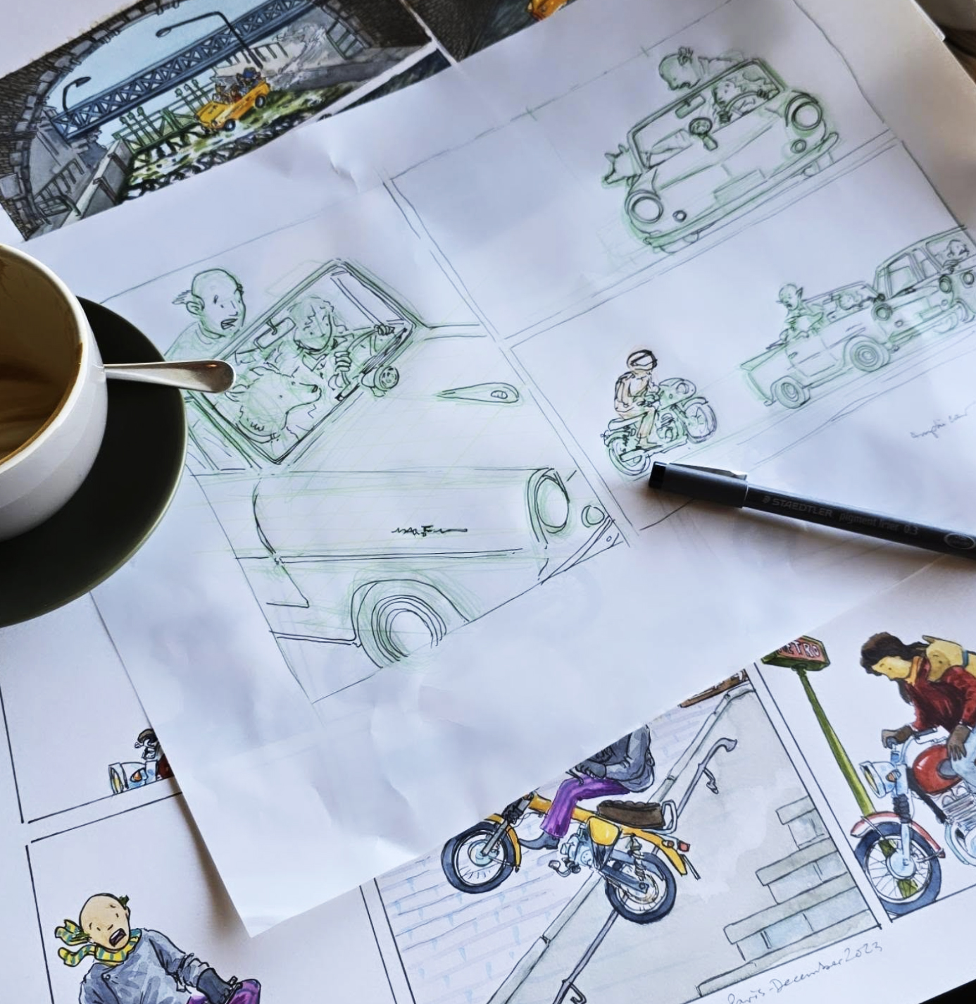
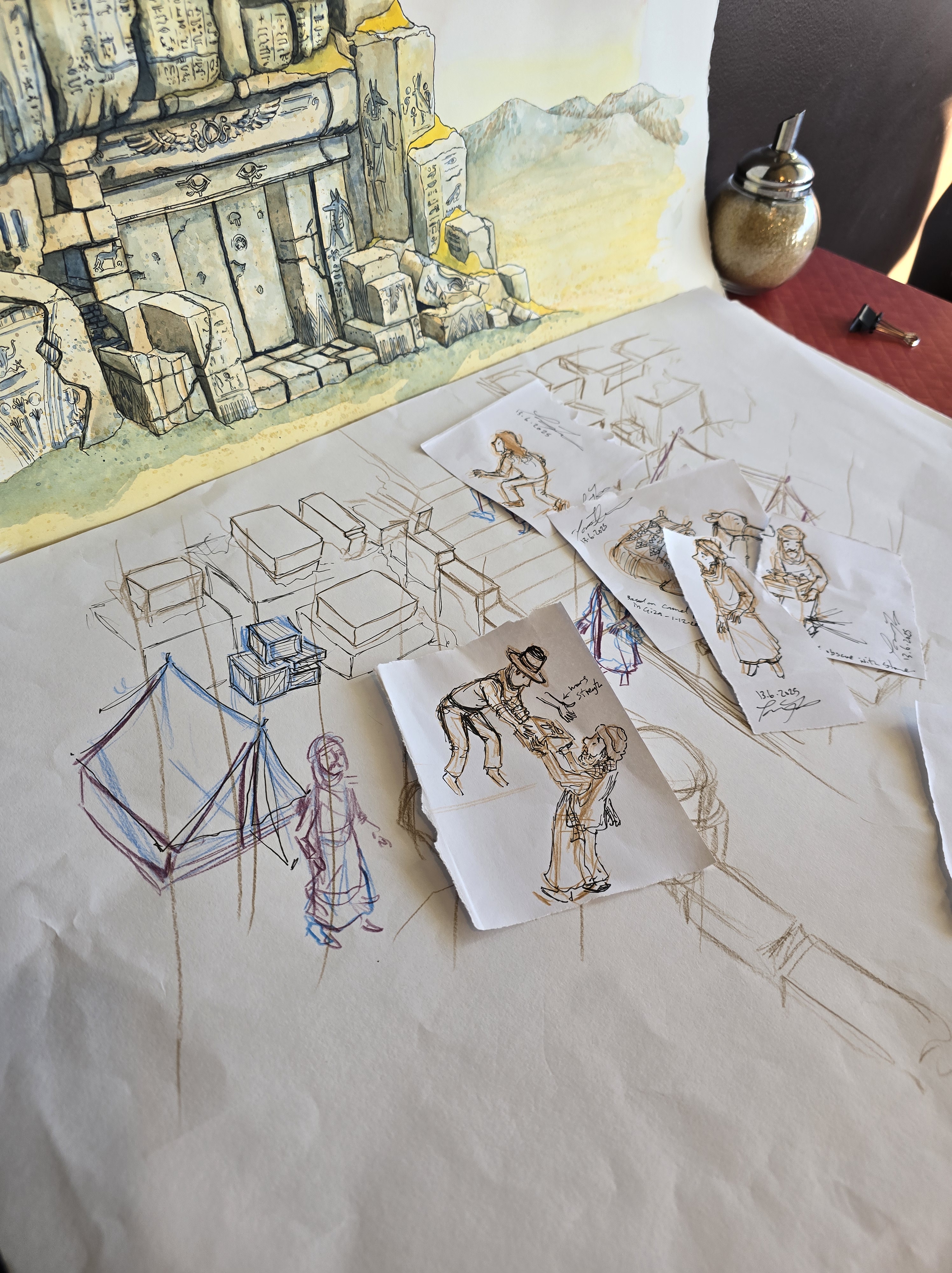
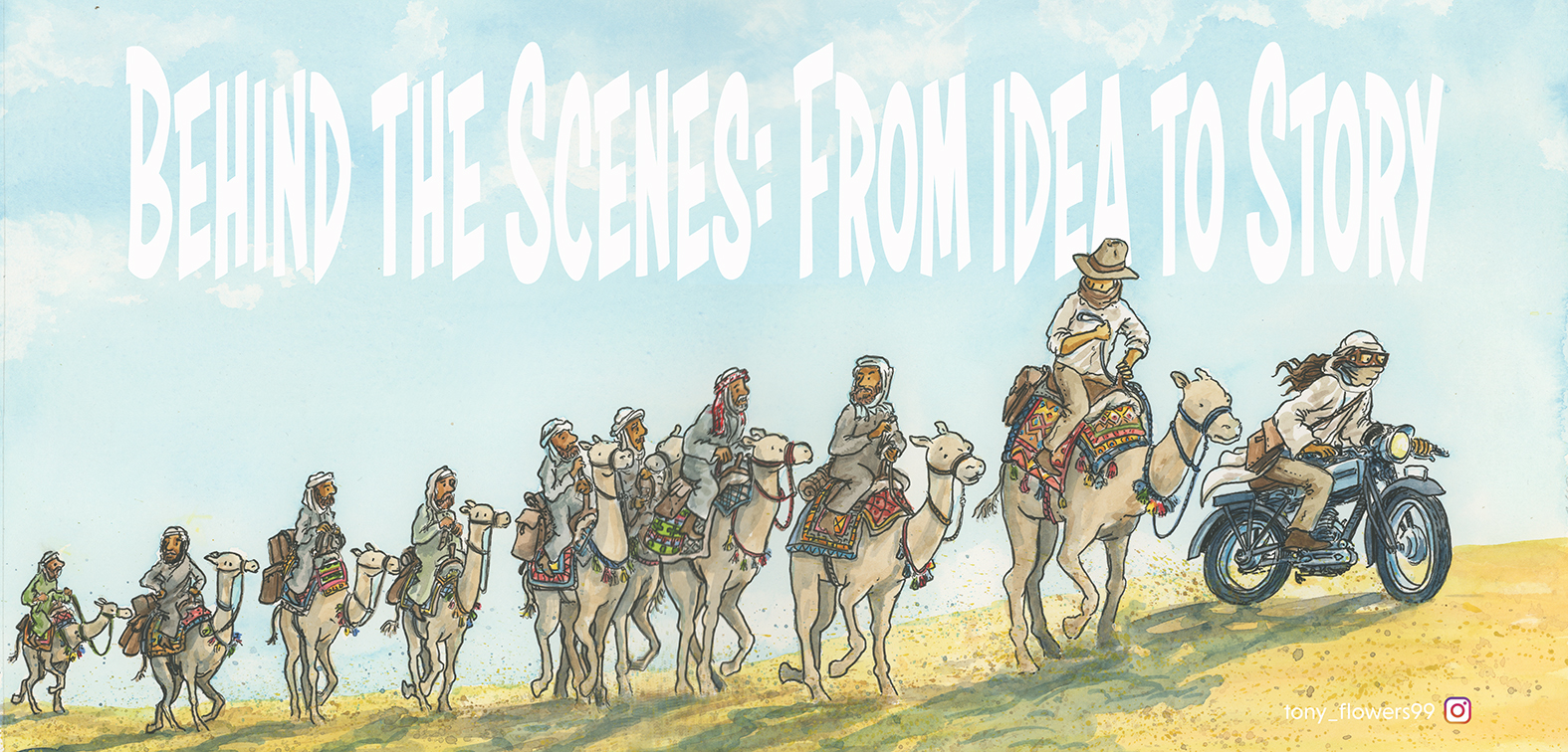
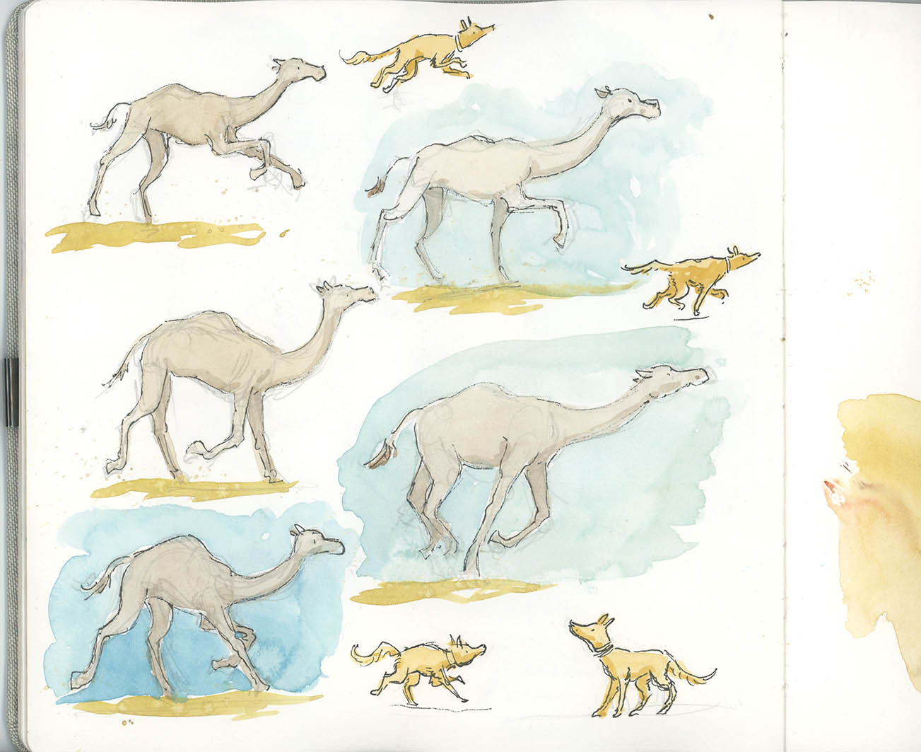
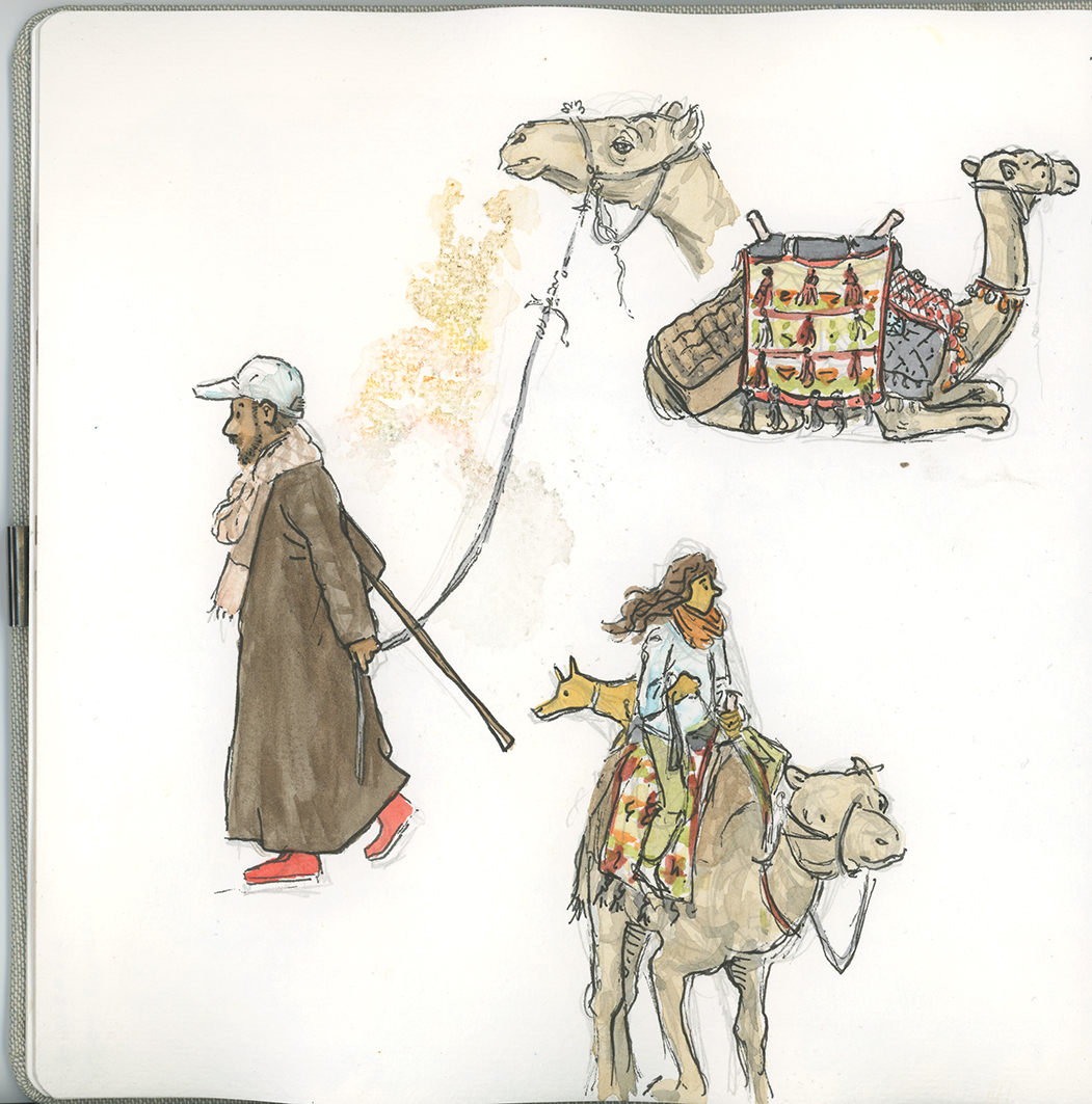
In the image above you can see some of the lines (on the left) that are used to add movement to this character sketch. As we progress with refining the linework. the medium used and the thickness and profile of these line all add meaning to how the reader views the story within the image.
3. Plane & Shape
A plane is a flat, two‑dimensional surface. When planes combine, they create the illusion of form. A shape is a defined area within boundaries. Shapes can be:
- Geometric (circles, squares, triangles)
- Organic (natural, flowing forms)
- Representational (shapes that resemble real objects)
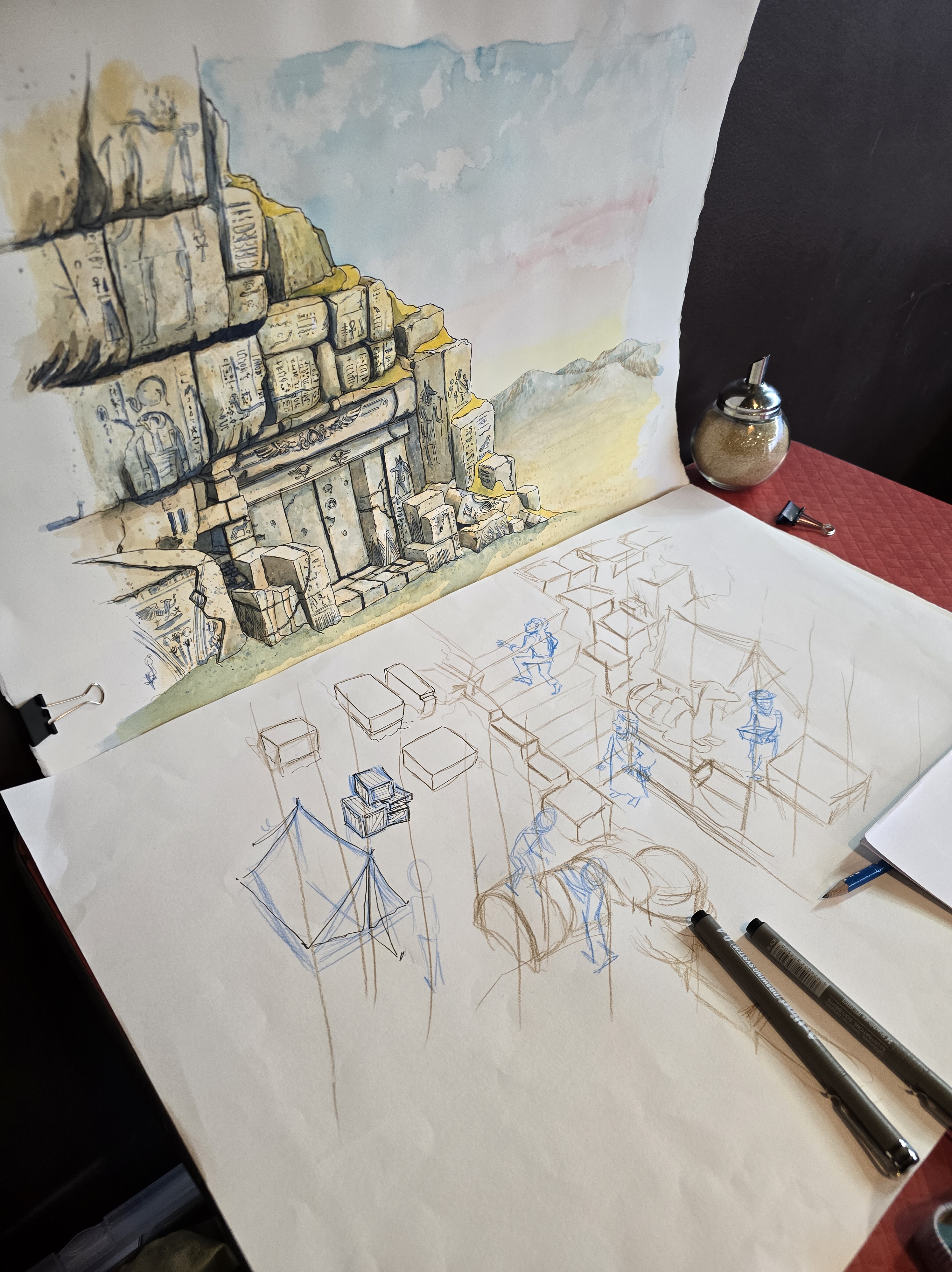
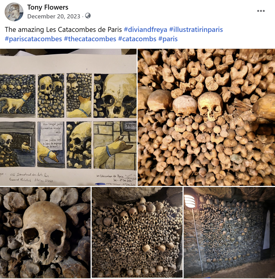
4. Texture
The visual suggestion of a surface—soft, rough, smooth, spiky, warm, cold. Texture can be:
- Representational (fur, brick, fabric)
- Abstract (patterns, marks, digital brushes) Texture enriches illustrations and helps communicate mood and material.
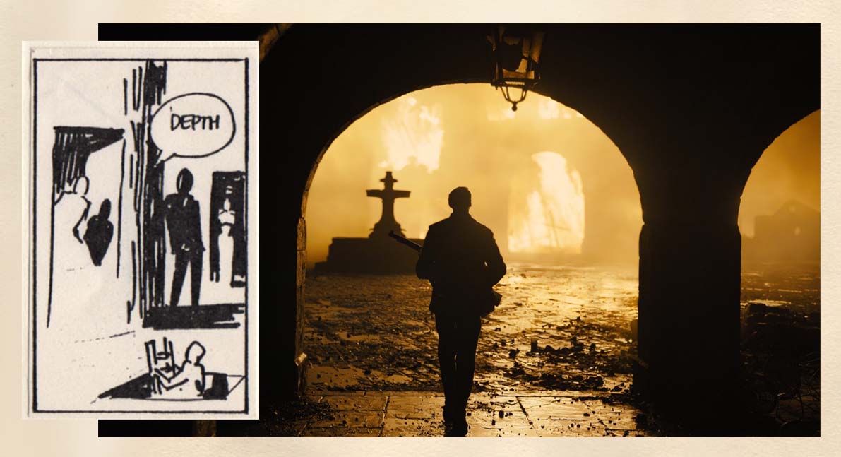
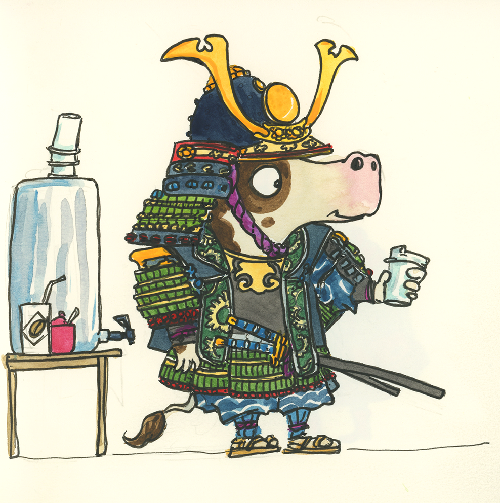
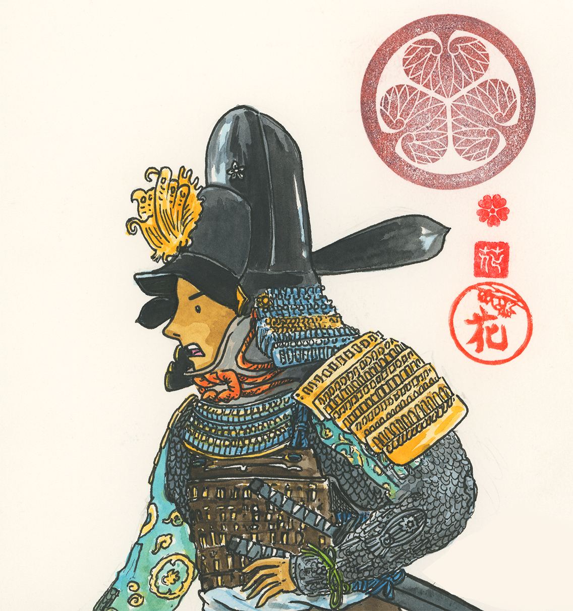
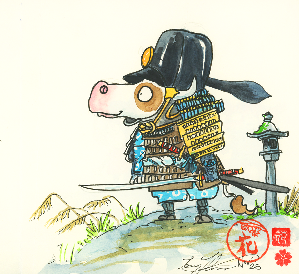
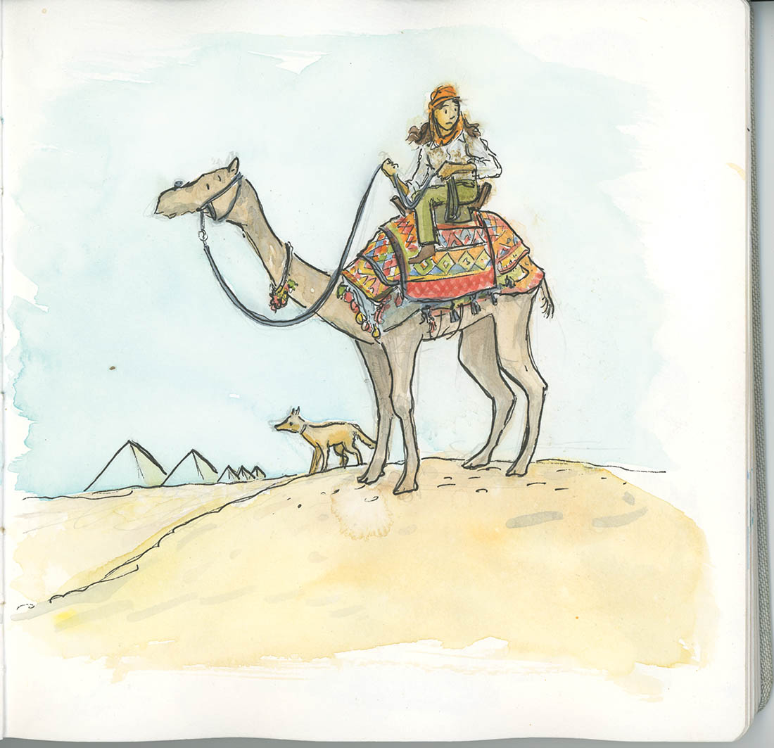
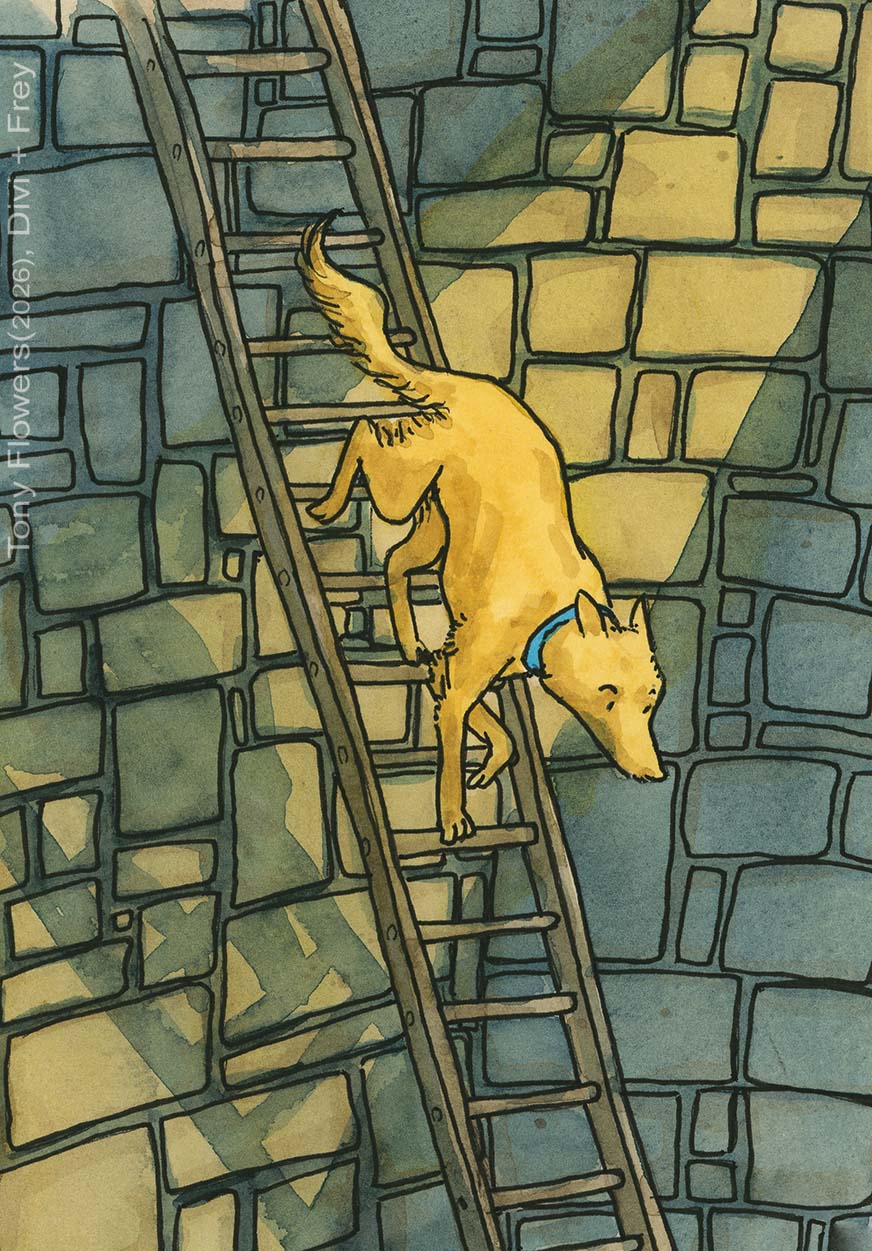
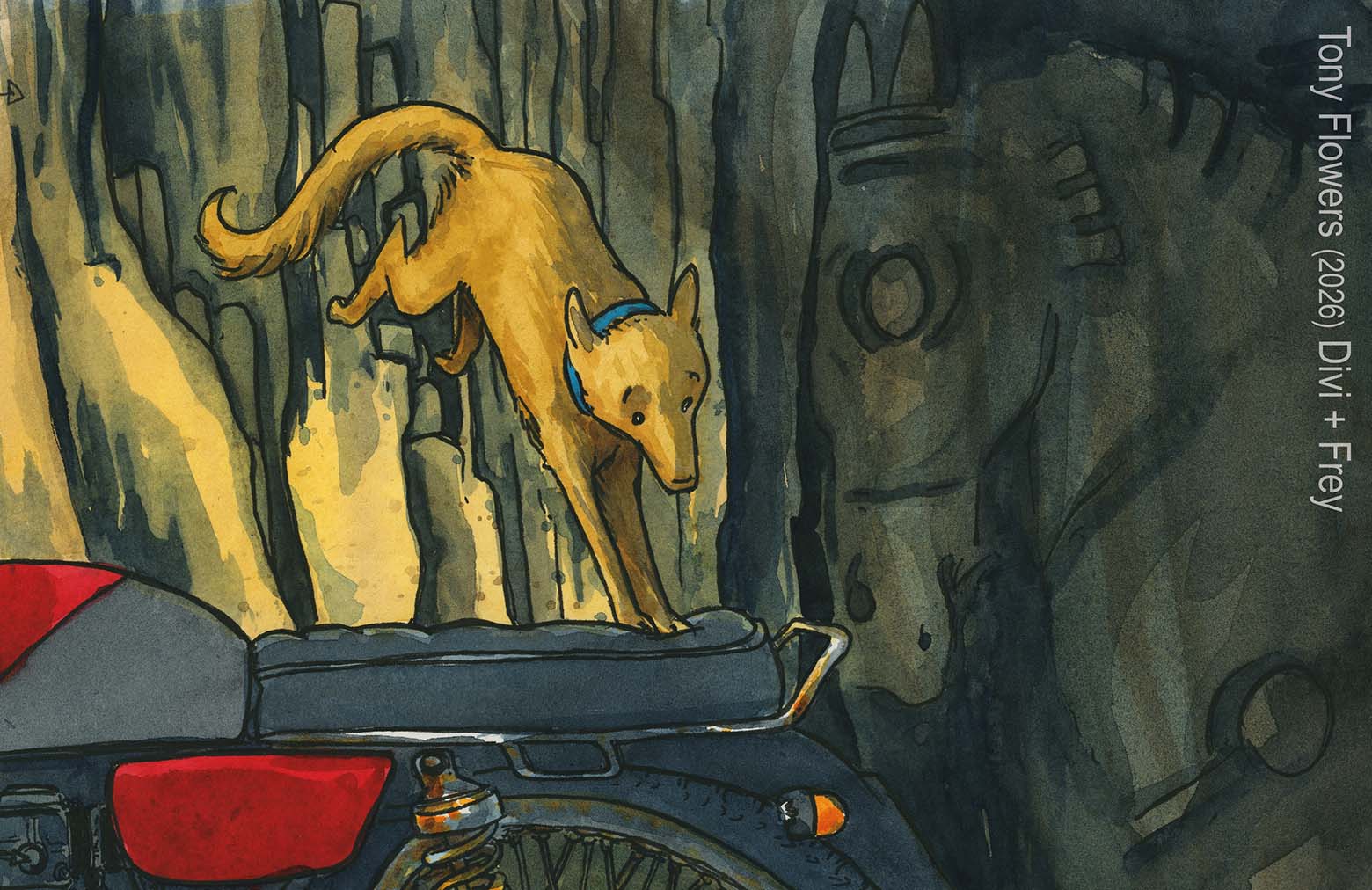
One of the reasons I love working in water colour so much, it the ability to build up textures in my images. All of these tiles are from illustration that appear in 4 different books (2 are from the image above). Texture allows you to build in how an environment or object feels.
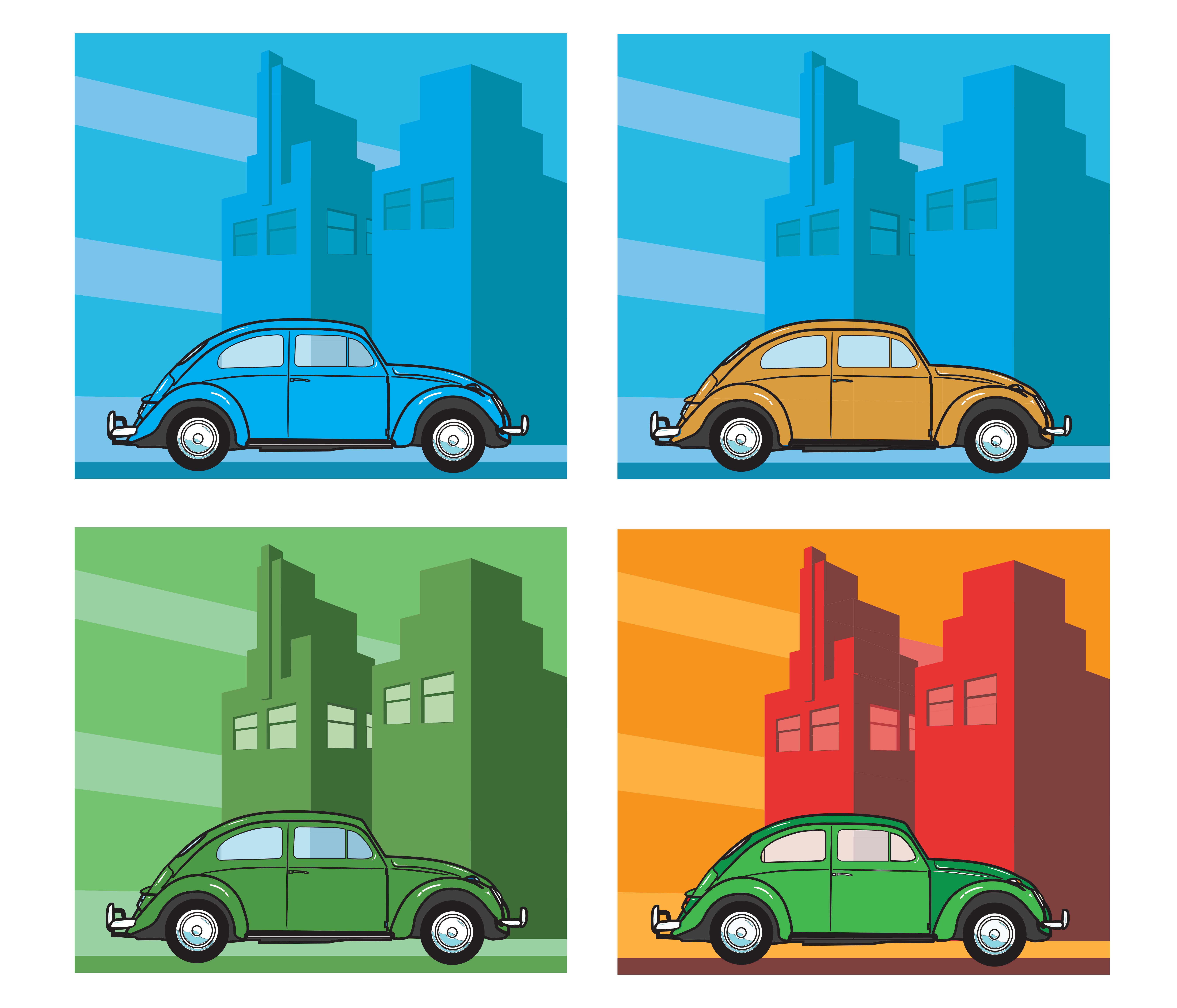
5. Colour
Colour is both science and storytelling. It communicates emotion, symbolism, and atmosphere. Key ideas include:
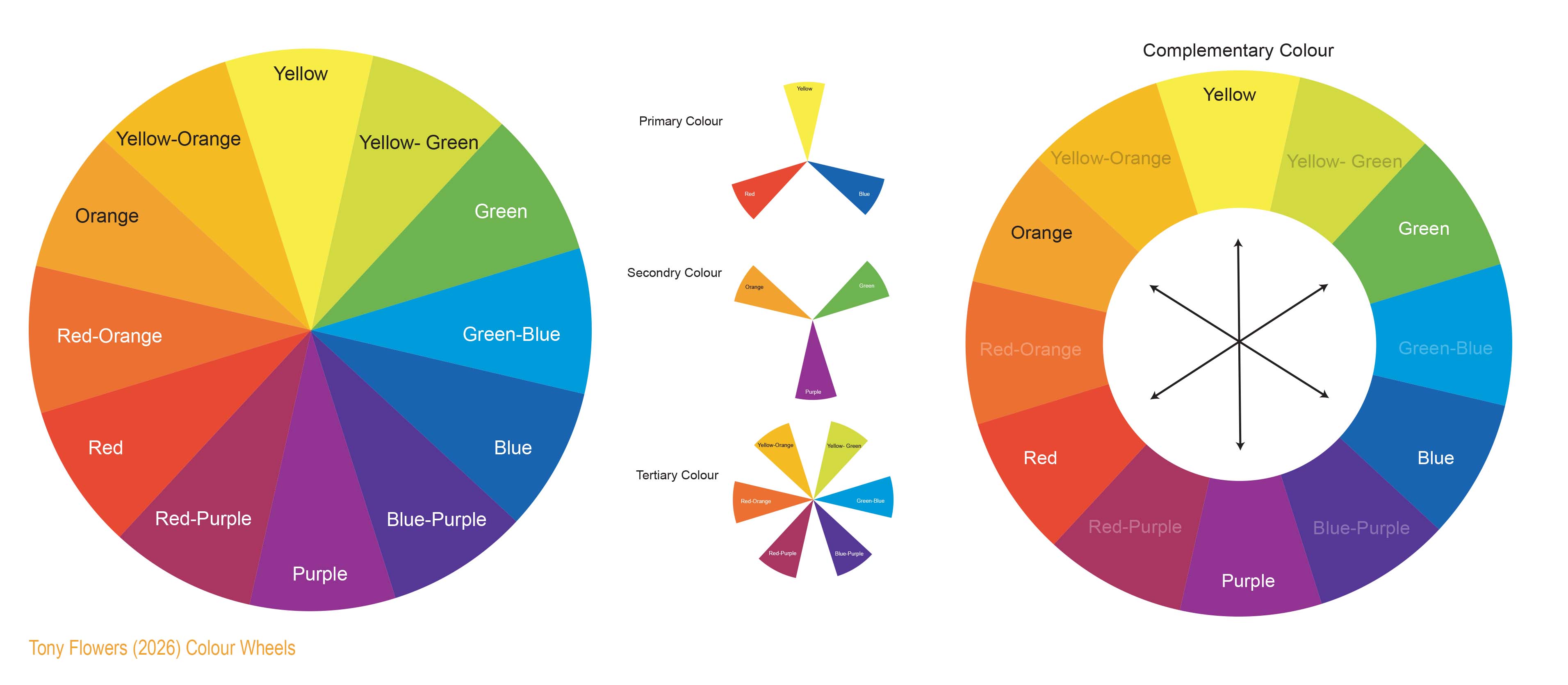
- Colour relationships: complementary, analogous, triadic, monochrome
- Cultural meaning and accessibility (e.g., colour blindness)
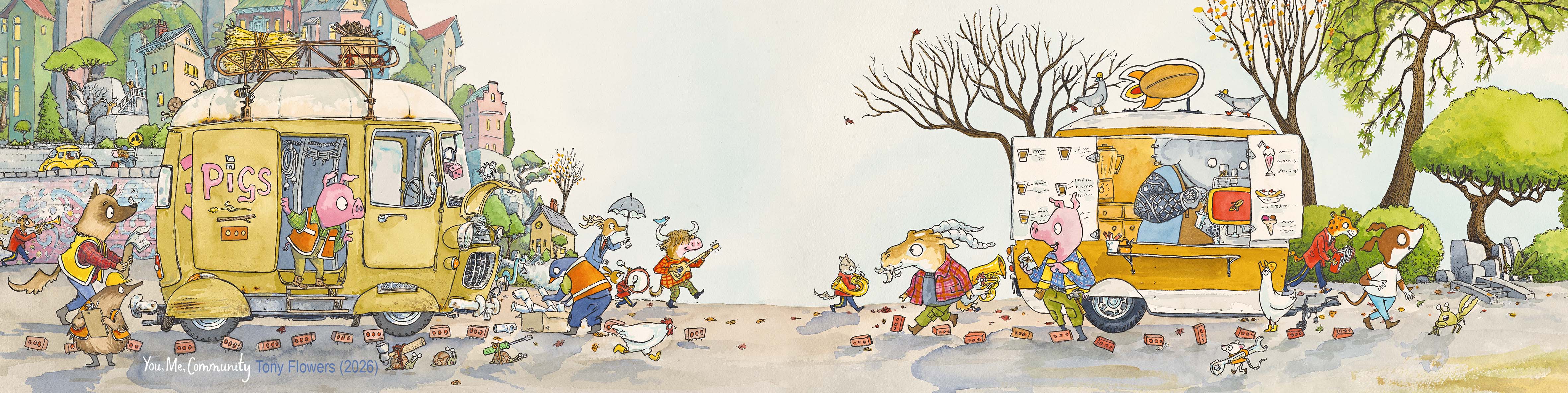
6. Space
The area around and between elements.
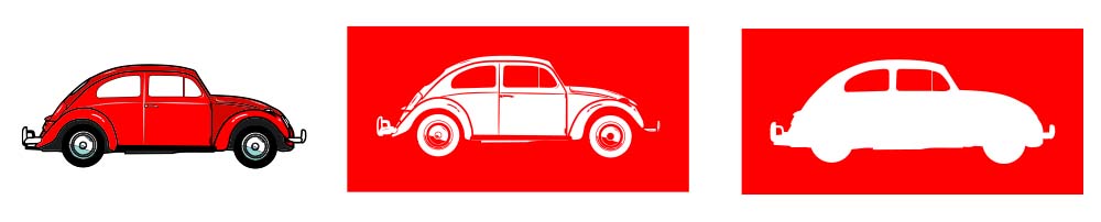
- Positive space holds content
- Negative space (white space) gives breathing room Good use of space improves clarity, readability, and visual impact.

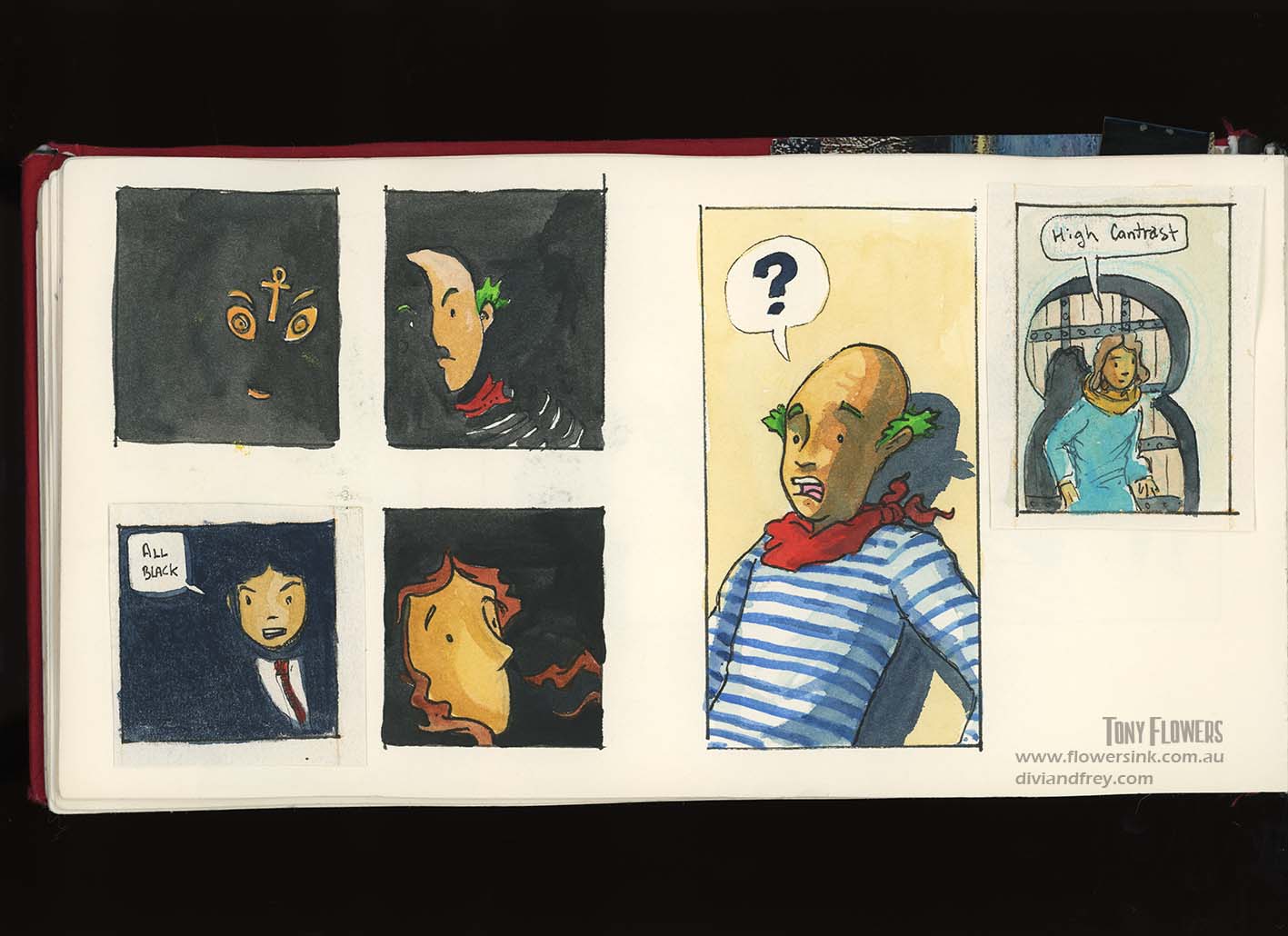
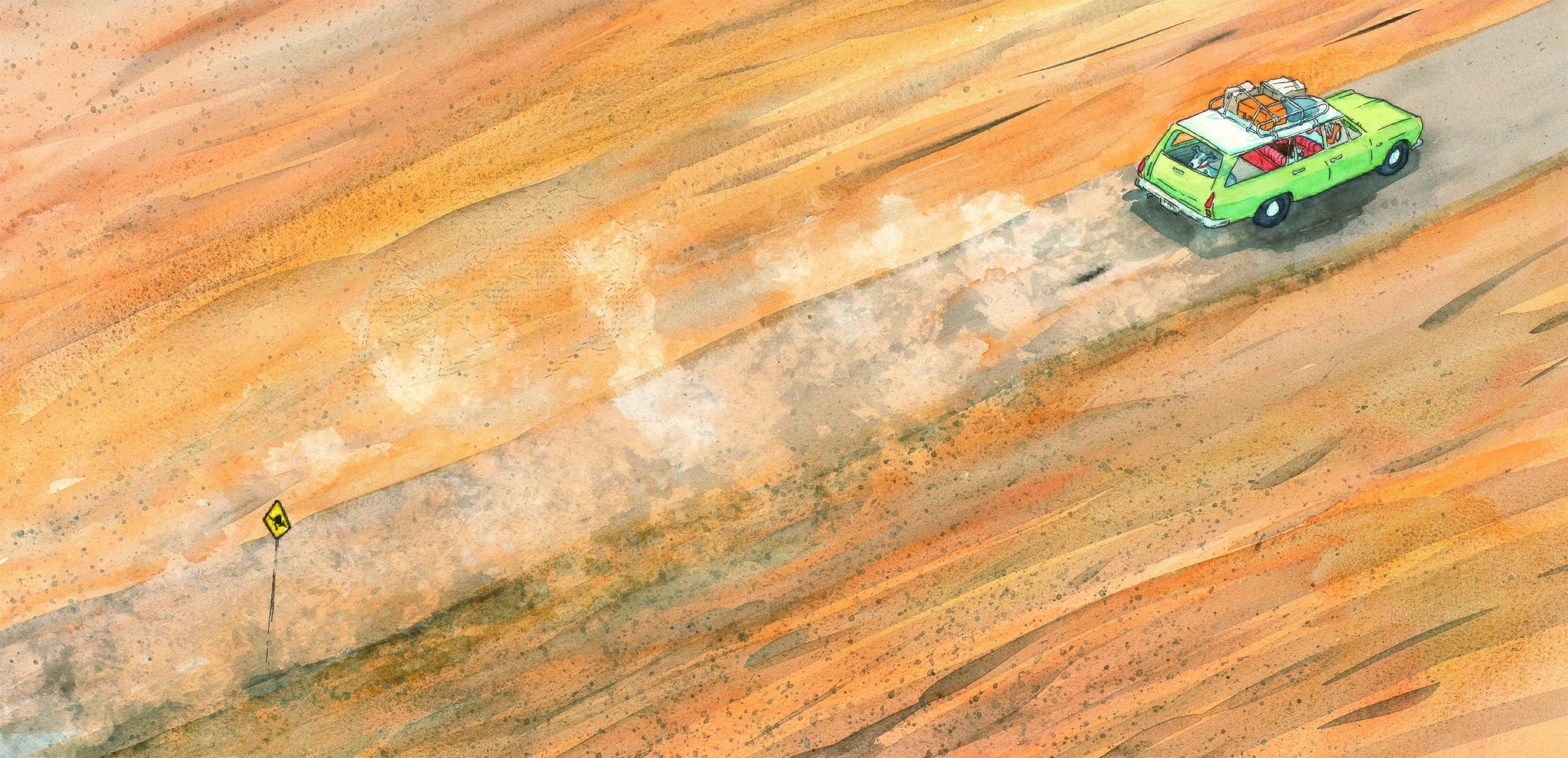
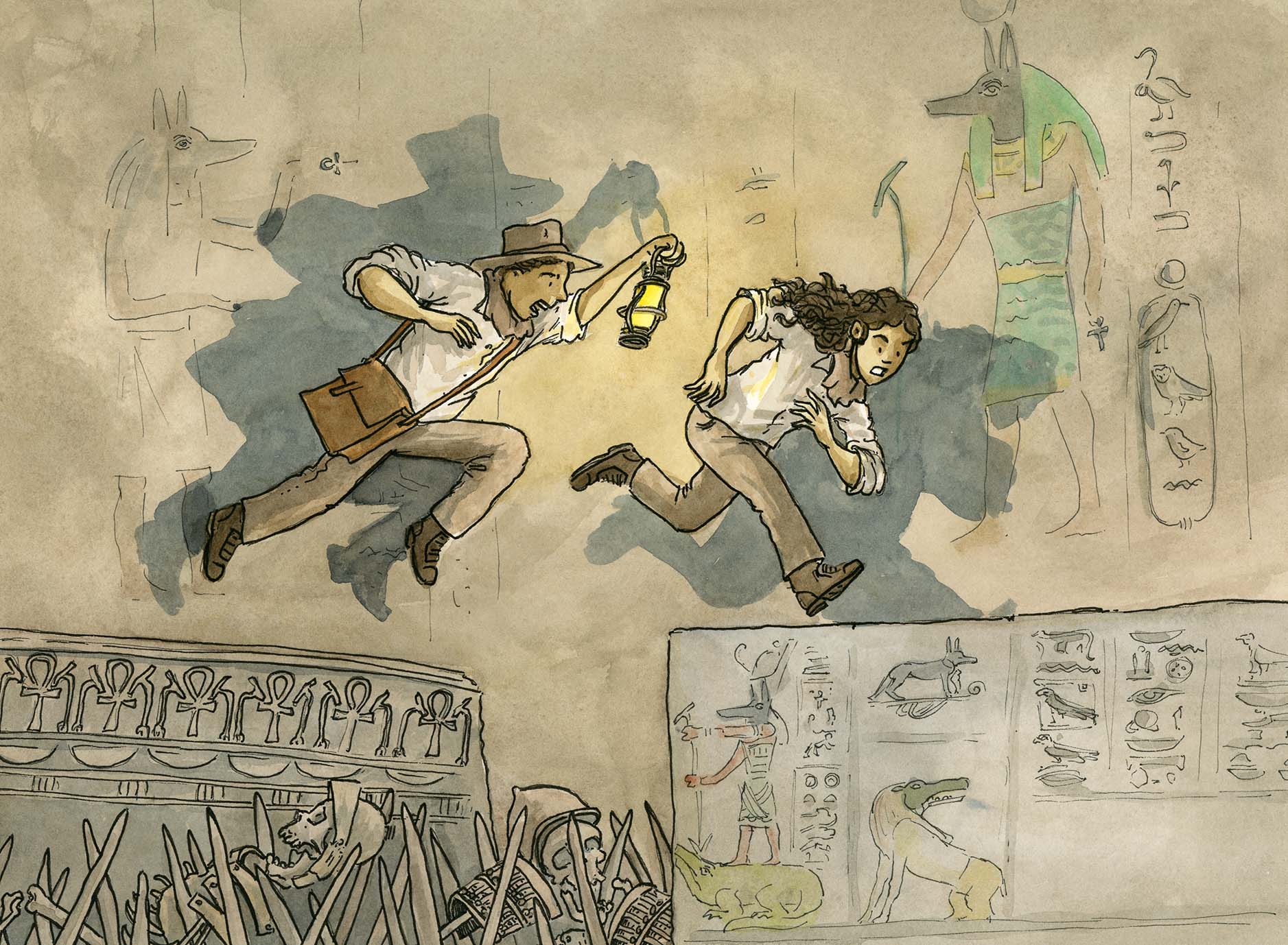
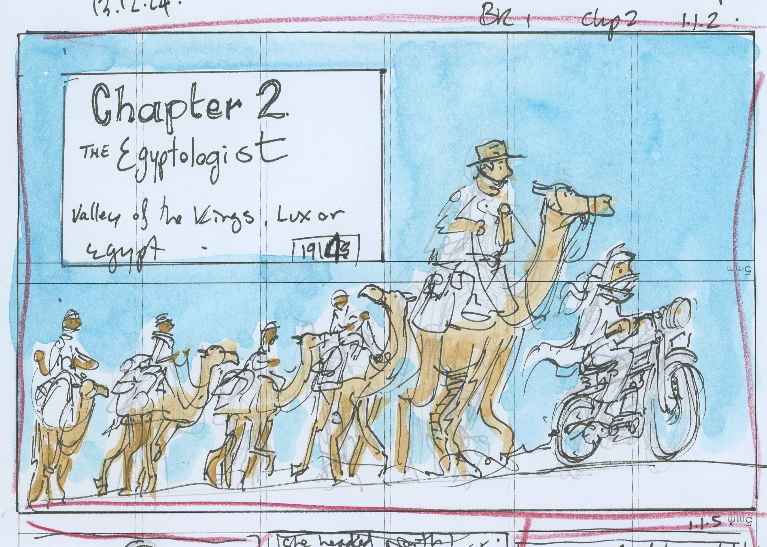
With good use of negative space, what is left out of a picture is just as import as what is included.
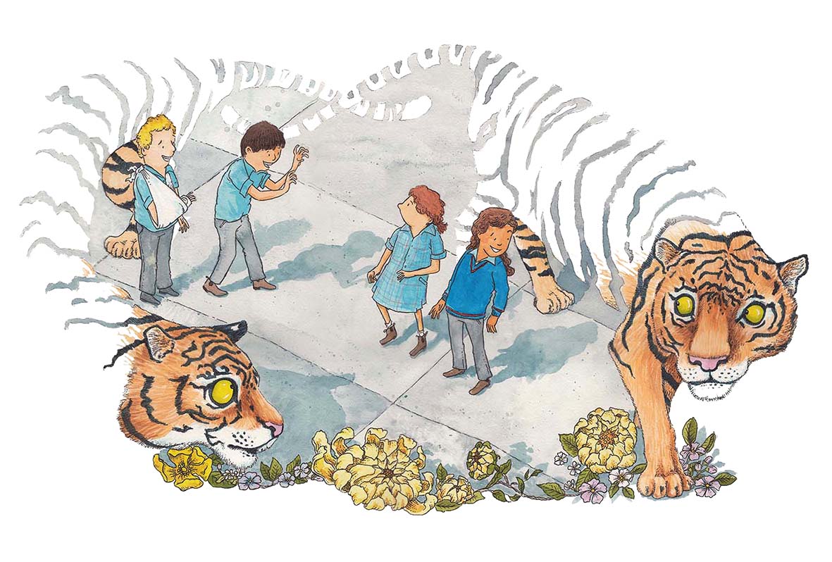
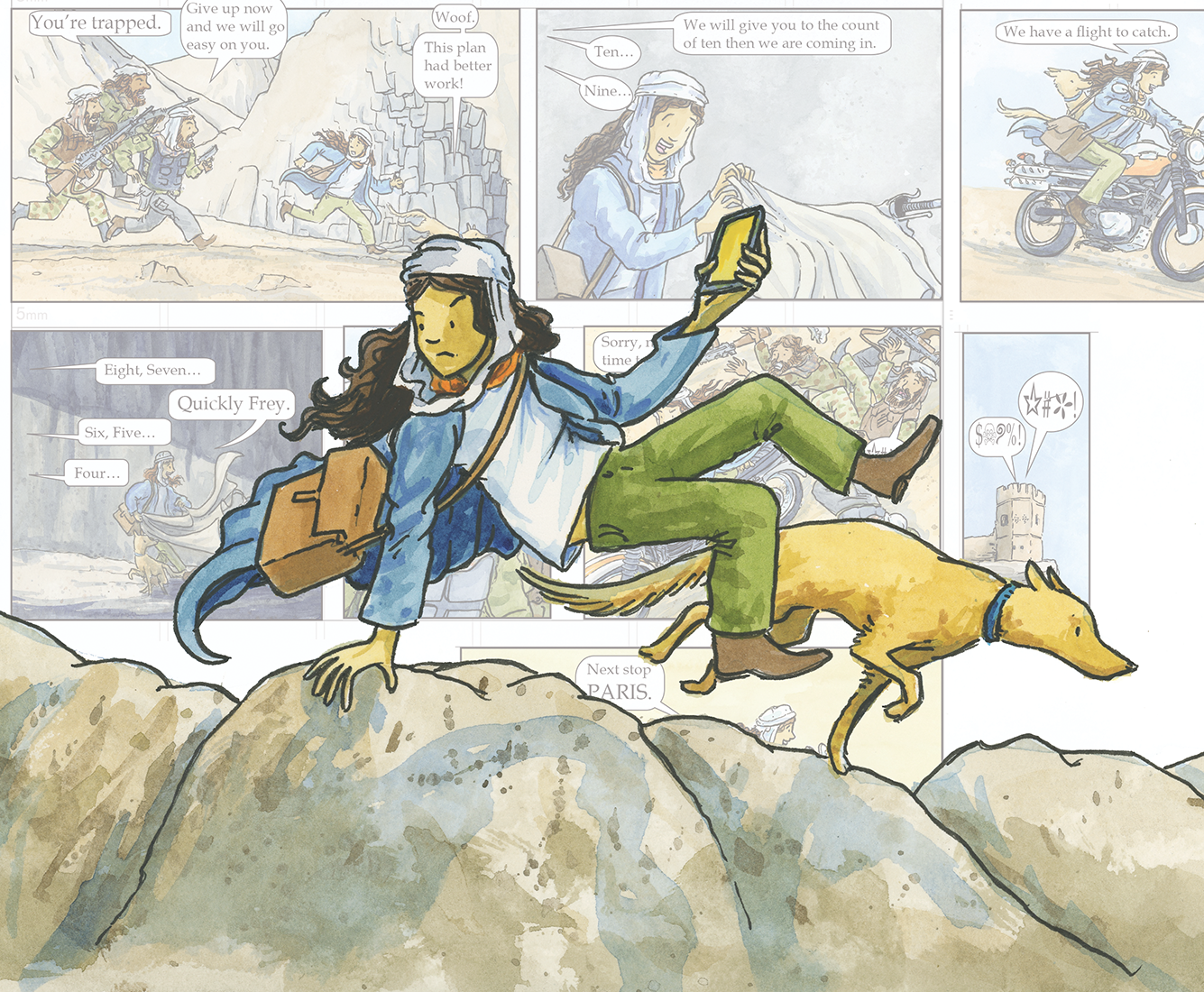
In the image above from Grandma’s First Tattoo, you can see of both negative space and positive space are combined to tell a story.
7. Form
The illusion of three‑dimensionality. Form is created through:
- planes
- shading
- light and shadow
- value
- perspective Understanding form helps illustrators create believable characters, objects, and environments.
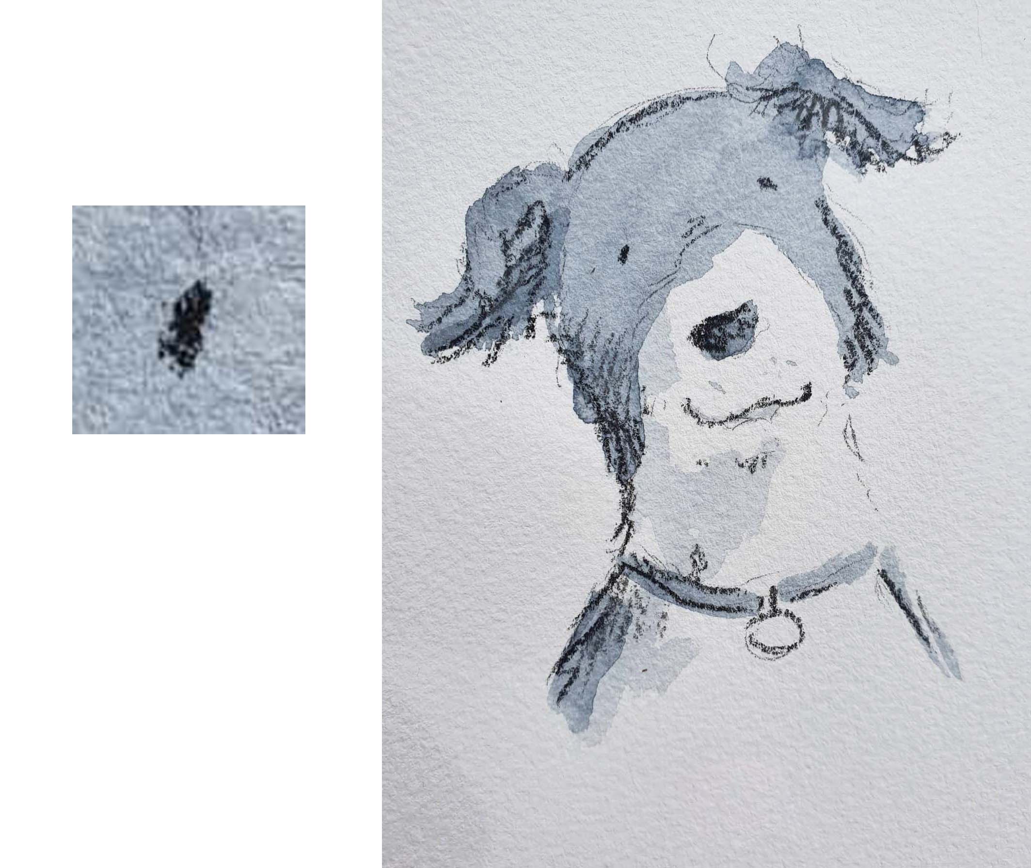
8. Value (Tone)
The lightness or darkness of a colour. Value is essential for:
- modelling form
- creating mood
- establishing contrast
- guiding the viewer’s eye Techniques like chiaroscuro use dramatic value shifts to create depth and focus.
I hope this post has given you a useful introduction to the elements of design, something that can help you begin your own illustration journey or simply understand images and how to read them with more confidence. Thanks for reading along as we explored these ideas.
If you’re a teacher and would like me to visit your school to run workshops on visual storytelling, illustration, or writing process, you’re very welcome to get in touch through my speaking agents. I’d love to work with your students and staff.
In Australia:
Lamont Authors
https://www.lamontauthors.com.au/lamont_author/tony-flowers/
Speakers Ink
https://www.speakers-ink.com.au/speakers/tony-flowers
For International enquiries, contact me directly.
SOMETHING EXTRA FOR THE TEACHERS OUT THERE
Visual Literacy Checklist
Use this checklist to help you look closely, think deeply, and talk confidently about any image, illustration, comic, photo, or design.
1. LOOKING CLOSELY: The Elements of Design
Point / Dot
- Can I see any small marks or points that draw my attention?
Line
- What kinds of lines are used (thick, thin, smooth, rough, curved, straight)?
- Do the lines show movement or emotion?
Shape
- What shapes can I see (geometric, organic, representational)?
- How do the shapes help build characters, objects, or patterns?
Colour
- What colours stand out?
- Do the colours create a mood or feeling?
- Are there warm/cool colours or a colour scheme?
Texture
- Does the image look smooth, rough, soft, or hard?
- How does the artist show texture?
Space
- What parts of the image are filled (positive space)?
- What parts are empty (negative space)?
- Does the space make the image feel crowded or calm?
Form
- Does anything look three‑dimensional?
- How does shading or light help create form?
Value / Tone
- Where are the light and dark areas?
- Does contrast help create drama or focus?